Expand my Community achievements bar.

Join us January 15th for an AMA with Champion Achaia Walton, who will be talking about her article on Event-Based Reporting and Measuring Content Groups!

Using Conditional Formatting as a Heat Map to Identify & Monitor Values

Avatar

Employee

5/15/23

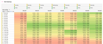
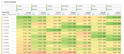
Using the Day of Week dimension (OOTB) and Hour of Day dimension (OOTB), you can create a custom heat map to understand what times and days of the week generate the most significant amount of engagement or drive the highest number of conversions. While using the Day of Week (OOTB) and Hour of Day (OOTB) dimensions produces an insightful and granular seasonality analysis, this heat map is not limited to these dimensions. For instance, swapping out the Hour of Day dimension for the AM/PM (OOTB) dimension will produce a high-level, meaningful analysis. 


When applying the conditional formatting setting, you can use auto-generated to automatically calculate the upper limit, midpoint, and lower limit based on the data, or you can define your own custom limits. 

jenmarti_3-1684161869134.png

After selecting and applying the type of conditional formatting for your analysis, your reports will appear similar to the examples shown below:


Heat map to trend engagement

jenmarti_2-1684161855442.png

jenmarti_4-1684161881967.png


Heat map to trend conversions

jenmarti_1-1684161850012.png


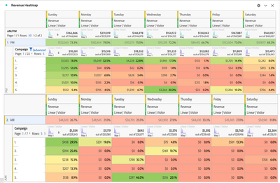
Taking it one step further, you can use the AM/PM dimension broken down by campaign name variable to understand what campaigns are driving conversions based on the day of week and time of day:

jenmarti_0-1684161843821.png


5 Comments

Avatar

Community Advisor and Adobe Champion

5/15/23

In addition to this, to create a truly "visual" heat map, you can hide Numbers, Percent and Totals from these views and just have the colours showing your "hot" and "cold" days/times.


It means that the heat map stands on its own without showing all the text.


You can do either way, but it's nice to remember that there are some additional ways to simplify the display

Avatar

Community Advisor and Adobe Champion

5/18/23

I love this feature. We use it a lot to do time-parting heatmaps to show when our audience visits our platforms and consume different media types. 

Avatar

Level 3

12/7/23

@Jennifer_Dungan  @jenmarti 

It is a very useful feature. Is there an option where can use custom colors - for timeparting heatmaps

red- high page views to gradient green to low page views .

Is that something we can do by adjusting the values


Avatar

Community Advisor and Adobe Champion

12/7/23

cparthasarathy if you want to reverse the red and green, I think the best option would be to create a custom calculated metric and select "Show upward trend as Bad (red)" - this will trick the conditional formatting to reverse itself.


So let's say you are using "Page Views" metric, make the following calculated metric:

Jennifer_Dungan_1-1701981364473.png


Then you don't have to try and figure out the changing scale of your metrics, you can leave it to automatically adjust.

Avatar

Community Advisor

1/13/24

This is a great feature.