
An Introductory Look at Exploratory Data Analysis on Adobe Experience Platform
Authors: Tina Dilip Soni, Marina Mahtab, Althaf Kudiyama Kandi, and Douglas Paton

In this post, we take a look at exploratory data analysis in Adobe Experience Platform. We talk about what it is and its importance to enterprise customers striving for better customer experience. This post describes how exploratory data analysis is done in Adobe Experience Platform.
Exploratory Data Analysis (EDA) is a critical step in data science that allows us to perform initial investigations on the data to discover patterns, spot anomalies, and to test hypotheses and assumptions with the help of summary statistics and graphical visualizations. It’s analogous to a child exploring new surroundings or a detective investigating minutest details of a crime.
There are two main goals with EDA:
- To get a first look at the data.
- To display the data in such a way that the most interesting features will become apparent. These features can be used for a machine learning objective.
Some of the most important exploratory data analysis methods include:
- Scatter plots — two-dimensional plots that can help a data scientist evaluate relationships between 2 dimensions
- Box plot — a visualization that helps data scientists detect outliers. Outliers tend to skew the model results and it is important to treat the outliers appropriately
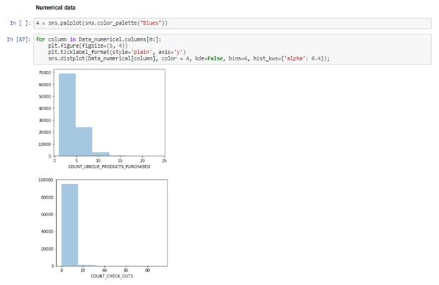
- Histogram — a plot that is used to discover the underlying frequency distribution (shape) of a set of continuous numerical data like the number of orders or age.
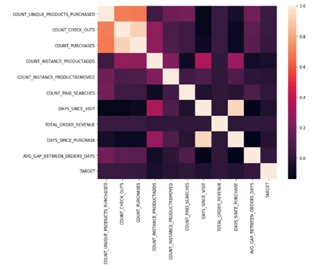
- Correlation Matrix — a table that gives correlation coefficients between variables. This matrix is used to summarize data and provide insights into relationships between different variables. It is also used as inputs to advanced analytics.
Why is EDA important to every data science project?
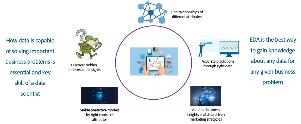
EDA is a necessary part of the machine learning process because it helps data scientists uncover hidden patterns and insights in the data. It can expose the relationships between different attributes and provides valuable business insights that can be used for marketing strategies. During the EDA process, identified significant features aid in making accurate predictions.
Ultimately, EDA helps build stable and reliable models that are used by data scientists to make accurate predictions about the future.
Where does EDA fit into the data science process?
EDA is one of the many steps involved in any data science project starting from business and data discovery to model building and scoring. However, EDA forms an integral part of building a machine learning model
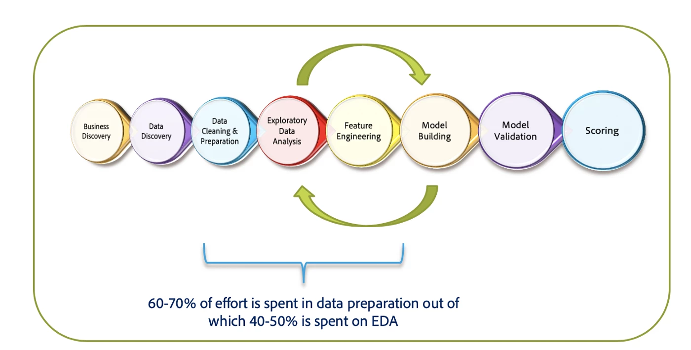
- Step 1: The first step in a machine learning project is business discovery. This helps us understand the business problem and convert that problem into a machine learning objective. This is done with business teams through whiteboarding sessions.
- Step 2: Next, a data discovery session is conducted to evaluate the availability of data to build the machine learning model. Data is loaded into the necessary systems for further analysis.
- Step 3: Once the discovery sessions are complete, data is cleaned and prepared, much like a chef would clean and chop vegetables before cooking.
- Step 4: The next stage is EDA. Features identified in the EDA process are then transformed and combined into meaningful predictors. We call this feature engineering. For example, calculating the average order value from the total order value and number of orders.
Data scientists spend about 60–70% of their time in a project working through the data cleaning phase to feature engineering. And roughly 40–50% of that time is spent in EDA.
The next step is model building, then validation, and finally scoring. We will not go deep into these topics in this post.
How Adobe Experience Platform makes EDA easy
In Adobe Experience Platform, EDA can be performed within Data Science Workspace in Jupyter notebooks using Python, PySpark or R. EDA can also be done through the help of Adobe Experience Platform’s integration with visualization tools like Power BI or Tableau. Not only do visualization tools provide insights about the data, but they can also be used as awesome CXO dashboards.
Some of the challenges with EDA
The most common challenge is the volume of data. You end up with lots of columns of information and it can be hard to draw insights because of overwhelming data volume.
Data is not the level of aggregation we are after here. For example, data is most often stored at events or transaction level. What we’re looking for are the insights the data offers for each customer.
Adobe Experience Platform overcomes these challenges with a feature that connects Query Service to Data Science Workspace to create a single optimized notebook. Within that notebook, we can write queries to fetch and aggregate data, making the entire process faster and organized into one go-to notebook.
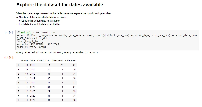
This feature is particularly useful for initial data exploration. It provides the initial peek into the data. In the code below, we explore the dates available in the dataset, which contains several million rows. Once we know the available dates, we can fetch only the relevant time range.
What EDA process looks like
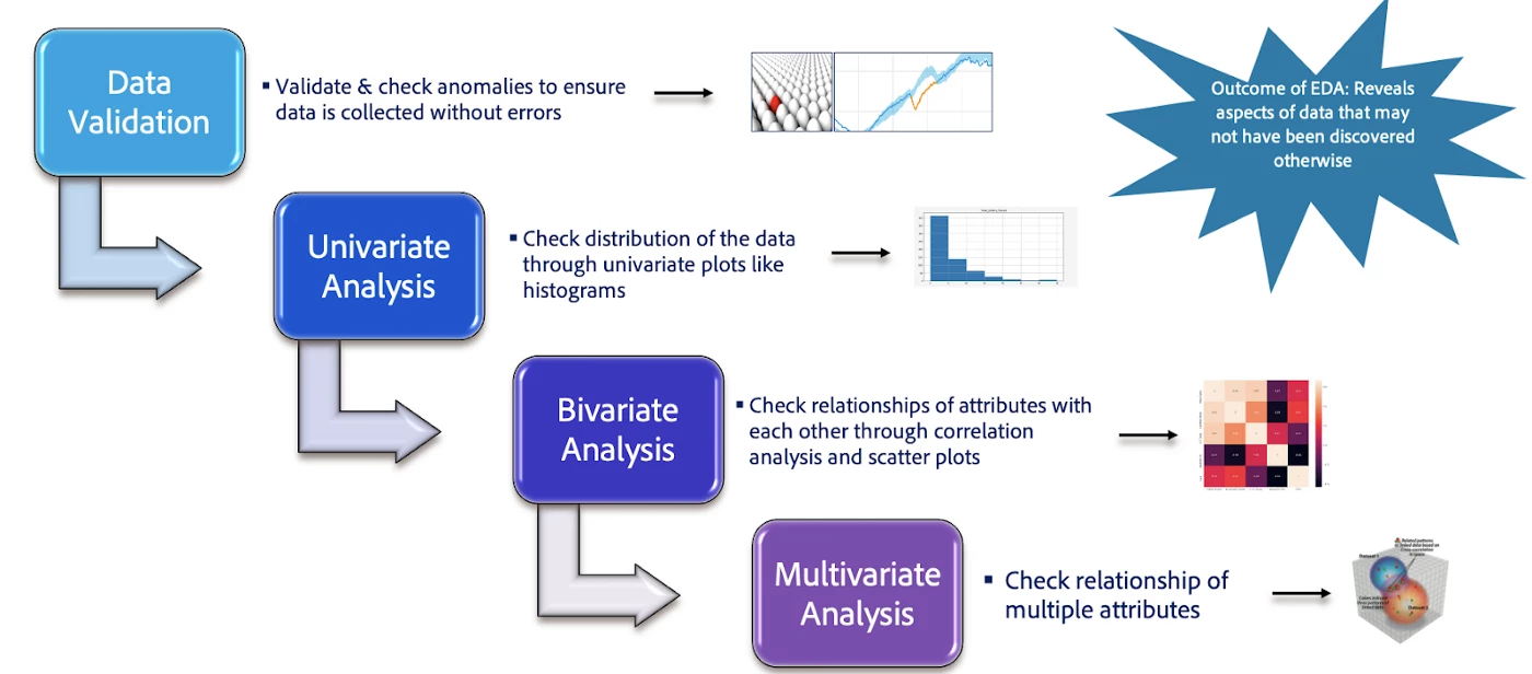
There are five different steps in the EDA process.
-
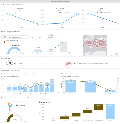
Sneak peek into the data: We can accomplish this in a Jupyter notebook by fetching chunks of data in query format and using libraries such as Plotly to get initial insights. We can also do this by connecting Adobe Experience Platform to Power BI or Tableau. The below dashboard gives exactly that while also giving the stakeholders insights on how well the organization is performing, as far as the goal of the analysis goes.
-
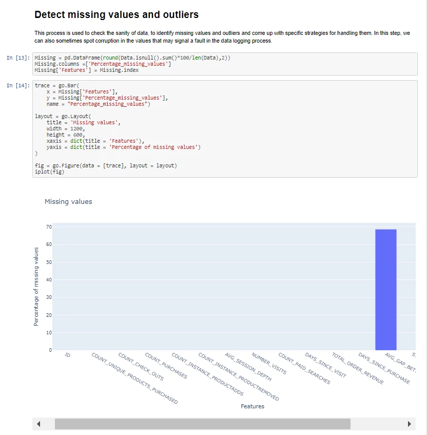
Data validation: This step checks to see if the data has any anomalies, missing values, or outliers. And makes sure there were no errors at the data collection stage.
-
Univariate Analysis: The distributions of each field/feature in the dataset are evaluated to check if the feature is biased towards a certain value or group of values. The bias could be because of the underlying data or errors while data collection
-
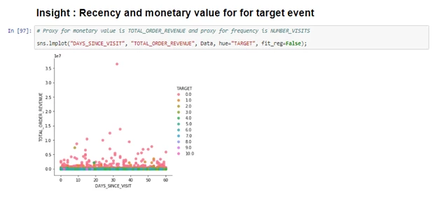
Bivariate analysis: This is done using correlation plots and bivariate plots like scatter plots and 2-dimensional graphs to check relationships between 2 features. This helps establish possible connections between variables. If two predictors are highly correlated, then it might make sense to drop one or combine them.
-
Multivariate analysis: This is done through multivariate plots like 3D plots to evaluate the relationship between features, and finally, understand the features that would be critical for any machine learning exercise.
Further exploration of exploratory data analysis
This article has demonstrated a few visualizations in Python. However, there are numerous different ways one can do visualizations in Python using libraries like Plotly, seaborn, or Matplotlib for example.
By following the above steps, a data scientist can leverage their expertise of Python in Jupyter notebooks within Adobe Experience Platform or use the integration capability of Adobe Experience Platform with Power BI to build some really cool dashboards which can also serve as data exploration.
If you’d like to learn more about data science and exploratory data analysis on Adobe Experience Platform, we have some additional resources to help get a better understanding of the topic.
To learn more about data science, check out our recent blog post on it. To find out more about Data Science Workspace and Query Service, you can check them out by clicking the links.
Follow the Adobe Experience Platform Community Blog for more developer stories and resources, and check out Adobe Developers on Twitter for the latest news and developer products. Sign up here for future Adobe Experience Platform Meetups.
Resources
- Adobe Experience Platform — https://www.adobe.com/experience-platform.html
- Query Service — https://www.adobe.com/ca/experience-platform/query-service.html
- Data Science Workspace — https://www.adobe.com/experience-platform/data-science-workspace.html
- Jupyter Notebook — https://jupyter.org/
- Python — https://www.python.org
- R — https://www.r-project.org/
- PySpark — https://spark.apache.org/docs/latest/api/python/index.html
- Power BI — https://powerbi.microsoft.com/en-us/
- Tableau — https://www.tableau.com/
- Plotly — https://plotly.com/
- Seaborn — https://seaborn.pydata.org/
- Matplotlib — https://matplotlib.org/
Originally published: May 14, 2020