Expand my Community achievements bar.

Analysis Workspace: Compact Report Stylesheet

Avatar

Level 4

2/28/17

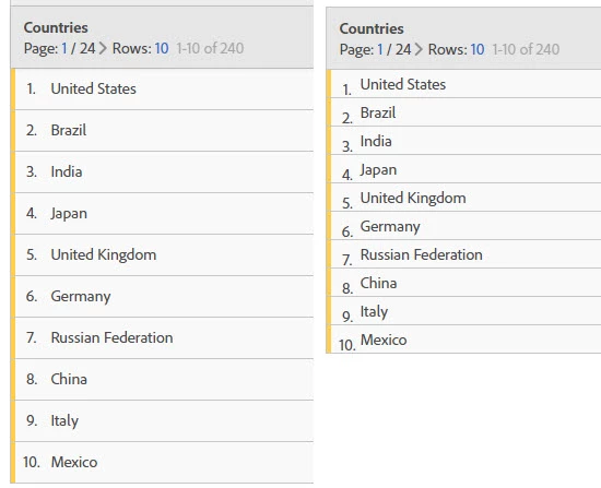
It would be great to have a compact stylesheet for Analysis workspace. The current layout has a lot of empty space which can be great at times, however, having a compact view will be very beneficial for:

  • Layout configuration - saving space
  • Less scrolling with more data on screen

In the old reports you were able to have maybe 3 tables within single screen vertically, wiht the new layout in AW you can hardly fit 1. Image below illustrates that even just removing the padding makes the table much more compact and shrinks it by 25% I am sure it can be done further.
application_octet-stream.jpeg

15 Comments

Avatar

Level 5

3/6/17

I know there have been requests to change colors and such, it seems like there could be an opportunity to link these together.

Avatar

Community Advisor

9/25/18

Firstly I'd like to say I'm a big advocate of Workspace.  However, in order to be able to able to practically work with Workspace we've had to invest in new large monitors (24"/27") for my team.

I strongly believe this layout issue is one of the reasons that power users in other parts of our organisation are so wedded to Ad Hoc.

It surely can't be good idea to build an interface that requires organisations to invest in new displays or makes it impractical to work with on a laptop screen.

jen.lasser I really hope Adobe act on this idea - Particularly given the decision to finally retire Ad Hoc.

Avatar

Employee Advisor

9/25/18

Thanks all for the feedback! This is something I'm moving to under review, we are renewing the discussions on this.

Avatar

Employee Advisor

10/16/18

Hi all - we have some options to share. Review the options below - they are in order of most compact to least compact (1, 2, 3, current UI). After reviewing, please provide feedback on the following questions (you can message me directly if you'd like):

  1. What would you call this setting?
  2. Where would you expect to access this setting?
  3. Which option do you prefer and why?
  4. How many options should we provide? If we provided many, when would you use different options?
  5. What would you expect the settings to impact within a Workspace project?
  6. If you shared a compact project, what do you want your end users to see?
  7. Any other feedback?

Condensed Options.png

Avatar

Level 5

10/17/18

1) Probably something like "compact mode"

2) Would depend on the answer to #5.

3) I'd use 2 or 3 if I needed a more compact mode. I'd stick with the current UI most of the time probably. 1 just seems too jammed up.

4) I don't see the need to provide more than provided above. My guess is I'd probably find one I felt worked best and use most of the time, but that may not be what others choose, so having a couple options might be good.

5) I had initially been thinking about the tables only, not the component menu. However, after seeing the compact menu, I kind of like it.  I think my ideal would be to have a compact component option separate if possible -- maybe as a Toggle that remembers me from workspace to workspace (maybe under Edit or Components menu).  For the tables, if it is a global setting, the edit menu probably makes sense.  If this can be controlled on a table-by-table basis, I'd expect to see it in the settings for that table (right-click table header)

6) I'd expect users to see the compact mode for the tables, same with PDF exports.  If the component menu was separate as I mentioned in #5 above, a user would default to their own settings.

Avatar

Community Advisor

10/17/18

Thanks jen.lasser for sharing insights and asking those question. Just my opinion on your points

  1. Depending on available options (see #2) I prefer something like
    "compact mode" if it is only a switch for another layout (thanks mikethompson​ for the naming)
    "row spacing" or "table spacing" if it is a "select" from different options (multiple layouts available)
  2. since it is a feature for a single table, I would expect it behind the color dot top left of the navigation.
    maybe something like this (the option box for a "switch" and the "select" for multiple options:
    1598684_pastedImage_3.png
  3. I'd prefer No 2, followed by 1. #3 is not a big change to todays settings
  4. I only want to change to one compact mode, no need to have different options. It is enough to have the possibility to change to a really compact table (where you show a lot of items)
  5. I expect to impact only the desired table (and copied tables as well). it should be the same setting when we use PDF downloads.
  6. The primary use case is to show the end user a big list of items, maybe combined with a CSV. I don't think it is really used to work interative, more used to show a static list with a lot of items.

More ideas

  • the grey header row (summary row) is still really big. Maybe it should be shortened as well.
    maybe by skipping the small chart and having the dimension and entry counter/page number on the same row
    a short example what I mean could look like this (maybe the page/item counter could be shortened)
    1598685_pastedImage_11.png
  • the title of the table is the same regardless which option you designed. maybe you could make a smaller spacing to the title as well to give even more space to the table
  • As far as I can see in the preview, the only change in the 4 options is the row spacing. maybe you could make the text size just a little smaller, not too much but this might look good in option 1 to have a really compact table ...

Feel free to contact me if you have any questions!

Avatar

Level 1

10/18/18

jen.lasser

1- Compact/Expanded View Options

2- Right Clicking on the freeform table menu

3- Option preferred is the most compact version (Option 1)

4- Two Options- Expanded vs Compact

5- Anything with a row line height variable (both the freeform table and the row height of the dimensions/metrics/segments on menu on the left) this INCLUDES Title rows, data rows and summary rows (the images don't have compact view in the title row, which signifies a good emphasis on the title but BOLD lettering would do the same and keep the workspace compact

6- Sharing a compact project, I would expect to see the same options I set on my computer, to also be set on the users computer.  If I share a compact project and the end user is not seeing the same that I have created, it is sad.  Its similar to when the object is sent to PDF and is not the same as on my screen.  Don't overthink, just provide the same as what is seen, and good to go. 

7- Looks great, love the idea and hope it is quick to market!