Simplify Dashboard Navigation with the New Table of Contents Feature in Adobe Analytics
Streamlined Navigation
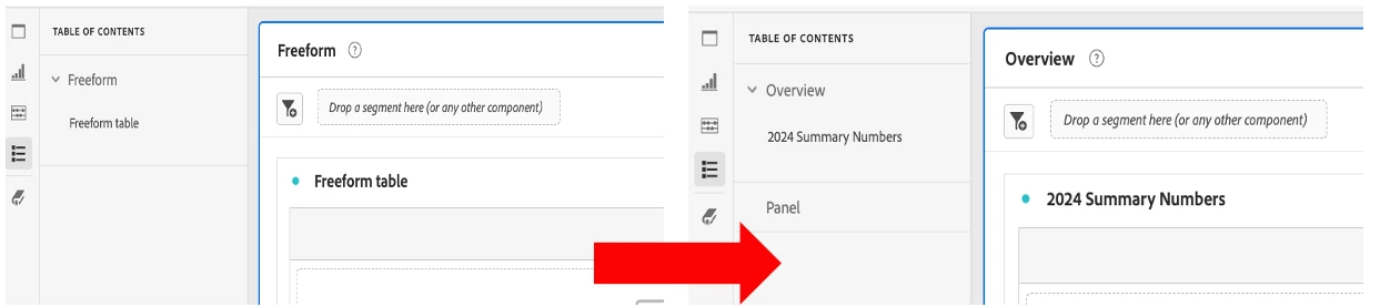
The Table of Contents provides clickable links that allow users to quickly navigate through different panels and visualizations within a dashboard. Previously, dashboard viewers had to scroll through the entire dashboard to gain an understanding of its components. This often made it challenging to get a high-level overview of key insights. With the Table of Contents, you can instantly see and access the major sections of your dashboard. This improves usability, especially for complex reports with multiple panels and visualizations.
High-Level Overview at a Glance
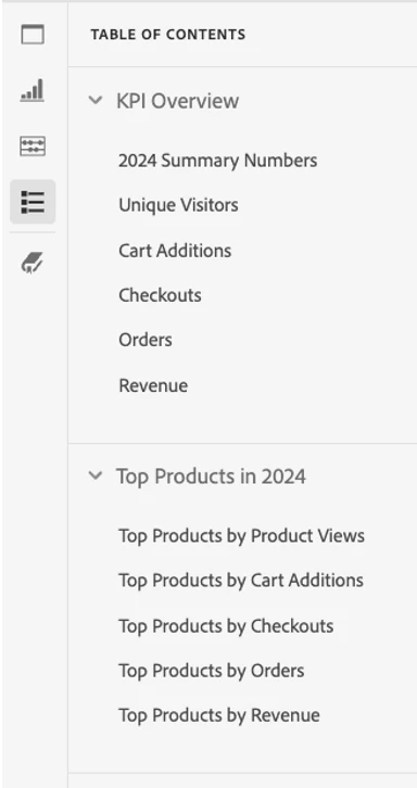
One of the most significant benefits of the Table of Contents is its ability to offer a structured, high-level view of your dashboard. For example, if your first Freeform table provides an overview of '2024 Summary Numbers,' this will appear at the top of the Table of Contents. Beneath this, you’ll find an indented title representing the name of your initial Freeform table within the Freeform panel. This hierarchical structure makes it easier to understand the flow of the report and identify key sections without needing to scroll endlessly.
Improved Report Cohesion
The Table of Contents helps create a more cohesive and intuitive dashboard experience. It allows users to grasp the overall structure of the report and understand how different sections are connected. This clarity enhances the user experience and ensures that insights are easily accessible.
By integrating this feature into your dashboards, you’ll enable users to:
- Navigate reports more efficiently
- Focus on key insights without distraction
- Gain a clear understanding of the dashboard’s structure and flow
Finalized Table of Contents: