What is your workaround to have nice looking interface for capturing requests?

- Mark as New
- Follow
- Mute
- Subscribe to RSS Feed
- Permalink
- Report
The current embedded forms look like this:

Examples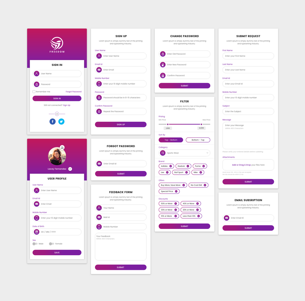
@workfront support any plan to make this look better?
Main pain points:
- A lot of useless white space
- everything left aligned
- limited organization of fields (custom fields cannot be mixed with default fields)
- lack of branding
- lack of visual elemnts
- outdated UI
https://one.workfront.com/s/idea/0874X000000oOFbQAM/detail
see my idea on this if you have similar thoughts.
Rafal
Topics help categorize Community content and increase your ability to discover relevant content.
- Mark as New
- Follow
- Mute
- Subscribe to RSS Feed
- Permalink
- Report
Sure thing. I'll add you, Brooke! Thank you!
Views
Replies
Total Likes

- Mark as New
- Follow
- Mute
- Subscribe to RSS Feed
- Permalink
- Report
Please add me as well if there is still room. Thank you!
- Mark as New
- Follow
- Mute
- Subscribe to RSS Feed
- Permalink
- Report
Hi Peggy, I'll add you to the research group. Thank you!
- Mark as New
- Follow
- Mute
- Subscribe to RSS Feed
- Permalink
- Report
@Gevorg Kazaryan‚ - I would love to be a part of the research/testing group if you still have room. Thanks!
- Mark as New
- Follow
- Mute
- Subscribe to RSS Feed
- Permalink
- Report
Hey @Alyson Hoover‚,
I'll definitely include you in the list and we will get in touch with you! As you see, a lot of people signed up for this and we will be contacting different groups in different stages of the research.
Looking forward to talking to you.
Views
Replies
Total Likes
- Mark as New
- Follow
- Mute
- Subscribe to RSS Feed
- Permalink
- Report
Does anyone know what happened to this? I see this was back in 2021.
Views
Replies
Total Likes

- Mark as New
- Follow
- Mute
- Subscribe to RSS Feed
- Permalink
- Report
I agree, the forms are frustrating as are the reports. It would be really nice if we could create our own style sheets.
Views
Replies
Total Likes
Views
Likes
Replies
