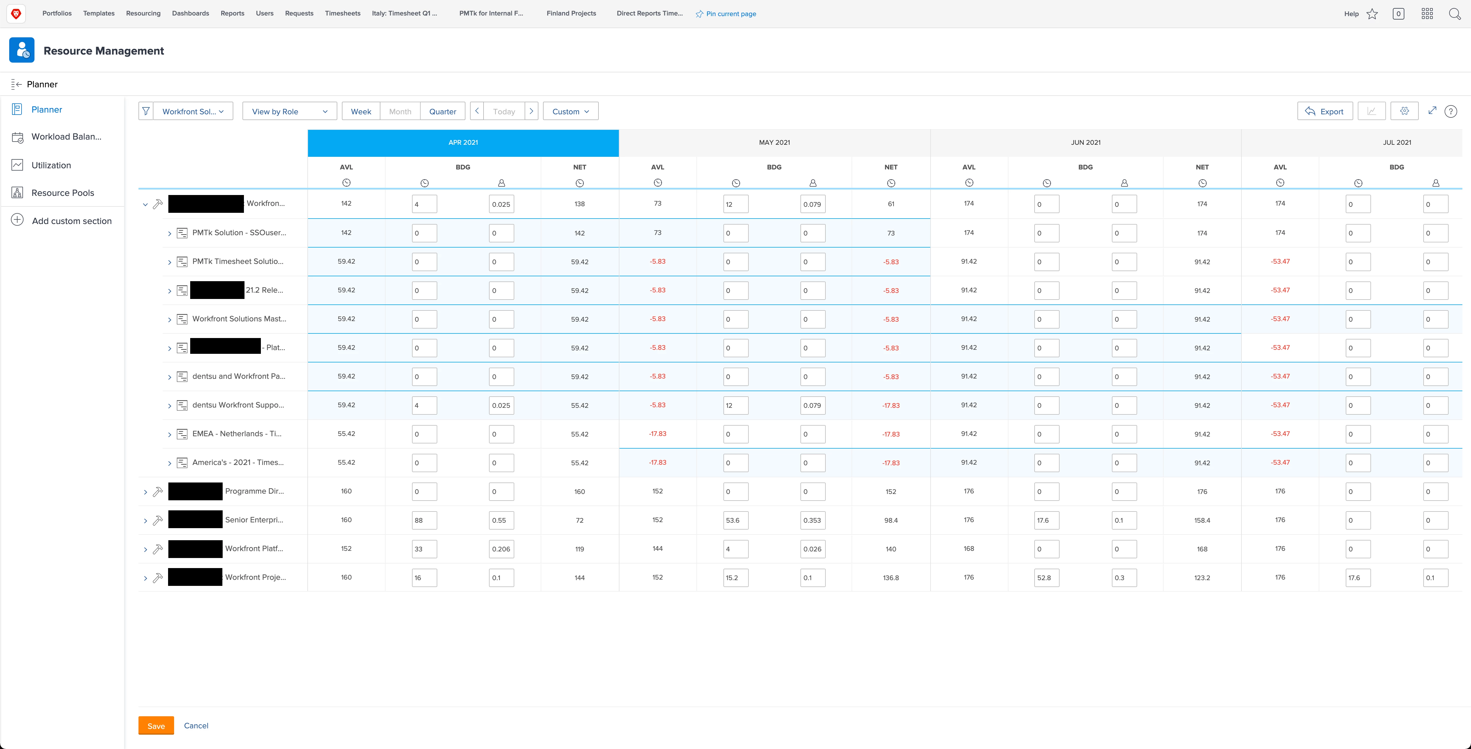
Resource Planner: UI Improvements Required
We are using the resource planner to forecast our team onto planned/active projects. There is an activity internally to explore using this globally.
Here are a few comments following our Snr. exec demo;
- The current UX is poor.
- Unable to see the full project name or resource role name.
- Entering values twice; once against the role/project and once against the specific user. It would be good to have an option to mirror the entry - speeds up the process.
- FTE is entered as a decimal; usually entered as a percentage. Lower priority.
- The product is slow to load.
- Adjust budgeting dates; the chevron on the left side is pointing in the wrong direction (it should be < instead of >).
- Adjust budgeting dates; should be renamed to something else, as it doesn't actually adjust anything, it just shows you if a particular period is low/high/overcapacity.
Innovative idea 1; a lot of companies split forecasting by confirmed / unconfirmed projects. It would be valuable to assess building this option into the planner. Value: able to assess capacity load in the scenario your unconfirmed pipeline shifts to confirmed at the estimated start date. Are we able to manage the unconfirmed pipeline in that scenario. If not, I need to be ready to hire external consultants for example.
Innovate idea 2; ability to see how the forecast impacts the project's profitability margin (i.e. if I resource a designer for 2 weeks, will this blow the budget). You could highlight the project red if it is no longer profitable and add the NET profit/loss value in the table or above/below the project name.
This idea covers a number of improvement areas; we think this product is immensely important for all Workfront customers and will be welcomed by new customers as well.
