Expand my Community achievements bar.

The next phase for Workfront Community ideas is coming soon. Learn all about it in our blog!

💡 How to Monitor and Manage your MARGINS: PART 1 [VIDEO + DISCUSSION]

Avatar

Level 10

WELCOME!


This is PART 1 in a series of related Meaningful Discussions. Once you've caught up on this one, join us for PART 2, noting that this one has enough replies that you'll need to click the Load More Replies button at the bottom to see the latest content.


Doug_Den_Hoed__AtAppStore_0-1682371580974.png


BACKSTORY


For my entire tenure with Workfront, the phrase "you can’t do financials" has been the disappointing standard response to those business owners seeking to make decisions based on profit margins, rather than just hours. That is about to change.


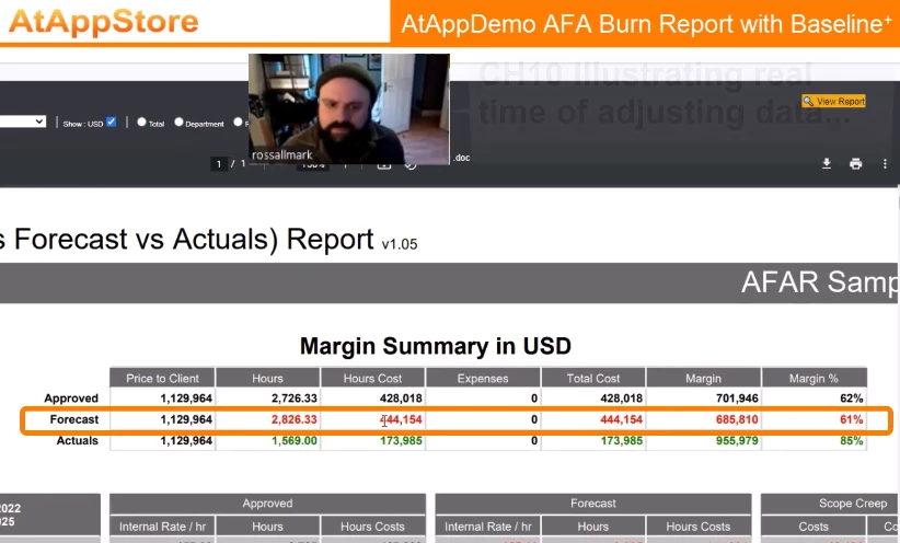
With many thanks to @jon_chen for helping make this [VIDEO + DISCUSSION] possible, I invite you to join my interview with Ross Allmark, Vice President for Transformations at Vice Media Group, who explains the details of our new AFA Burn Report with Baselineᐩ solution, which allows Workfront users to track margins at the Project, Department, Role, and User level over time.


Doug_Den_Hoed__AtAppStore_0-1679375046141.png


VIDEO


The video is broken into the following chapters:


  • 00:00 CH01 Introducing Ross Allmark, Vice Media Group
  • 00:33 CH02 Select Report, Project Filter, Dates, and Settings...
  • 01:34 CH03 Choose Currency (USD vs Project)...
  • 02:08 CH04 Choose Total, Department, Role, or User level...
  • 02:33 CH05 The importance of Rate Cards...
  • 03:03 CH06 Generate the AFA Burn Report...
  • 03:29 CH07 Zooming in on the Margin Summary...
  • 03:55 CH08 Defining Approved vs Forecast vs Actuals...
  • 04:53 CH09 Margin Summary details...
  • 05:41 CH10 Illustrating real time of adjusting data...
  • 07:23 CH11 Zooming in on the Selected Detail vs Summary...
  • 08:34 CH12 Moving down to "the real action"...
  • 09:00 CH13 Total, Department, Role and User Rates, Hours, and Hour Costs rollups...
  • 09:07 CH14 Approved details...
  • 09:39 CH15 Forecast details...
  • 09:58 CH16 Scope Creep details...
  • 11:04 CH17 Actuals details...
  • 11:30 CH18 Approved Remaining details...
  • 11:44 CH19 Burn Projection details...
  • 12:47 CH20 Why Projection is the Most Viewed Section...
  • 13:20 CH21 Data Cutoff (+/- Highlighting) details...
  • 14:13 CH22 How to identify and manage Scope Creep...
  • 14:42 CH23 Signoff


DISCUSSION


At your earliest convenience, I invite you to watch the full video (or chapters, above) and then share your thoughts below whether they are questions, answers, comments, or ideas.


To make this post as valuable and interesting as possible, I suggest you copy and paste the 00:00 CH##  link from above into your post, for context and quick access. I will reply similarly, and will also periodically make targeted post for each chapter as a conversation starter.


This [VIDEO + DISCUSSION] approach will lead to some interesting sidebars below the umbrella of the overall topic, allowing others to discover it, watch the video, and contribute to the discussion over time. I will kick that concept off momentarily using Chapter 12 to illustrate, below.


Thanks for your interest, and especially (in advance) your participation. I look forward to further discussion in due course!


Regards,

Doug


TIP: click the three dots above and then click "Follow" to be alerted when others add to the conversation

26 Replies

Avatar

Level 10

CHAPTER 12


As Will Rogers said, “You never get a second  chance at a first impression”, so I invite you to fast forward to the 08:34 CH12 Moving down to "the real action"... punchline and learn:


  • Approved means Baselineᐩ
  • Forecast means Planned
  • Scope Creep means Transparency
  • Actuals means...well, Actuals
  • Burn Projection means Advanced Warning


By using our AFA Burn Report with Baselineᐩ solution along with standardized Job Roles across their 14 global offices (in varying currencies), Ross can clearly compare the Internal Rate, Hours, and Hour Costs on each project, by Department, Role, and User across Approved, Forecast, Scope Creep, Actuals, and Burn Projection, then use that insight to take action in order to maximize margins.


QUESTIONS


  1. Do you use Baselines?
  2. Do your Baselines equate with Approved?
  3. Do you use standardized Job Roles?
  4. Do your Job Roles have Internal Costs?
  5. Do you have Projects of differing currencies?
  6. Do your Projects calculate Margins?
  7. Do you have a way to project Final Margins?

Avatar

Level 2

Thank you so much for sharing, Doug! 


Once again, you have created an outstanding solution to a problem that a lot of us face.


As we grow in our Workfront maturity, defining baseline standards and incorporating budget tracking have become frequent topics of conversation.   I am excited to share this solution with other members of my team as a demonstration that highlights the importance of taking meaningful baselines.  


I'm curious if you have anything in the works to show higher level comparisons across projects or programs?  Maybe something like the Margin Summary details (04:53), but for a filtered set of projects? 


Best,

Justin


My pleasure Justin,


Yes, Baselines are a powerful but perhaps (I suspect) underutilized built in feature of Workfront. This Create project baselines article gives a good overview (including the built in ability to take a default Baseline when a Project is first set to a status of Current), and this Gantt Chart article shows how you can optionally juxtapose Baselines information against the project plan to easily visualize slippage, stretching, etc.


Typically, the Default baseline is used to represent the latest and greatest "approved" version (which is indeed the case in our AFA Burn Report solution), and depending on the nature and duration of the project plan, that initial default Baseline is often sufficient. In other cases, I've also found it useful to take Baselines on some regular cadence (e.g. "monthly" for an annual campaign, or even "hourly" for a short but intense plan such as a Workfront Merge), either manually, or using Fusion, or using our Create Baseline solution. The latter can even be configured to create Baselines when a particular business situation such as "Projected Project Completion Date slips more than 7 days vs the Project's Default Baseline Planned Completion Date" is detected by a Project filter, to automatically "capture the moment" (for better or worse) so it can later be analyzed and acted upon.


As I touched on at 03:03 CH06 Generate the AFA Burn Report, in order for our AFA Burn Report to be able to analyze Margins down to the Department, Role, and User level, in addition to the built in Baseline data, we also invented some technology (namely "...with Baselineᐩ") to collect even more granular data. I'll leave it at that for now, but suffice it to say: the sooner you start using Baselineᐩ, the further back in time you could then (later) use our AFA Burn Report solution.


As to your insightful question about comparing Project level Approved vs Forecast vs Actuals at a higher level such as Programs (or Portfolios, or even in a Standalone Dashboard), I'm pleased to confirm that we do indeed also have the means to do so, via our AFA Burn List solution, which tracks Rates, Hours and Hour Costs at the Total, Portfolio, Program, and Project level. The two solutions work in tandem: use the AFA Burn List to review and spot the opportunity or concern at the high level (e.g. spot the "most over-budget Project within the Portfolio"), then [Ctrl] + click it to navigate to and view its AFA Burn Report to assess the root cause and decide how best to take corrective action.


Thanks for the excellent questions, and when you have more, keep them coming!


Regards,

Doug


Avatar

Level 2

This is exceptional.   The ability to look for outliers from a higher level (the $ 20k vs $ 10k) view allows flexibility in the granularity needed.  As always the desire is to target opportunities to act or make a decision.  


Regarding other areas (other than over budget or scope) - are the areas to look at elements such as schedule issues (schedule risk vs cost risk) or flag opportunities to advance elements?


david


Thanks David,


Fun fact: the Data Cutoff (+/- Highlighting) you mentioned actually wasn't in the original AFA Burn Report spec. In parallel, we'd just invented something similar for our (soon to be released) Swimlane solution, so ported it in. It turned out very well, though, giving Project Managers the means to choose which Small Stuff to Don't Sweat, and instead focus on the items material enough to warrant assessments and decisions, as shown at 13:20 CH21.


Your question about trying to incorporate other areas such as schedule risk vs cost risk did come up during our design phase, but proved to be tricky. Workfront has many built in features to monitor schedules risk (such as Baselines as I was just mentioning to @justincross in the previous post, Projected Dates, and Progress Status, among others), as well as features such as the Workload Balancer to then adjust schedules, so (admittedly but intentionally copping out) we decided to leave trying to show schedule variance out of scope for the AFA Burn Report (for now, at least).


That said, there is of course a relationship between the schedule and the costs, which did lead us to add the 07:23 CH11 "Selected Detail vs Summary" concept to the AFA Burn Report. PMs can choose a subset of time within the Project, refresh the report, and then compare the average Internal Rates, Hours, and Hour Costs as a proportion of the overall Project for each of the Approved, Forecast, and Actual vantage points. If, for an example, the PM chooses the first 4 months (up to "today", let's say) of a 12 month Project in which the schedule has slipped, they would likely observe lower actual Hours and Costs within that period than originally approved. Accepting that reality, they might then re-plan the work to recognize the slippage and (let's say) correct it over the next 4 months, meaning the Forecast Hours and Hour Costs within that time range would be higher than the Approved.


In a future release, we're percolating some cool "data table and graphics" to reveal and trend this kind of information, so if you've got any ideas on useful ways to visualize it (particularly if they help relate schedule risk to cost risk), I'd welcome the opportunity to discuss it further.


Regards,

Doug


cc: @weizenbachdk 

Avatar

Level 4

I like how this highlights Scope Creep instantly - that's a neat feature. The two-year forecast also. A great demo, thanks for posting - nice to see different solutions to big problems.


Cian


Thanks Cian,


I'm glad you agree with our decision to name "Scope Creep" so bluntly (as shown at 09:58 CH16). Surely for someone, somewhere, it would be normal to see negatives in those columns, but for many reasons, Scope Creep tends to be the norm.


Just to clarify, the Burn Projection (shown at 11:44 CH19) in the AFA Burn Report isn't restricted to being two-years; for whatever timeframe is selected, it adds the Actual Hours up to today (i.e. "what was actually done") to the Remaining Plans after today (i.e. the PM's forecast of what will still be done) to then give the most accurate forecast possible.


As you might guess, given their ever-changing nature, those calculations take a fair bit of logic (and processing time) to compute, so at the moment, are only available on the AFA Burn Report. That said, given they are the Most Viewed Section (as mentioned at 12:47 CH20) we are also designing the means to include them in a future release of our AFA Burn List, so that they can be reviewed and aggregated by Project at the Program, Portfolio, and even Standalone Dashboard level.


Regards,

Doug


cc: @BrownPaperBag 

Avatar

Level 2

Doug,


Rather than 'reporting' I am very keen on the variable granularity view.   i.e.    Do I see anything at 50,000ft?   How about 30,000ft etc...    That does permit a quick review be it on a portfolio with say 1 million entries vs a single project with say 1000 entries.


Can you apply this to schedule as well?  Might you have an example?


In general I view managing projects as a series of risks being managed - Scope risk, cost risk, schedule risk.    from a broader perspective, I DON'T need a report on a train wreck that already occurred but rather indicators that a train wreck WILL occur unless some action is taken.    thoughts?


d


Nice: I really like your train wreck indicators vs report analogy David -- an important distinction.


Currently, our 13:20 CH21 Data Cutoff (+/-) is a Highlighting feature that shows numeric values (i.e. costs) that are over that Cutoff in red (bad), and those under that Cutoff in green (good). We carried the same concept to do the same thing across multiple Projects (by Total, Portfolio, Program) in our AFA Burn List solution, as shown here:


Doug_Den_Hoed__AtAppStore_0-1679584719621.png


This approach reveals the Bad and Good Actors amongst the data returned, and by including all the other "within Delta Cutoff" data (black), visually provides some tactile context as to the ratio of Bad vs Good vs Normal. However, the flip side of that coin is that it also forces the user to visually scan for the Bad and Good actors, which -- using your analogy -- would be tedious and inefficient across 1000 entries on a Project, or a million (i.e. "lots") of entries across a Portfolio.


So (you've got me thinking, and thank you for the idea)...in a future release of both the AFA Burn Report and the AFA Burn List, we will add the option for the user to toggle which entries among the Bad (red), Good (green) and Normal (black) they want to see, and then only bring back entries who then meet that criteria. By doing so, you could then choose your own altitude and window seat: e.g. start by showing only Bad Actors Projects > 50,000, then (among those), descend to such a Project and choose to see Bad and Good Actors (only) > 10,000 so you can take action to AVOID the train wreck.


As for applying this to schedules, I'm going to also mull over applying this relatively new Delta Cutoff (+/-) concept against "days slippage" instead of "costs" on our UberGantt, Roadmap, or Timeline solutions, since each of them already have a visualization component to them that would pair nicely.


Regards,

Doug

couple things  - yes to your correction.     50% of the scope but 60% of the cost.    


And to the schedule element.   That - I believe - would serve.   The objective with either (cost or schedule) is to get a panoramic view to start and have guidance or tools to lead to areas requiring attention.  I know we focus on the bad actors but really the good new stories are important too (like 'hey - we are ahead of schedule and below cost - woo hoo!!)


d

Avatar

Level 1

Thanks Doug, it's great to see the trusted and valued Adobe Workfront partners taking the solution to new lengths to help out our customers.


As usual, you have really thought through what the customers are crying out for and looked at servicing those needs in an effective way.


How would this be managed if we needed to have multiple currencies across either our customer's clients or their different regional offices?


Thanks from the APAC Workfront SME 'valued' partner!


Thank you @NickyAllen,


That's very kind of you, and much appreciated. As I often say, our best ideas come from clients, so I'll gratefully pass along your compliments to Ross Allmark, who approached us with the original concept.


Hoping I now catch you before you scoot for the weekend Down Under, to your currency questions...


Doug_Den_Hoed__AtAppStore_0-1679622432558.png


As mentioned at 01:34 CH03 Choose Currency and shown above, the AFA Burn Report does support multiple currencies. It currently defaults to USD (since that happened to be the default Workfront currency for Ross), but could be easily changed to whatever currency a particular client chooses; and in fact (note to self) in a future release will simply "detect" the default Workfront currency.


For projects whose currency is set to that same currency, all of the underlying cost amounts are simply shown "as is" (since they match). Similarly, for a project whose currency is those who differ from the default, if the USD checkbox is NOT selected, the underlying cost amounts are also simply shown "as is", but in the project currency (since, again, they match). For the other two cases where the checkbox setting does NOT match the project currency, the AFA Burn Report then applies the current Exchange Rate from within Workfront appropriately to then show the report in the desired currency.


During development, we decided to stick with that simple but defensible approach, leaving it to the SysAdmin to decide when to update the Exchange Rates (i.e. monthly). We considered writing an API routine to pull currencies from an official source more frequently, but concluded the development time would be better spent elsewhere (on the 13:20 CH21 Data Cutoff feature, as it turned out).


That said, when we later then tackled our AFA Burn List to tracks Rates, Hours and Hour Costs at the Total, Portfolio, Program, and Project level, we had to think again.


In order to aggregate financials in a meaningful way, it is obviously crucial to ensure that projects with differing currencies (Ross, for example, has 14 offices across 12 currencies) are converted appropriately, especially when it comes to aggregating. However, I learned that As Designed, such aggregation does not match the underlying currency details, so we had to think of a different approach.


We debated (and in fact, are still considering) using an approach similar to AFA Burn Report that would allow the end user to select from among (only) those currencies defined within Workfront, and in turn then use (only) those "official" Exchange Rates. However, for our initial release, because it was more flexible and (surprisingly) faster to develop, we invented this technique to set up an Exchange Rate Dashboard, making it quick and easy for anyone to choose a currency of interest, automatically look up the corresponding exchange rate over the internet, plonk it in to an exchange rate field, and then run the report, as below:


Doug_Den_Hoed__AtAppStore_1-1679624149671.png


Using those mechanics and that math ensured that our AFA Burn List would then apply the appropriate Exchange Rates, across multiple Projects, with varying Currencies, in the desired Currency, at ALL levels.


So! If you have any clients who need to manage Projects across multiple currencies, please let me know and I'd be happy to chat further either here or at doug.denhoed@atappstore.com.


Regards,

Doug


Avatar

Level 2

Doug/Jon...   my history would spend the greatest amount of time in the forecast (Ch15) area.   An element I believe is fair is that as the project progresses you can make a few simple comparisons.   Say 50% of time consumed but 60% of time.


Forecast accuracy of course improves as the project is executed.   say +/- 15% at kickoff but +/- 5% when 80% complete.    Can that be seen/reported?   Would there be an interest?


d


Hmm...thanks David,


In your example, I'm guessing you meant "50% of the time consumed but 60% of the cost", so with the AFA Burn Report and AFA Burn List being more "numbers" vs "Gantt Chart", I wonder if we could also pull in columns to show the Approved, Forecast, and Actual schedule percentage, so that end users could then compare that against the cost percentage...would that meet the requirement you're describing?


Regards,

Doug


Thanks for confirming (above) David,


We're going to mock up and prototype some ideas around adding a column the AFA Burn Report that will convey and contrast the schedule % against the cost % which (to pique your interest) might include using a Sparkline of some sort.


I'll drop an update with some screenshots in due course.


Regards,

Doug


Hi David,


I am pleased to share the following prototype to convey and contrast the schedule % against the cost % in a future version of our AFA Burn Report and AFA Burn List solutions.


May I invite you (and any others who wish to join in) to study it, ask any questions you may have, and offer any suggestions to improve it?


Regards,

Doug


AFABurnReportWithBurnProjectionChart.png

 cc: @weizenbachdk 

Doug - I looked at this a number of times and I like it.    Enough depth for diagnostics and guides needed to drill down when needed.


An element of interest is how forecasts change with time.  i.e.  If I reforecast every week, can I compare (say) my forecast from 6 weeks ago to the one I have today.  In general, as a project progresses your forecasts should be getting better and less varied.  If they aren't - then that in itself may be a clue that deeper investigation is warranted.


cheers


david


david


Thanks David,


I appreciate you studying our graphical model. There's a lot to it, we also really like where it's heading, so are currently building out a set of test cases to confirm how it will behave in different situations. For example, Case B shows a simple ONE WEEK SLIP on a five week project:


CaseB02.png


This video of Case B helps illustrate the relationship between the driving parameters and their effect on the chart, which is helping us ensure we design it as usefully as possible. As we work through other cases, we are also noticing certain patterns that could be useful in early prediction, warning, and correction.


To your point about monitoring change over time, we have three approaches in mind:


  • SHORT TERM: PMs manually download the AFA Burn Reports to PDF (or Word, or Excel, or PowerPoint) format on an ad-hoc cadence, saving them into a document folder beneath the project for future reference
  • MID TERM: The AFA Burn Report automatically generates and files such a report whenever it is run (should the PM wish it to do so)
  • LONG TERM: The AFA Burn Report assembles such reports (or the raw data...still thinking...) and animates the report in a fashion similar to the video above


So! While it is still Early Days, may I invite those interested in such graphical features to review and help me improve the design by commenting here?


Regards,

Doug


Avatar

Level 6

Hey @Doug_Den_Hoed__AtAppStore - 

Could you share some more details on the Baselines and Baselines+ you reference?


One of the challenges with baselines that we are faced with is around project expansion (aka scope creep, change, etc).  Currently if an additional set of tasks is added to a project (either because the scope expanded or b/c we started the project knowing it would contain phase A, B, and C but only had a plan for part A - and now know the plan for B) we haven't found a way to capture and report against changes effectively.


In my example, of a project with phase A, B and C - where we initially build the plan for phase A and start work

  • The initial baseline doesn't include phase B & C tasks
  • If we snap a new baseline when we have the plan for B, it now suggests any changes to phase A are "part of the plan" so we can't show if we're running fast, slow, or on track to original plan.
  • And then when phase C comes along it's even more challenging b/c at this point the baseline suggests phase A is complete

From a reporting/finance perspective we want to know if the project is tracking to the plan for each phase - not how phase A looked at the start of phase C.


Does any of the work with baselines for this tool or the "Baselines +" you mention help with that challenge?


Thanks @Jason_JB,


This graphic explains the Baselineᐩ part of the equation:


AtAppStore_A_Baseline+.png


As the punchline says, the earlier you start capturing Baselineᐩ data, the further back in time comparisons can be made. In addition to the AFA Burn Report Margin related details, Baselineᐩ can also be adapted to capture custom data values, too, which can open up all kinds of new reporting and trending opportunities.


Now: to your Very Interesting question about wanting to know if the project is tracking to the plan for each phase - not how phase A looked at the start of phase C.


When a native Baseline is created (such as the default behavior of doing so when a Project is initially converted to Current status), the structure (e.g. Task Names, Task Numbers, Planned and Projected Dates, etc.) of the entire Project's set of Tasks are copied "as is, at that time" into the Baseline Tasks. On a Project with phase A, B and C, it is reasonable to adjust phase A as work progresses, settles, and is completed. In due course (and sometimes in parallel), as phase B enters the equation, focus then changes to adjust phase B, and at some junction, it might make sense to create a new (default) Baseline so that phase B can be evaluated "fairly" against its new-and-improved plan at the time. However, as you pointed out, doing so also includes the phase A Tasks...and that makes comparison "unfair": for example, a Task that completed a month behind its original Baseline date will now match the current Task exactly (in the new default Baseline).


Although I'd never thought of it quite that way until you described it, it would be better for such cases if each phase of the Baseline could choose which Baseline makes the most sense for that phase (e.g. the original for phase A, the second for phase B), etc.


My first thought was to let PMs manually type in a "Baseline Override" custom parameter on a particular Task (e.g. look up, copy and paste the Baseline ID), then enhance the AFA Burn Report to draw the Baselineᐩ information from "that" Baseline for "that" Task (and its children), rather than from the default Baseline. Over time, the "Baseline Override" could be changed as needed (or even cleared to go back to the Default Baseline).


Although powerful, forcing the Manual entry of a "Baseline Override" is an obvious weak spot, so instead, it occurred to me that the Baselineᐩ logic could be enhanced using a business rule to automate that step, such as:


  • use a convention (such as a checkbox on a custom form) to tag certain parent Tasks as being "Is Phase"
  • when Baselineᐩ runs, if the % complete of such a parent Task is greater than a certain % (e.g. zero), once the new Baseline is taken, automatically push that Baseline ID into the Baseline Override field, provided it doesn't already have a value (effectively locking it in)
  • at that same time, an additional "Use Override" checkbox could also be set to true (which AFA Burn Report would consider), so that a user could toggle choose to toggle the Override "off" (returning instead to the Default) without losing the Baseline ID
  • if warranted, an additional "Baseline Override Audit" calculated parameter could use this Targeted Auditing Proof Of Concept technique to keep track every time a change is made


This approach could meet your requirements...but it would bind you to using the AFA Burn Report, since the native Task reports can only access the Default Template Tasks.


Harrumph.


That led me to wonder outrageously if the API would allow  editing the Default Baseline Tasks in order to force them to match the desired shape (e.g. phase A from the original Baseline, phase B from the recent baseline, etc.). After some testing, although the API allows certain calls (e.g. set the Baseline's plannedCompletionDate) without error, it doesn't actually "stick"; and in other cases (e.g. set the Baseline Task's plannedCompletionDate), it errors out explicitly.


Since, in my opinion, the intention of a Baseline is tantamount to an audit, I think it is a Good Thing that the API appears to not allow such adjustments.


My final (faint hope) idea would be to try to write a solution that would construct a new Baseline object (e.g. use phase A from this Baseline, phase B from that Baseline, etc.) and then push it in as the Default Baseline. If it did work, that approach could change everything -- including the possibility of using native Task reporting.


So! With all of that said, I'd be very interested to hear from you and others on these key points:


  • how common and valuable is this idea of "splitting" a default baseline into different phases?
  • would manually entering a "Baseline Override" be sufficient, or would automating its population with a business rule be better?
  • if the latter, is there some superior business rule besides % complete > zero that would yield better results?
  • with all of the above in place, would relying on the AFA Burn Report for reporting be good enough, given the native reporting functionality's restrictions (e.g. Tasks can only "hit" their Default Baseline Tasks)
  • is there a way (via the API) to either update an existing Baseline, or "hand roll and insert" a new default Baseline (so that native reporting could then be of use)?
  • philosophically, if it turns out you could update or hand roll and insert a default Baseline...would you?


Regards,

Doug