Unlocking the Power of Adobe Real-time CDP Customer AI - Part 3: Understanding Adobe Real-time CDP Customer AI Predictions

Image credits: Adobe Firefly
In the last two posts, we explored how to identify prediction opportunities that align with your business goals and discussed the steps to build those predictions using Adobe Real-time CDP Customer AI. Now, let’s dive deeper into the process of translating a prediction goal into a fully functional Customer AI predictions which can be used to build intelligent audiences right away!
When working with Adobe Real-time CDP Customer AI, it’s essential to know how to interpret the metrics and results to make strategic decisions. Here's a simple breakdown of key metrics and charts, explained with analogies to make them easier to grasp.
1. Trusting the Prediction Quality Using AUC
What is AUC?
The AUC, or Area Under the Curve, measures how well your model can distinguish between likely responders (customers who will take action) and non-responders. The closer the AUC score is to 1.0, the better the model is at separating these groups.
Analogy: Metal Detector on a Beach
Imagine you’re at the beach with a metal detector looking for coins. The detector beeps when it senses a coin, but sometimes it picks up random junk. A high AUC score is like having a highly accurate metal detector that mostly finds coins and rarely beeps for junk. In marketing, a high AUC means your model is reliably finding the right customers who are likely to respond, without too many false positives.
- High AUC (close to 1.0): Like a detector that rarely mistakes junk for coins, this means your model is great at spotting the right customers.
- Low AUC (closer to 0.5): Similar to a faulty detector that beeps for both junk and coins, this means the model is not much better than random guessing.
Why It Matters for Marketers
A high AUC gives confidence that the Customer AI model’s predictions are dependable. This means your campaign targeting is likely to reach the right people, improving response rates and potentially reducing wasted ad spend.
2. Explainability of Predictions Using Influential Factors

What Are Influential Factors?
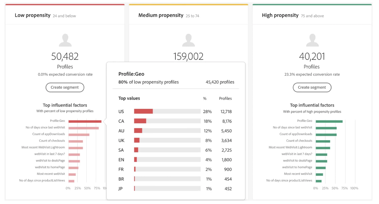
Influential factors are the data points that significantly impact the Customer AI model’s predictions. Think of them as the ingredients in a recipe.
Analogy: Ingredients in a Recipe
Creating a Customer AI model is like cooking a dish. Just as using fresh tomatoes and quality spices makes a more flavorful meal, choosing the right influential factors (like customer demographics or purchase history) enhances the accuracy of your predictions. If you choose the right ingredients, you get a more refined model that aligns closely with your marketing goals.
- Choosing Relevant Factors: Just as you’d pick ingredients that match the cuisine (e.g., basil for Italian dishes), adding factors that align with your campaign goals helps the model perform better. For example, if you’re aiming for a retention campaign, recent purchase history could be a key ingredient.
Why It Matters for Marketers
Understanding influential factors lets you see which aspects of customer data drive predictions. This knowledge helps in refining campaigns to focus on meaningful customer traits, improving the relevance and impact of marketing efforts.
3. Actionability of the Predictions Using Gains Chart and Lift Chart
What Are Gains and Lift Charts?
These charts help visualize how effectively your model is prioritizing likely responders, which can guide your targeting strategy.
Gains Chart: Finding the Best Customers Faster

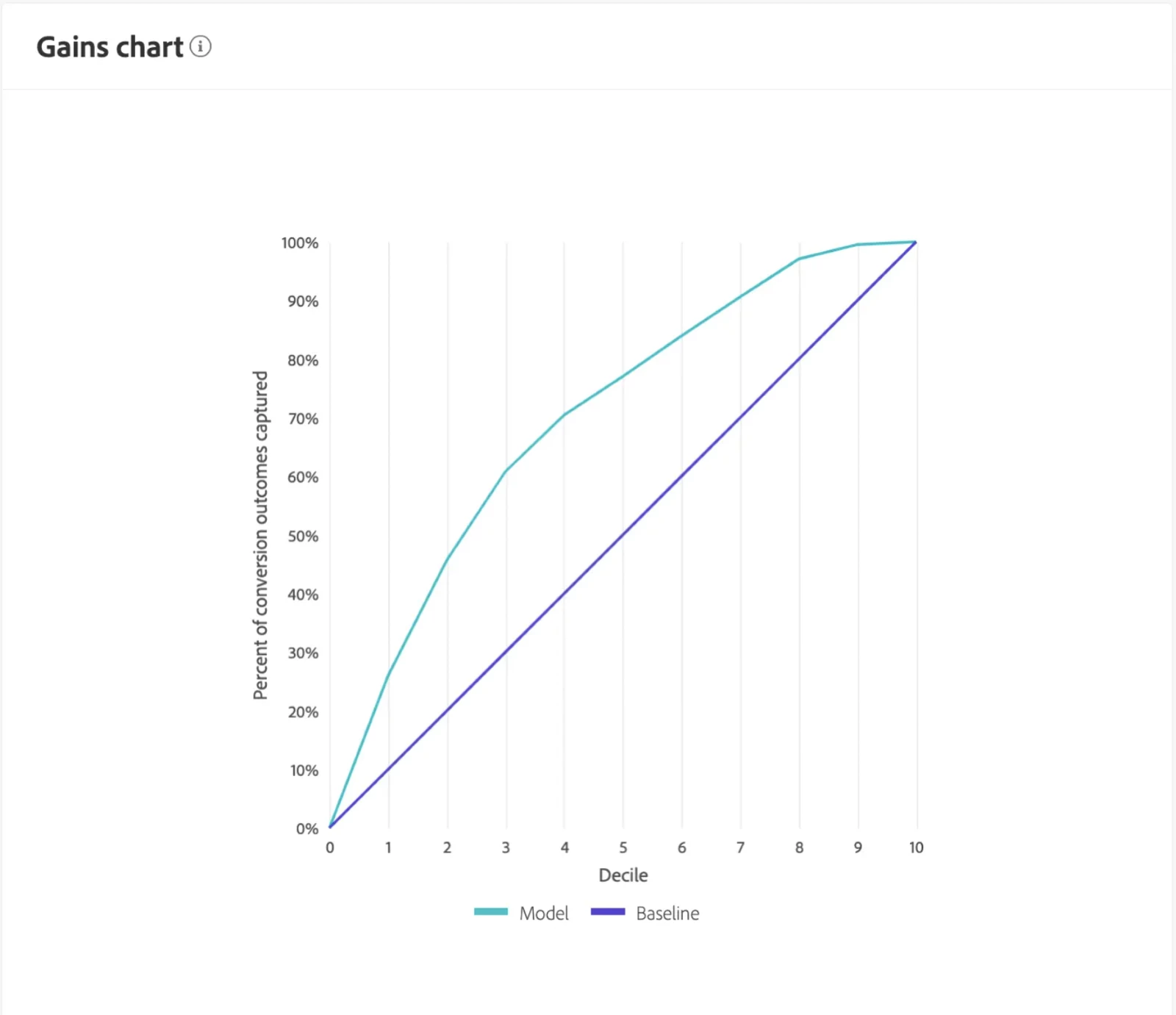
The Gains Chart shows the cumulative number of likely responders captured as you target top customer segments.
Analogy: Loyalty Cards in a Stack
Imagine sorting through a stack of loyalty cards to find the most active customers. The Gains Chart shows you that by targeting just the top 10% of customers (those scored highest by the model), you reach a large portion of your ideal audience quickly. Without this sorting, you’d have to sift through many more cards to reach the same number of valuable customers.
- In Simple Terms: The Gains Chart helps you identify the segments where you can capture the most valuable customers fast, allowing you to focus efforts for maximum efficiency.
Lift Chart: Boosting Campaign Efficiency

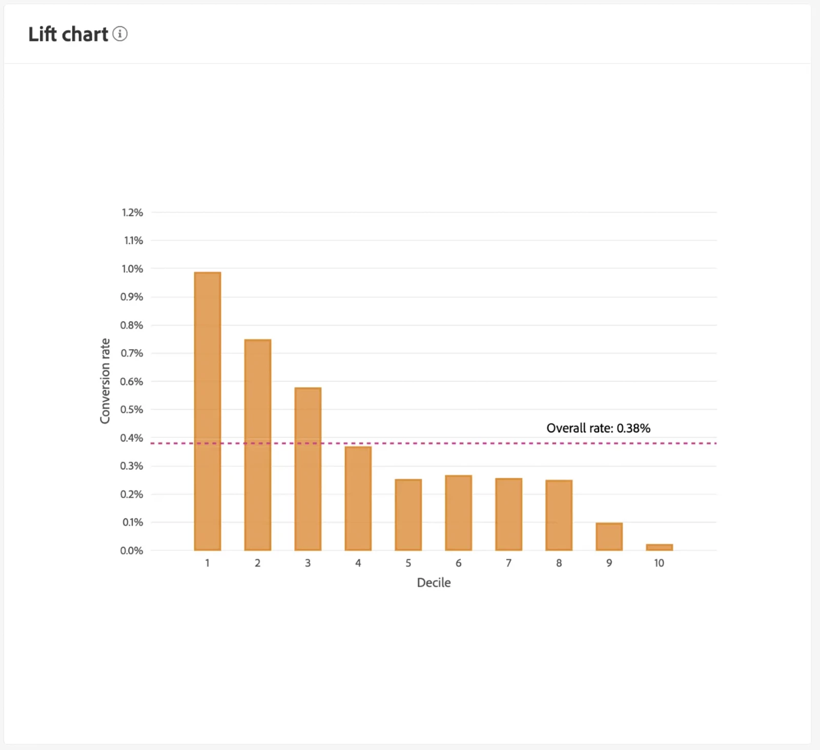
The Lift Chart shows how much better the model performs compared to random targeting, indicating the model’s efficiency in each customer tier.
- Analogy: Measuring Impact of Targeting
If you were to randomly select customers for a campaign, you’d have average response rates. The Lift Chart highlights how much higher response rates are when you target the top segments. For instance, if focusing on the top 10% yields a response rate four times higher than random, the Lift Chart validates the value of prioritizing high-propensity customers.
- In Simple Terms: The Lift Chart reveals the incremental benefit of each customer segment, showing the added impact of targeting the highest-potential customers over random selection.
Gains vs. Lift Chart
- Gains Chart: Helps you understand the total responders reached at each stage, showing the cumulative capture of high-potential customers.
- Lift Chart: Allows you to gauge the model’s performance improvement over random targeting in each segment, helping to assess the incremental value of focused targeting.
Why These Charts Matter for Marketers
By using Gains and Lift Charts, you can better allocate budget and resources toward segments with the highest likelihood of responding, ensuring campaigns are not only effective but also efficient. The Gains Chart guides you in quickly capturing the bulk of valuable customers, while the Lift Chart helps quantify the effectiveness of targeted marketing over broad, untargeted approaches.
4. Historical Performance: Expected vs. Actual Outcomes

What is Historical Performance?
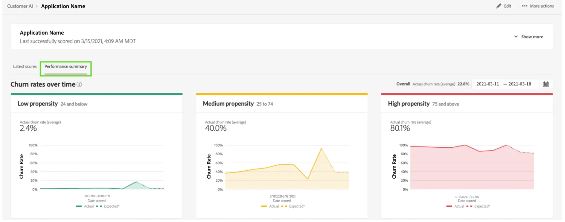
Historical Performance helps you compare predicted outcomes with actual results over time. Initially, the model shows only the expected rates (displayed as dotted lines) because data isn’t yet available. Once the outcome window has passed, the actual rate (solid line) replaces the expected rate, allowing you to see how closely the model’s predictions align with reality. Hovering over the lines displays the exact date and rate, helping you track performance on any given day.
Analogy: Forecast vs. Reality in Weather Predictions
Think of it like checking a weather forecast. Initially, you only have the expected weather prediction (say, a 70% chance of rain). But after the day has passed, you can look back and see what actually happened (e.g., it rained or it didn’t). Similarly, in marketing, you start with predicted outcomes and later see the actual results, which gives insight into the model’s accuracy over time.
Why It Matters for Marketers
By comparing expected and actual outcomes, you get a clearer picture of how accurate the predictions are, allowing you to fine-tune future campaigns based on real performance. It’s like having a feedback loop that builds trust in the model's forecasts.
Summary
Understanding Adobe Real-time CDP Customer AI predictions can transform your marketing strategy by helping you trust, interpret, and act on model outputs effectively:
- AUC (Area Under the Curve): Like a metal detector, it helps you confidently identify customers likely to respond, assuring the quality of predictions.
- Influential Factors: Like ingredients in a recipe, the right factors improve prediction accuracy, guiding you in crafting campaigns that resonate with your audience.
- Gains Chart and Lift Chart: These charts allow you to prioritize high-potential customers, with the Gains Chart focusing on cumulative capture and the Lift Chart measuring targeting efficiency.
- Historical Performance: A forecast vs. reality comparison, where expected rates are updated with actual outcomes, providing feedback on the Customer AI model’s accuracy over time.
By leveraging these insights, you can optimize campaign effectiveness, reduce inefficiencies, and make more data-driven marketing decisions.
Part 1 for this blog post series: Part 1: Real-World Scenarios to leverage Intelligent Audiences
Part 2 for this blog post series: Part 2: From a Prediction Plan to Adobe Real-time CDP Customer AI App
Authors: Pawan Sevak

