Has anyone experience in reporting on a custom field with multiple entries?
We have keywords for every project (one or multiple) and would like to know how often each keyword was used this year, preferably in a nice graph.
Solved! Go to Solution.
Topics help categorize Community content and increase your ability to discover relevant content.
Hi Manuel,
If you want to group by a multi-select field in a report, the below text mode for your grouping should do it:
group.0.displayname=Keywords
group.0.valueexpression={DE:Keywords}
group.0.valueformat=HTML
textmode=true
However, please note that you will not be able to create a graph using this grouping.
If you want to create a graph against your multi-select field, you will need to create a calculated field on the custom form that references the 'Keywords' field. Enter the following into the calculation: {DE:Keywords}. You will then be able to reference this calculated field in your reports and use it to build graphs. There is more help on this subject in this article here on Workfront One.
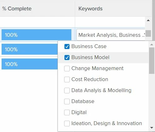
One thing to point out though, is that when you report on a multi select field Workfront will group by each of the custom field entry variations in their entirety. So in your example above, a report group would appear as "Business Case, Business Model'". Or if a user was to select all fields, another group would appear as "Business Case, Business Model, Change Management, Cost Reduction, etc. etc.". Workfront will provide a string for each of the multi-select variations that have been entered into the custom field to group by. For this reason, it could be difficult for you to count the number of times a keyword was used, especially if you have a large report with lots of field entry variations.
Hope this helps!
Best Regards,
Rich.
This is possible but it's a pain. You'll need to create a calculated custom field for each option that counts when that option is selected. Then you can report on the sum of the calculated custom field. It's not pretty and it will make your forms very ugly but it's possible and something that I have to do regularly as my users insist on having multi-select fields. I've been told with Reporting V2 this will be much easier to accomplish.
Here's the Workfront Article for more details and directions.
GOOD LUCK!!!
Hello Monique - Can you re-share the link please (if it is still available). The above link doesn't work.
Thanks 🙂
Views
Replies
Total Likes
Hi Manish, I think I found the new link: https://experienceleague.adobe.com/docs/workfront/using/reporting/reports/custom-view-samples/groupi...
@MoniqueEvans, thanks for the hot tip! I'm following up until the point where you're supposed to report on the sum of the calculated custom fields. Is there any way to chart and group by each entry value? If we were to use the example above, I'd like to see in one report, how many times Business Case, Business Model, etc were each selected.
Thanks!
You can. The way I did this in the past was I created a calculated custom field for each field option. I named the field "Field Choice Name Count" to keep things are clean as possible and then used the calculation:
IF(CONTAINS("FIELD CHOICE",CUSTOM FIELD NAME),1,0)
What this does is fills in a 1 if the choice is selected and a 0 if it wasn't. So once you make a field for each choice you should have a list on your form with lots of 0s and the occasional 1 for those selected.
From there you run your report on the new calculated field (Field Choice Name Count) instead of the multi-select custom field. You can report on the calculated field the same way you would with any non-multi-select field and can illustrate the sum, avg, etc of the number of times X choice was selected vs Y choice.
For those types of reports, I typically will do a color-coded fill for the 1s and let the 0s be blank so you don't get sensory overload and have the default view be the summary.
Views
Replies
Total Likes
Pressed enter too fast. If you want to do a visual chart, I typically export the data and use Excel to make a quick chart.
Views
Replies
Total Likes
@Richard Leek‚ and @Monique Evans‚ : thank you so much for the comprehensive and very helpful answers!
It's a bit sad and very hard to explain to my users that a task that looks so simple ist so hard to realize... let's see how we make the best out of it!
Hi Manuel,
Another option (pardon the pun) would be to use our Excel Updater solution to break those Multi Selects into separate checkboxes within a couple of hours (permanently), as follows:
At that point, because each checkbox is persisted separately in the Workfront database, you can then easily Filter, Group, and Chart on any of them, such as a Filter for Business Case = Yes, in a vertical Column Chart, grouped by Project Entry Date (by Month).
Regards,
Doug