Plotting planned hours over time

- Mark as New
- Follow
- Mute
- Subscribe to RSS Feed
- Permalink
- Report
I am trying to figure out if there is a way to plot the planned hours of a project over the life of a project. Like the Utilization info will give you, but for the life of the project. (The Utilization chart is limited to a week or a month and I can't export the data to Excel to recreate the chart.) I would love to see just one project but it would be great if I could layer project on top of project to see how they all stack up. But let's start with the first baby step.
Does anyone know how to plot the planned hours vs. the day or week of the project for the entire life of the project? Hours on the y-axis and weeks on the x-axis. It would also be great if I could export the data.
Topics help categorize Community content and increase your ability to discover relevant content.

- Mark as New
- Follow
- Mute
- Subscribe to RSS Feed
- Permalink
- Report
Hi Matt,
That is a tricky challenge, but our Capacity Charts solution handles all that, and more, plotting Capacity, Planned, and Actual hour (x-axis) over time (y-axis) for whatever timespan and measurement you choose (eg 1 year, by week), accounting for schedules, time off, roles and people, for as many Projects as you choose (via filters), grouped and stacked as you see fit (eg by Role, by Project), rendered in real time from right within Workfront, with a leading “thumbnail” summary, followed by full page individual charts and an optional data table, and downloadable as pdf or Excel.
Regards,
Doug

- Mark as New
- Follow
- Mute
- Subscribe to RSS Feed
- Permalink
- Report
Doug, this looks great. Pretty much exactly what I need, but the price is way out of my range. I am going to have to see if I can find a different solution. Thank you again. I will keep his in mind if my organization grows big enough to be able to afford a tool such as yours.
Views
Replies
Total Likes
![]()
- Mark as New
- Follow
- Mute
- Subscribe to RSS Feed
- Permalink
- Report
Hi Matt,
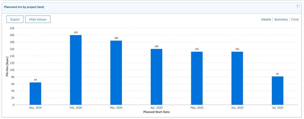
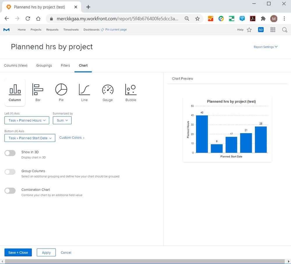
great question - we also need a different view for the planned hours. Could this view be helpful to you?
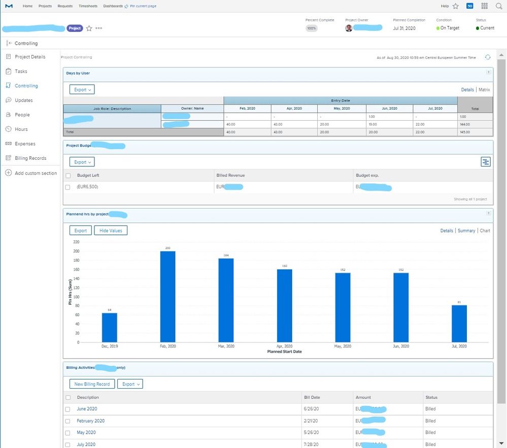
Here used in a project dashboard:
Views
Replies
Total Likes
- Mark as New
- Follow
- Mute
- Subscribe to RSS Feed
- Permalink
- Report
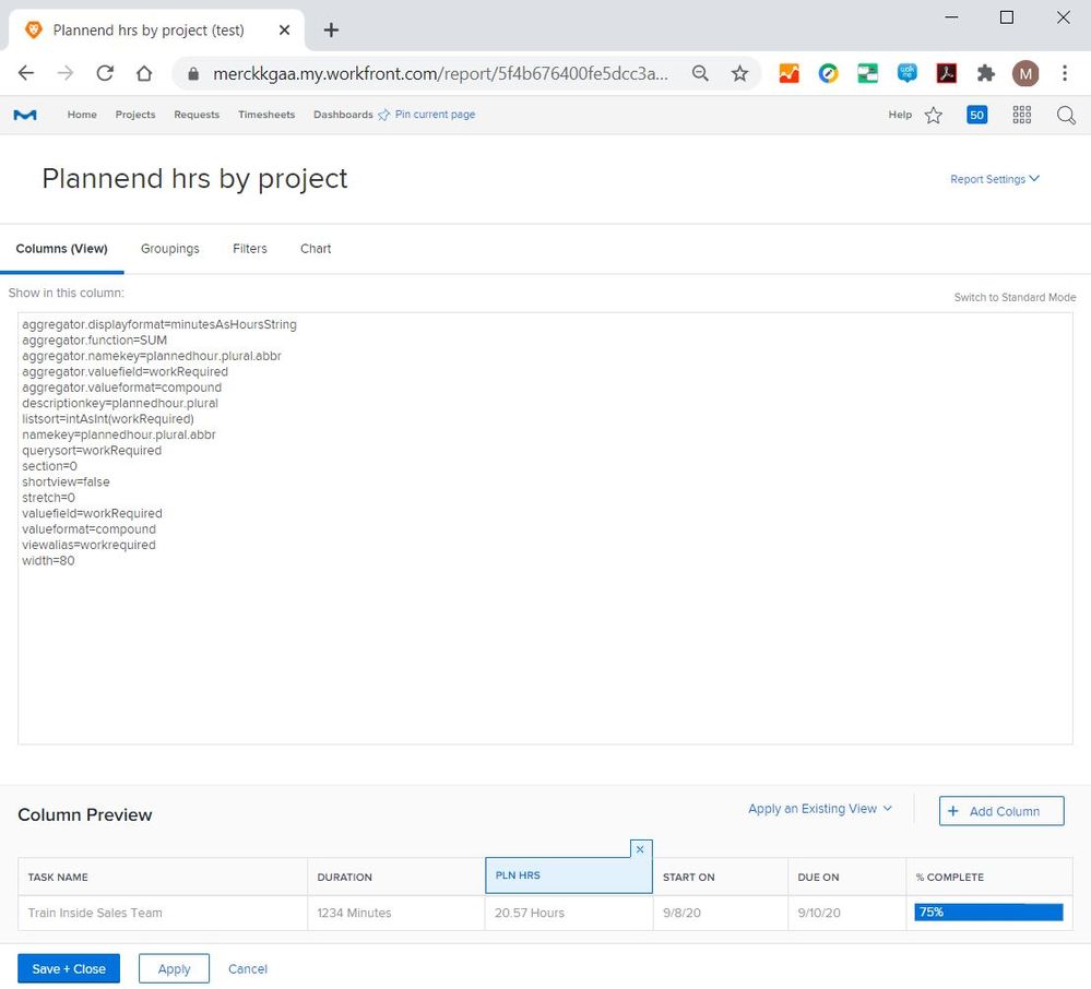
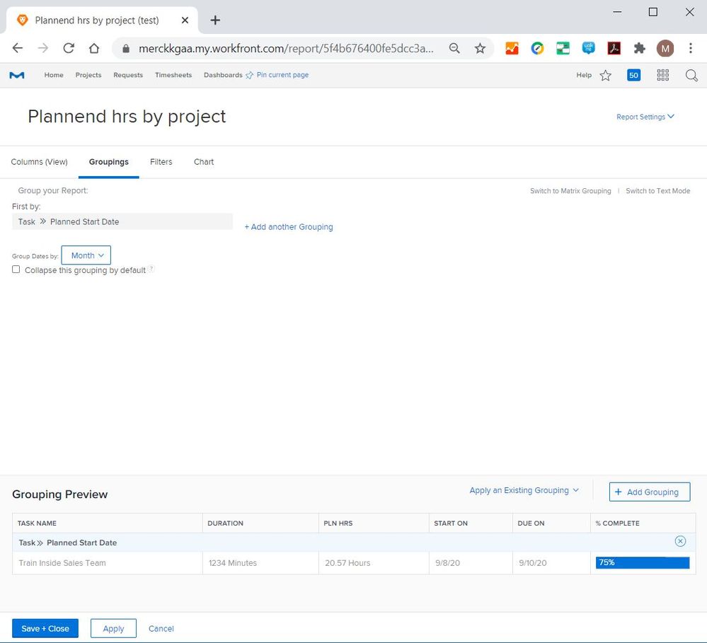
I can never figure out how to get the dates to appear on the X axis! Do you mind sending a screen shot of the graph setup? Thanks!
Views
Replies
Total Likes

- Mark as New
- Follow
- Mute
- Subscribe to RSS Feed
- Permalink
- Report
Manuel, thank you for your help. That chart would work fine but I need to know how WF distributes hours for longer tasks. For example, if I have a task that is 60 hrs. and 3 weeks long, and I create a report like the one you showed but with hours grouped by week, is it going to show 20 hours per week? Is it going to show 60 hours in the first week? Or the last week?
The information is in WF and is displayed in various ways. You can see it in the utilization tab on a project. You can see it in the resource planning. You can see it in some of the new analytics. But I can't get to it with a report. I just need to get the total number of hours for any give day/week/month for a project.
Do you know how WF distributes the hours for longer tasks?
Views
Replies
Total Likes
![]()
- Mark as New
- Follow
- Mute
- Subscribe to RSS Feed
- Permalink
- Report
Unfortunately, Workfront puts all hours to the beginning of a task.
That’s why Doug proposed to use it only for short tasks. As workaround, we asked our users to split tasks when they exceed a month to be able to get monthly reports.
Views
Replies
Total Likes

- Mark as New
- Follow
- Mute
- Subscribe to RSS Feed
- Permalink
- Report
Manuel,
I might be able to get what I need from the Resource Planner if I export the data to Excel. Do you know if the Planner lumps all hours to the beginning of a task? I certainly hope not.
Views
Replies
Total Likes
![]()
- Mark as New
- Follow
- Mute
- Subscribe to RSS Feed
- Permalink
- Report
The resource planner calculates the distribution of the hours over time. Unfortunately, the functionality cannot be used in normal reports as far as I know.
The Excel workaround is fine, but it undermines the transformation into real time data usage instead of number crunching in Excel.
Views
Replies
Total Likes

- Mark as New
- Follow
- Mute
- Subscribe to RSS Feed
- Permalink
- Report
Views
Replies
Total Likes
![]()
- Mark as New
- Follow
- Mute
- Subscribe to RSS Feed
- Permalink
- Report
It's a constant fight to cut the tasks in pieces which limits project management usability.
Doug, let's connect - I'd love to jointly find a better solution.
Views
Replies
Total Likes

- Mark as New
- Follow
- Mute
- Subscribe to RSS Feed
- Permalink
- Report
I'd be happy to, Manuel -- please email me at doug.denhoed@atappstore.com.
Regards,
Doug
Views
Replies
Total Likes
![]()
- Mark as New
- Follow
- Mute
- Subscribe to RSS Feed
- Permalink
- Report
It's a task report with the following details:
Views
Replies
Total Likes

- Mark as New
- Follow
- Mute
- Subscribe to RSS Feed
- Permalink
- Report
Manuel, thank you for your reply. Unless I am misunderstanding, this will still group hours to the planned start date.
If I have a task that is 40 hours and 5 days long, I want the report to show 8 hours a day not 40 hours on the planned start date..
Views
Replies
Total Likes
![]()
- Mark as New
- Follow
- Mute
- Subscribe to RSS Feed
- Permalink
- Report
Unfortunately, you are absolutely right :-( All information I got from Workfront indicates that only the native planner view allows to cut down the tasks. I'd love to find a way here, as the planner doesn't fit our needs.
Doug's solution is excellent, albeit expensive.
Views
Replies
Total Likes

- Mark as New
- Follow
- Mute
- Subscribe to RSS Feed
- Permalink
- Report
Yes, Doug's solution is exactly what I am looking for. However, my organization is small and can't afford it. I have had some luck exporting data from the resource planner and working with it in Excel using pivot tables. It is a very manual process and a bit messy, but I am encouraged by what I am finding. There is a feature suggestion HERE if you want to go comment and vote for it.
Views
Replies
Total Likes
![]()
- Mark as New
- Follow
- Mute
- Subscribe to RSS Feed
- Permalink
- Report
Let's hope for many votes!
Views
Replies
Total Likes

- Mark as New
- Follow
- Mute
- Subscribe to RSS Feed
- Permalink
- Report
Thanks for the details, Manuel: that approach works well for tasks with short (i.e. <1 day) durations, since the Planned Hours will all be "lumped" into either the Start Date or End Date, depending on which you've decided to Group By (Planned Start Date, in your case). To avoid double-counting Summary Tasks, I also recommend filtering to only numberOfChildren = 0 assuming that those "leaf / bottom / child" Tasks is where the Planned Hours are configured.
Matt and Sara, if your Tasks are mainly of a short duration (and/or close enough), Manuel's technique might be all you need; but if your Tasks are longer and you need the concept of having the time "spread" throughout the duration, you could either try an Assignment report (provided you assign all tasks, ideally 1:1 to a single role and user), or as I'd mentioned above, consider our Capacity Charts solution, which handles all that and more (e.g Schedules, % Role apportionment, PTO, etc.)
Regards,
Doug
![]()
- Mark as New
- Follow
- Mute
- Subscribe to RSS Feed
- Permalink
- Report
Hi Doug,
great remark! Indeed, the task duration remains an issue for our solution. In our case, the have a monthly tasks for each user and do monthly reporting.
I love your Capacity Chart add-on, it's the perfect solution! However, the pricing makes it interesting only for a high number of users.
Views
Replies
Total Likes
![]()
- Mark as New
- Follow
- Mute
- Subscribe to RSS Feed
- Permalink
- Report
Does anyone have some more information about the Assigment Report? I don't find much information about it and don't manage to bring months/weeks to the x-axis.
Views
Replies
Total Likes

- Mark as New
- Follow
- Mute
- Subscribe to RSS Feed
- Permalink
- Report
Doug, that is good advice. I have run into the double counting problem before and always check for children tasks when I create these types of reports. I haven't tried an assignment report. I will have to look into that. We have many long tasks in our projects that require the spreading of hours.
Views
Replies
Total Likes
Views
Likes
Replies


