This conversation has been locked due to inactivity. Please create a new post.
This conversation has been locked due to inactivity. Please create a new post.
Does anyone have a solution for displaying updates for collaborators in the NWE? Since this is not visible in Home and there is no My Updates tab like in Classic, I'm trying to come up with another way to display something similar for our collaborators. This is going to be a big loss for them.
Additionally, does anyone recall that list where we had 10 votes to allocate to a specific list of features for the NWE, has anything come of this? I know I allocated all of my votes to the updates feature in Home - but it wasn't the one with the highest number of points/votes when I did that. Just curious what the outcome was from that?
Thank you in advance!
Sydney
Topics help categorize Community content and increase your ability to discover relevant content.

I think this is going to end up being a dashboard full of notes reports that you pin to their layout template.
You might reach out to Narayan to see if he still has that free package (WFPro Notes). I didn't see a link for it on his list: https://wf-pro.com/home/packages/
It looks like this: https://www.youtube.com/watch?v=JqIEE2o6v5M&t=1887s
At least with this, you can kickstart something into your instance and modify as needed.
Hi Sydney -
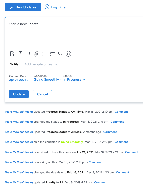
Collaborators should be able to see updates on the Home page. Like they appear here: 
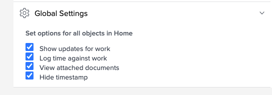
You may have the updates turned off on the layout template if they aren't seeing them. Check the settings on the Home and Summary section to see if the box is unchecked.

The Innovation Lab is where you'll want to look for status of the votes we submitted. It's here: https://one.workfront.com/s/innovation-lab-leaderboard
Hope this helps,
Teale
Views
Replies
Total Likes
Sorry, just to clarify, I am talking about a feed of updates that a review level user can see a list of all of their recent updates and reply to them from that feed. (not a worker who can see the updates feed on items they are assigned to)
Views
Replies
Total Likes
I was hoping the Updates tab on the users "profile page" could work, but this only shows updates, it does not show document approvals. Ideally, our request and review users would only have to go to one place to see a feed that includes updates they are included on as well as documents they need to approve. (with the ability to reply to updates and approve/reject document approvals)


Views
Replies
Total Likes

You could get creative with a dashboard and pull in a notes report for the updates portion and then pull the home screen in at the top. This is far more clunky than Classic, but it has the same effect of having your document approvals in one spot and recent updates in another.
Views
Replies
Total Likes
My concern with using a dashboard is that its going to negatively impact the user experience because they won't have the ability to reply to the update from the dashboard. Additionally, updates vary so much in length that I worry about how it will look. I understand this may be my only option, but I'm disappointed that reviewers and requesters no longer have this information in one place.
Views
Replies
Total Likes
@Sydney Peterson‚ this is a huge snag for us as well. We're working hard to try to move our next set of users over to NWE and the 'disappearance' of a central place in Home to see all updates from all projects is a big point of contention (I have users who literally cannot believe this has gone away.)
Do you have the link to the Idea for this for upvoting? I searched but couldn't find anything that was exactly this. Hoping this will get addressed soon, as it's a bigger barrier to NWE than I think they realize!
@Carolyn Glendening‚ I was beginning to think I was alone in this! I’m relieved to know I’m not! Last I checked earlier, the link was the link was directing to the wrong idea. I will check on this tomorrow and circle back!
Views
Replies
Total Likes
@Carolyn Glendening‚ I actually read the idea wrong and it was to bring back the "Recent Updates" area. I posted a new idea here if you wouldn't mind voting for it!
I have upvoted and added my comment as well that this is a big barrier to NWE transition for us. I don't think having to cobble together (less functional) dashboards is a solution, and hope Workfront will consider this as missing functionality vs a standard enhancement request (here's hoping!.)

I just upvoted. I was umming and aahing about the timing of educating myself on the NWE and migrating our group over to it, but this would be a major loss for us (half our group are reviewers). So glad I came across this post - will be on the lookout for how this evolves.
Hi Laurence, thanks for upvoting! If you have time and would consider adding your comment above to the Idea as well, I think that would be helpful!

Laurence, Carol, Sydney, Samantha (et al), fyi, but sad news...
In Classic as SysAdmin, I created a new dashboard called My Updates (Classic), added an External Page (bottom right), named it "My Updates (Classic)", set the URL to https://[yourdomain].my.workfront.com/myUpdates, and was pleased to see "My Updates" then render within that dashboard...even for me as SysAdmin. With my thinking then being to add it to a layout template as a way for Reviewers to then get "back" to that functionality within NWE, when I then flipped to NWE, however, when the dashboard refreshed, it apparently intercepted the myUpdates url behind the scene and redirected it to projects/all, instead. So...no joy.
Rescuing My Updates might technically be as easy as not doing the redirect...but there might be Adobe business reasons (to which I'm not privy) that make this new behavior As Designed.
Regards,
Doug

Hi everybody,
Just wanted to let you know that I have sent this thread to our product team so they can revisit the ideas.
Thanks for sharing your feedback as always!
Kyna
@Kyna Baker - inactive‚ Thank you so much!
Views
Replies
Total Likes
At this time, our engineering resources for Home Worklist are committed to high priority Adobe + WF integration items and then focusing on the performance of this page along with Update stream. I don't know when we will have resources to work on this but would like to understand the issue better. It sounds like the suggested work arounds (going to My updates URL and dashboard) didn't work. Could it be that you could assign a task to reviewers/collaborators and then it will appear in their Home worklist? We have only heard about this issue from a couple customers and the initial data on this feature reported low usage so I am wondering how they handle these items. Any more information would be helpful. Thanks for your help.
Views
Replies
Total Likes
Hi Jessica,
In our instance we DO assign tasks to reviewers/collaborators and all I see in the Work List is document approvals, no tasks.
Our reviewers/collaborators also submit requests (issues) that they are NOT assigned to, so even if tasks did show up in the Work List, which they do not currently, they wouldn't see issues on this page.
Also, updates aren't always posted to the task level - so they would not be able to see updates posted to the project level, or other updates posted to tasks they are NOT assigned to but they are tagged in.
I'm surprised to hear that this feature reported low usage, it's the page our reviewers/collaborators rely on most to quickly respond to updates posted on any object they've been tagged in or to approve documents. We give them a dashboard, but it outlines key dates and deadlines, not updates.
Thanks for the update. I hope this information is helpful.
Sydney
Views
Replies
Total Likes
Hi Jessica, I'd second all of Sydney's comments, and add a couple of points:
1) If other customers are similar to us, they may have started their NWE transition with their Planner users, then broadened to other user types. I suspect that like use, those managing the NWE transition save the users -- and more to the point, the Groups/subgroups who interact with a large number of Reviewer/Requestor users -- who don't spend significant time every day in Workfront for later. Although Reviewer/Requestor users are a large user population by the numbers, they don't live in WF the way a lot of us do, so we started with the groups that do.
Now we are looking at the broader picture for all users and are realizing that the transition to NWE for Reviewers/Requestors is seriously worse than their current UX, in terms of being able to get to (and even more importantly RESPOND to) items we need them to be able to see, update, and approve as quickly as possible. This could have a big impact on our ability to get approvals in a timely fashion and without a lot of user confusion.
The NWE UX for Reviewer/Requestor users is unfortunately extremely unfriendly (as detailed above.) This is actually impacting our ability to move the groups of Planner/Work users who interact heavily with those users to NWE also, since we'd like to be able to standardize our training materials and deal with only one UX. So it's not just about the Reviewer/Requestors in a silo.
2) Unfortunately, the idea of having to manually create more tasks (aside from the good points that Sydney raises) doesn't work in the real world of how approvals are sometimes sought and communicated. We have templates and 'standard' approval elements for our projects/tasks. However, in reality, on-the-fly tagging plays just as important a part for various projects, and is a judgement call made by humans depending on a number of factors that can't be built into a template. The flexibility of WF to allow this has always been critical for our projects' success, and the central place for reviewers to see everything -- formal or informally 'assigned' - in one place is a key piece of that puzzle.
I hope that helps, and thank you for asking for this info!
Carolyn
Views
Replies
Total Likes
![]()
Hi folks, great discussion here! We'd love to talk more about this to better understand how reviewers/collaborators do their work. If you are available, please sign up for a 30 minute call to show us your use case at your company: https://calendly.com/wf-product-research/my-updates.
Thank you in advance!
![]()
Hi @Sydney Peterson‚, wondering if your users are looking for this.
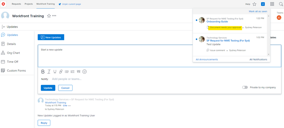
Have the user go to the Waffle, click on their name/icon (upper lefthand corner of the waffle pop up), select Updates from the left nav (if they don't already land there). They can "Pin" the page if it's what they're looking for.
Views
Replies
Total Likes
Views
Likes
Replies
Views
Likes
Replies