Can we talk about why the design to show items that are ready for a build changed so much between Launch and DTM?
In Launch, I feel like it is Easter and I am trying to find all my candy. And I definitely have that feeling that there is candy I am missing in my hunt...so many rabbit holes to look down...and nobody likes this feeling! (screen shot 1).
In DTM, I have a beautiful list of changes and I can easily go down the list and cherry pick the items that I want to include in the build (screen shot 2).
Screen Shot 1 :: Launch
Screen Shot 2 :: DTM
Thanks -
Sarah
Solved! Go to Solution.
This is one of the things that is a little more complex in Launch than in DTM in order to provide more flexibility and control. And it is a bit different. I would point your attention to two things that will help in case you haven't seen them already:
1) The Add All Changes button
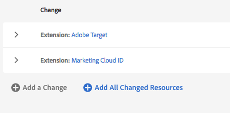
2) The "Changed" radio button. This should actually default to on, and when you look at your Rules, Data Elements, or Extensions in that part of the page, by default it will only show you the changes for that particular type of resource.
OH - I missed the All and Changed radio buttons! That is perfect
Thank you!!
Views
Replies
Total Likes
Views
Likes
Replies