Traffic for time
- Mark as New
- Follow
- Mute
- Subscribe to RSS Feed
- Permalink
- Report
Can anyone tell me how will be the report for traffic at the time of the day? Will this be a hourly?
Traffic usually means visits right.
Solved! Go to Solution.
Views
Replies
Total Likes

- Mark as New
- Follow
- Mute
- Subscribe to RSS Feed
- Permalink
- Report
To dovetail with what @Jennifer_Dungan suggested,
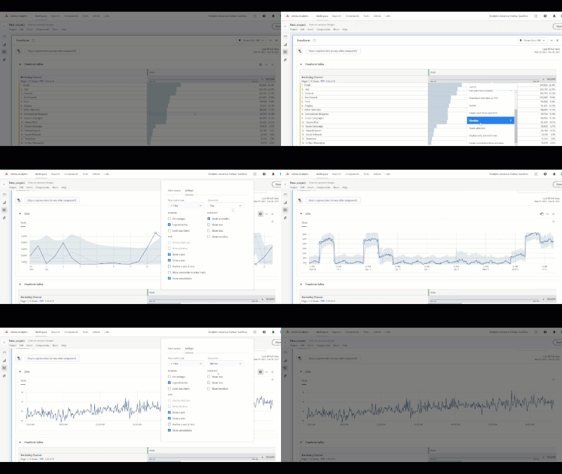
I'll often start with a daily trending chart. From there, it's very easy to change the granularity to hourly and minute by clicking on the gear in the upper right of the visualization. However, depending upon your date range, the trend may only show partial data, so you may need to narrow your dates.
Here's an example using sandbox demo data if it's helpful. Just start by right clicking on any metric(s) you're interested in and selecting Trend.

- Mark as New
- Follow
- Mute
- Subscribe to RSS Feed
- Permalink
- Report
There's a variety of ways you could break it out.
Your thought about visits by hour of the day makes sense. You could also break out by minute within Analytics but that's typically not needed. In a specific situation, though, it could help pinpoint an issue.
Page views could also be used with, or in place of, visits.

- Mark as New
- Follow
- Mute
- Subscribe to RSS Feed
- Permalink
- Report
Perhaps knowing more about what you are trying to pull would help us to help you...
"Traffic" is a generic term that can mean Visits or Page Views or Visitors (or even specific actions - i.e. what is the traffic of form submissions - in this case the "traffic" would be successfully completed forms)... there is no specific definition of this.
As @Josh__Stephens mentioned, you can break out the data by hour, or by minute.. it really depends on what you need. Though I agree with Josh, I usually only look at the data by minute when I am trying to troubleshoot an issue or support an investigation where were really need to dig deeply into what is happening (usually for a specific user to keep the data easier to follow).
Now, I will mention one thing when it comes to "hour" in Adobe... there are actually two dimensions that you can use.
- Hour - this is a unique hour based on a specific date (i.e. 18:00 2023-12-28 - this will represent data collected on Dec 28th between and including 6:00:00 PM and 6:59:59 PM)
- Hour of Day - this will collapse all data within your report range to a specific hour of the Day (6:00 PM - this will represent all data in your range, let's assume the last 7 Full Days that occurred between and including 6:00:00 PM and 6:59:59 PM - so Dec 22 AND Dec 23 AND Dec 24 AND Dec 25 AND Dec 26 AND Dec 27)
Hour of Day is really good at seeing what hours of the day average out to the highest traffic times that your site has, or just to create segments to limit data to "Core Business Hours" or maybe only during a "Flash Sale", etc)

- Mark as New
- Follow
- Mute
- Subscribe to RSS Feed
- Permalink
- Report
To dovetail with what @Jennifer_Dungan suggested,
I'll often start with a daily trending chart. From there, it's very easy to change the granularity to hourly and minute by clicking on the gear in the upper right of the visualization. However, depending upon your date range, the trend may only show partial data, so you may need to narrow your dates.
Here's an example using sandbox demo data if it's helpful. Just start by right clicking on any metric(s) you're interested in and selecting Trend.

- Mark as New
- Follow
- Mute
- Subscribe to RSS Feed
- Permalink
- Report
And to add one minor point to Josh's post, if you are using something like "Week" granularity, and your report is something like Last 30 Days, or Last Month, etc... the first and last days of your reporting period probably won't line up with the beginning and ending of the week, so your first and last points on the graph may be low.... (since it may only represent 2 or 3 days worth of data, as opposed to the rest of the entries that represent 7 days)
I try to remind people that if they are trying to look at a trend by week, they should set their panel date range to be one of the pre-defined "Last Week", "Last 2 Full Weeks", "Last 12 Full Weeks", etc... or to create a custom rolling range that is based on week (maybe you only need 8 weeks of data and that is missing from the pre-defined ranged).


