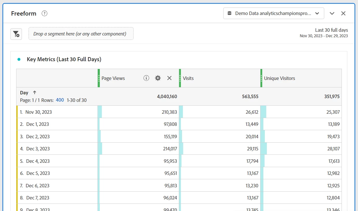
Hi, that sounds pretty good if I am reading the above properly. But here is a sample using one of the Sandbox data sources. (I added Page Views, since PVs, Vs and UVs tend to be the three standard key metrics):

Note that I decided to use "Last 30 Full Days" for the daily breakdown, as this way users can always see a 30 day trend. If you use "This Month (excluding today)" then at the beginning of a month, the users can only see one or 2 days (or no data at all if they look specifically on the 1st). The total of course will include data from last month.
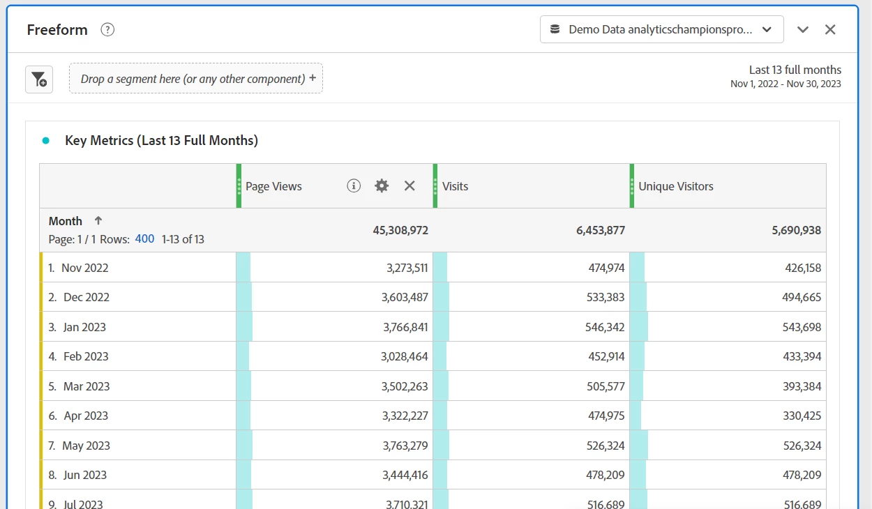
Then I would create a second panel, using "Last 13 full months", (or "Last 12 full months" or "Last 3 full months", etc) and show a monthly trend:

Now they can see how each month over the time frame compares to one another, and shows the information specifically by month.
Note: I cleaned up the display on the above tables by hiding percent, grand total (which in this case is literally the same value as total since I am not using filters), sparkline and anomalies. You can choose to display the tables in a fashion that makes the most sense to you and your team.
Now, IF they need a "Month to Date", you could do another panel showing the current month... or you could use a custom data range on your monthly panel that includes "Last 13 Full Months + This Month" but a lot of people get confused when they see a partial month compared to a bunch of full months and think that the site is going horribly wrong... I've just found it much easier not to show "Today" or "This Month" in trend lines to avoid the same panic calls over and over again....

