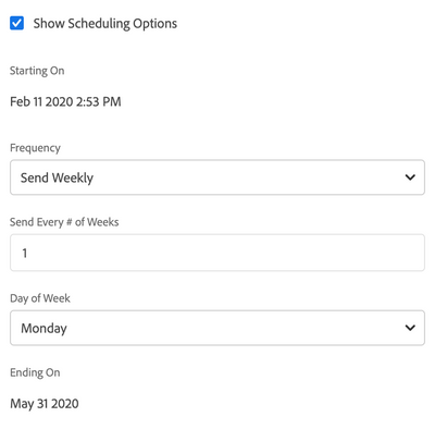
Look at this screenshot:

Did you know that you can edit the schedule's time by clicking the "2:53 PM" time?
I bet you didn't.
Because the "2:53 PM" black text looks just like the "Feb 11 2020" black text, just as it looks like the black text every where else. So your first reaction was "that is static text, not a link".
Adobe, for a creative company, this UI design is really backwards! Stop hiding user-actionable links/buttons behind a "beautiful" design. A design fails if the user doesn't understand how it is supposed to be used. That is Design 101.
Make links look like links, and static text look like static text.