This conversation has been locked due to inactivity. Please create a new post.
This conversation has been locked due to inactivity. Please create a new post.
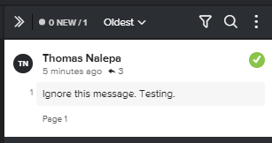
I don't know if I'm going crazy or if something has changed, or it never was and I'm just noticing it now. There is absolutely no way to tell that a comment in a proof has a reply unless you click on every single comment. I feel so certain that replies were either always cascading, or there was an identifier that shows that there's more to read, but honestly, I'm not sure. Before i put in a ticket and make a big complaint about this, was hoping to check with everyone else if you are seeing this, if this is a new change, or if there is a setting that has gone awry that I'm not aware of. Thanks!
Topics help categorize Community content and increase your ability to discover relevant content.
Trying to bump this to the top. What has changed is that now all comments in a proof are rolled up so you can't see the replies. If there is a proof with 1000 comments it means people have to click on 1000 comments to see any replies. It is outrageous. Please, if you are affected by this, please submit a ticket. It's really awful and we are seeing people missing important information because they didn't click on something.
Views
Replies
Total Likes
![]()
See attached image.

Views
Replies
Total Likes
Yes, thanks, I do see that now when I put on my microscopic glasses. I think it used to be that the comments were unrolled so you could glance through them, rather than having to click on 1000 comments to see what the responses are. (We often have hundreds of comments in a proof, and almost always someone answers each one, even if it's to say "ok" or "ignore this."
It's now cumbersome and impossible to scan -- similar to the changes they made to the Community emails -- more clicking, less visibility, worse user interface. I'm really upset at the backwards way this tool is going.
Views
Replies
Total Likes