Question
High contrast mode for proofing statii
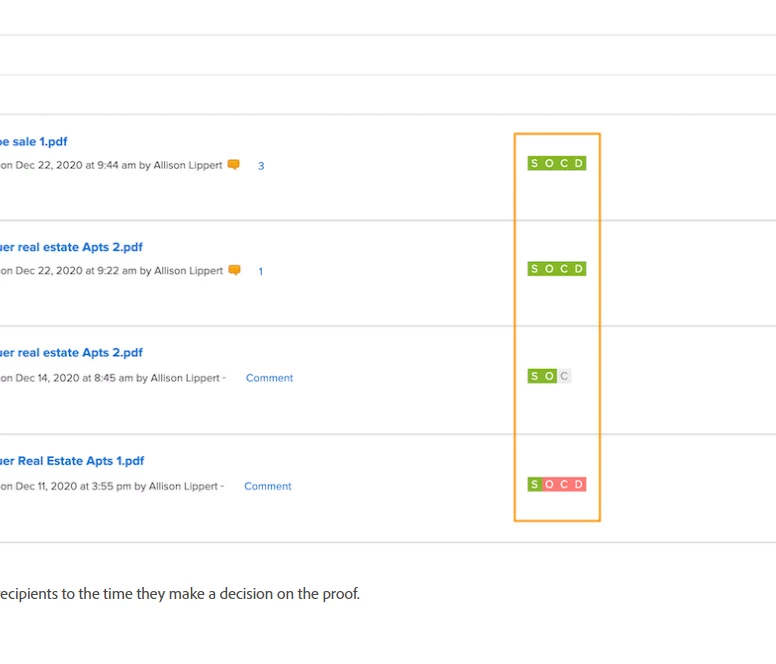
I am colorblind and the proofing statii colors are too similar in hue for me to differentiate them easily. In the example screenshotted below from the tutorial, I didn't even realize there was meant to be color coding until I read that the colors were important. Can they be adjusted for high contrast or be different shapes?
