Non-breaking space? Fixing right justified text in drop down list.
- Mark as New
- Follow
- Mute
- Subscribe to RSS Feed
- Permalink
- Report
When I right justify the text for the items in my drop down list, the control's down arrow partially obstructs the right-most character. I thought I might be able to add a non-breaking space to the right of the text, thus pushing it to the left, and out from under the arrow. Is there a non-breaking space character recognized by LC in this context? If so, how do I create it? Am I overlooking a simpler solution? Thanks.
Solved! Go to Solution.
Views
Replies
Total Likes

- Mark as New
- Follow
- Mute
- Subscribe to RSS Feed
- Permalink
- Report
Interesting. While the "marginRight" attribute does not exist for a dropdown list object "para" node, you can set the "marginRight" attribute. Try this...
// form1.page1.subform1.DropDownList1::initialize - (JavaScript, client)
DropDownList1.para.marginRight = "5pt";
Steve
Views
Replies
Total Likes

- Mark as New
- Follow
- Mute
- Subscribe to RSS Feed
- Permalink
- Report
I don't see the same behaviour.
Are you talking about Design view
or when the object is rendered?
Steve
Views
Replies
Total Likes
- Mark as New
- Follow
- Mute
- Subscribe to RSS Feed
- Permalink
- Report
It happens in both design and rendered view. It is a minor aesthetic problem, as the arrow obscures a sliver of the right hand edge of the last character in the text. I tried the old ALT-255 trick, which inserted what looked like a blank in design view, but it disappeared in the rendered view.
I can live with this, but it would make my form a little nicer if I could "scootch" the text left a little.
Thanks for taking the time to respond.
Darrell
Views
Replies
Total Likes

- Mark as New
- Follow
- Mute
- Subscribe to RSS Feed
- Permalink
- Report
Interesting. While the "marginRight" attribute does not exist for a dropdown list object "para" node, you can set the "marginRight" attribute. Try this...
// form1.page1.subform1.DropDownList1::initialize - (JavaScript, client)
DropDownList1.para.marginRight = "5pt";
Steve
Views
Replies
Total Likes
- Mark as New
- Follow
- Mute
- Subscribe to RSS Feed
- Permalink
- Report
Thank you. That works.
Views
Replies
Total Likes
- Mark as New
- Follow
- Mute
- Subscribe to RSS Feed
- Permalink
- Report
Thanks, Steve. That worked. Sorry about the delayed gratitude, but I got
shunted off to a different project for a while, and haven't been checking
this email account.
Views
Replies
Total Likes
- Mark as New
- Follow
- Mute
- Subscribe to RSS Feed
- Permalink
- Report
The same thing happens with a text field whose caption is right justified. It's too far to the right and squished right up next to the beginning of the field.
I don't want to change the caption programmatically. Rather, I'd like to be able to get a teensy weensy space at the end somehow, but it doesn't seem to take. Any suggestions?
Thanks,
Elaine
Views
Replies
Total Likes

- Mark as New
- Follow
- Mute
- Subscribe to RSS Feed
- Permalink
- Report
If you hover over the little orange bar your cursor will change. Once it has changed you can slide the divider to the right to give you as much space as you need.
Paul
Views
Replies
Total Likes
- Mark as New
- Follow
- Mute
- Subscribe to RSS Feed
- Permalink
- Report
Thanks Paul, but the caption text scoots right along next to the orange bar
as you slide it. So that does not seem to work.
Views
Replies
Total Likes
- Mark as New
- Follow
- Mute
- Subscribe to RSS Feed
- Permalink
- Report
In this case, I find that inserting an ALT-255 character does add some space, even in the rendered view. I don't know what is going on in the black box, but it does add a little space. At the end of your caption, hold down the Alt key, and press 255 on your number keypad.
Darrell
Views
Replies
Total Likes
- Mark as New
- Follow
- Mute
- Subscribe to RSS Feed
- Permalink
- Report
Thanks Darrell, but that doesn't seem to work either. You can't see the
space in design or preview mode. --Elaine
Views
Replies
Total Likes

- Mark as New
- Follow
- Mute
- Subscribe to RSS Feed
- Permalink
- Report
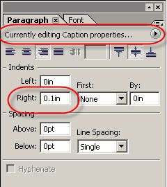
In the Paragraph palette, make sure that you are editing the caption only, then set a right index to move the text slightly left.
Paul
Views
Replies
Total Likes

- Mark as New
- Follow
- Mute
- Subscribe to RSS Feed
- Permalink
- Report
On the Paragraph tab ....set it to adjust caption only then you can use the right index to set a small space to be used.
Paul
Views
Replies
Total Likes
- Mark as New
- Follow
- Mute
- Subscribe to RSS Feed
- Permalink
- Report
Yeah, baby! That did it! Thanks Paul! You have a fun job ![]()
Views
Replies
Total Likes
Views
Likes
Replies
Views
Likes
Replies
Views
Likes
Replies


