Expand my Community achievements bar.

Predictions Using Advanced Statistical Functions in Adobe Analytics

Avatar

Administrator

9/14/21

Author: Jaemi Bremner

landing-banner.jpeg

In this article, we would look at a very simple demonstration of how we can use the linear regression model to predict the estimated revenue based on the number of texts sent out in Adobe Analytics and would compare the calculations using sklearn.

In this digital age, businesses are collecting huge amounts of data to gain insights about their customers, serve them with relevant content, and to optimize their business. One key part of optimization is to make the best use of the marketing spend on the most influential channels based on the impact each channel/touchpoint has on a conversion.

One way to align the marketing spend for different campaigns is to get their impact on conversion and try adjusting the spend for all channels such that the conversions are high. Businesses use multiple statistical approaches to attain this level of optimization. Adobe Analytics helps us with some out of the box metrics which makes the life easier for a marketer to use these statistical functions. Lets see how this works.

What are linear regression models?

Linear regression models are used to show or predict the relationship between two variables or factors. Linear regression is widely used in the industry today for making predictions of a value based on the change in input factors. The linear regression line has the equation of:

Y = a + bX,

Where:

  • Y is the dependent variable
  • X is the explanatory variable
  • a is the intercept
  • b is the slope of the curve

Now, in this demonstration we could be using the following elements which are already configured in an analytics report suite:

Figure 1: Elements in Analytics WorkspaceFigure 1: Elements in Analytics Workspace

Now, let’s see how data looks in Analysis Workspace:

Figure 2: Trendline in Analytics WorkspaceFigure 2: Trendline in Analytics WorkspaceFigure 3: Revenue & Text Sent Table in Analytics WorkspaceFigure 3: Revenue & Text Sent Table in Analytics WorkspaceNow, we would like to get an estimated increase in revenue if we choose to send 25,000 texts and 50,000 texts. For this, we would be creating a calculated metrics which would get us an estimate of the revenue expected. This will be done using the formula mentioned above.

Here we have advanced statistical functions available in the calculated metrics space for intercept and slope.

Figure 4: Calculated metric builder in Analytics WorkspaceFigure 4: Calculated metric builder in Analytics Workspace

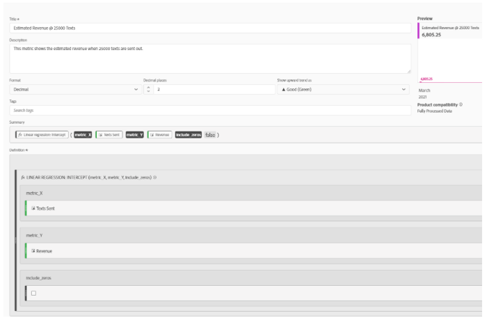
So, now we will create a calculated metric called Estimated Revenue @ 25000 Text and add the description for the metric. For this, we will open up the calculated metric builder and search for Linear regression : Intercept and add it to the formula bar in the builder. Now, this function requires two input metrics: metrix_X and metric_Y which are Texts Sent event and Revenue respectively. Next, we drag-drop these metrics to their respective blanks in the builder. This is how the calculated metric builder would look like:

Figure 5: Calculated metric builder view in Analytics WorkspaceFigure 5: Calculated metric builder view in Analytics Workspace

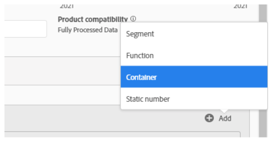
Next, we add another container to add additional function values:

Figure 6: Another container to add function values in Analytics WorkspaceFigure 6: Another container to add function values in Analytics Workspace

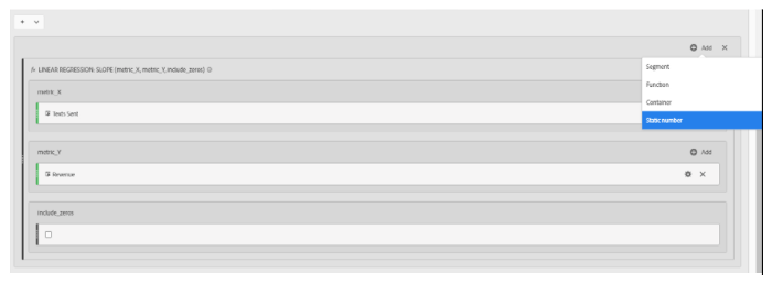
Now, we search for Linear regression : Slope and drag it to the second container and set the operator to + between the two containers, and add the same metrics which we added in the first container for metric_X and metric_Y. Next, in the second container, we click on Add and choose Static number.

Figure 7: Add Static numberFigure 7: Add Static number

Next, we change the operator between slope and static number to “X” and enter 25000 in the static number column. For the simplicity of the demo, we left to include zeros unselected and save the calculated metric with the format as currency.

Next, we open up the calculated metric and replace 25000 with 50000 in the name, description, and the static number field and use the Save As option to save this as the second prediction metric. As we have both the estimated revenue metrics ready now, add both the metrics to the same table. Now we get two lines for the predicted revenue values. The graph looks like this:

Figure 8: Revenue Metrics and Predictive Revenue DashboardFigure 8: Revenue Metrics and Predictive Revenue Dashboard

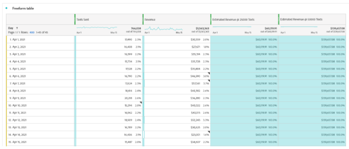
The values can be seen in the freeform table:

Figure 9: Values of Figure 8 dashboardFigure 9: Values of Figure 8 dashboard

The values which we are seeing are as follows: Estimated Revenue for 25000 and 50000 Text Sent is — $60119.91 and $139657.08 respectively.

Now let’s validate this in Jupyter notebook:

Open a notebook and run the following commands in order:

import numpy as np

import matplotlib.pyplot as plt

from sklearn.linear_model import LinearRegression

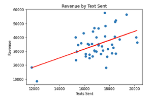
text_sent = np.array([17490,16408,16599,15734,17128,16790,17624,18414,20218,15294,16962,18509,16789,16406,15487,16686,19372,17686,16102,16955,17653,17318,17111,18819,17866,16811,17388,16261,18518,16656,15926,16340,18456,18323,16100,11778,12198,15367,17114,18204,15308,17817,18191,20134,17728])

revenue = np.array([30558.68,27670.99,35314.49,35727.71,35004.27,46590.4,57561.23,40382.05,36280.23,40021.67,40013.32,52243.1,30624.98,25000.66,34606.89,44107.78,56486.35,48119.19,26327.85,29922.3,40704.71,28114.83,34379.26,38558.02,31622.02,30102.82,33495.5,35259.82,28400.88,26217.87,42847.65,34758.68,51224.18,32468.67,27971.82,18426.69,8462.23,29888.69,46552.6,34761.04,23668,26129.11,28615.34,39937.2,18231.33])

linreg = LinearRegression()

text_sent = text_sent.reshape(-1,1)

linreg.fit(text_sent, revenue)

predicted_revenue = linreg.predict(text_sent)

plt.scatter(text_sent,revenue)

plt.plot(text_sent, predicted_revenue, color='red')

plt.title("Revenue by Text Sent")

plt.xlabel("Texts Sent")

plt.ylabel("Revenue")

plt.show()


line-graph.png


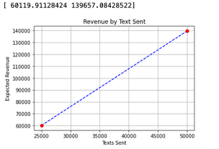
inputval = np.array([25000,50000])

inputval = inputval.reshape(-1,1)

predicted_rev = linreg.predict(inputval)

print(predicted_rev)

plt.scatter(inputval, predicted_rev)

plt.plot(inputval, predicted_rev, color="blue", linestyle = 'dashed')

plt.plot(inputval, predicted_rev, 'ro')

plt.grid()

plt.title("Revenue by Text Sent")

plt.xlabel("Texts Sent")

plt.ylabel("Expected Revenue")

plt.show()


revenue-by-text-sent-graph.png


print("Predicted Revenue @ 25000 Texts is: $" + str(predicted_rev[0]))

print("Predicted Revenue @ 25000 Texts is: $" + str(predicted_rev[1]))


predicted-revenue.png

With this we can confirm that the numbers match with the estimated revenue numbers we calculated in Adobe Analytics.

Follow the Adobe Experience Platform Community Blog for more developer stories and resources, and check out Adobe Developers on Twitter for the latest news and developer products. Sign up here for future Adobe Experience Platform Meetups.

References

  1. Adobe Analytics Workspace
  2. Advanced Function in Adobe Analytics
  3. Jupyter Notebooks

Original Publication Date: June 11, 2021