
Introducing React Spectrum
Authors: Devon Govett, Danielle Robinson, and Matthew Deutsch

Adobe has more than 5,000 engineers working across the world on hundreds of products, which must all meet high standards for UI consistency, accessibility, internationalization, and usability. Meeting these standards at our scale has been a challenge for us. We acknowledge design systems are now more popular than ever, and many companies both large and small are implementing their own component libraries from scratch.
Even with the rise of the modern view libraries, it is still extraordinarily difficult to do so in a fully accessible way with interactions that work across many types of devices. This represents millions of dollars of investment for each company as they duplicate work that could have been shared. Additionally, many companies and teams don’t have the resources or time to prioritize features like accessibility, internationalization, full keyboard navigation, and touch interactions. This leads to many apps having sub-par accessibility and interactions which contributes to the perception of the web as an inferior app platform compared to native apps.
We’re excited to share what we learned in this blog through our announcement and release of React Spectrum, a collection of libraries and tools that help you build adaptive, accessible, and robust user experiences for web applications. React Spectrum includes three libraries:
- React Spectrum — A React implementation of Spectrum, Adobe’s design system.
- React Aria — A library of React Hooks that provides accessible UI primitives for your design system.
- React Stately — A library of React Hooks that provides cross-platform state management and core logic for your design system.
Before we dive into each library, here are the four key concepts.
Key concepts of React Spectrum
React Spectrum addresses these four key concepts for developers within companies to meet standards and improve experiences.
- ♿ ️ Accessible — Accessibility and behavior are implemented according to WAI-ARIA Authoring Practices, including full-screen reader and keyboard navigation support. All components have been tested across a wide variety of screen readers and devices to ensure the best experience possible for all users.
- 📱 Adaptive — All components are designed to work with mouse, touch, and keyboard interactions. They’re built with responsive design principles to deliver a great experience, no matter the device.
- 🌍 International — Support for more than 30 languages is included out of the box, with support for right-to-left languages, date and number formatting, and more.
- 🎨 Customizable — React Spectrum components support custom themes, and automatically adapt for dark mode. For even more customizability, you can build your own components with your own DOM structure and stying using the React Aria and React Stately hooks to provide behavior, accessibility, and interactions.
React Spectrum’s architecture
To enable the reusing of component behavior between design systems, React Spectrum splits each component into three parts: state, behavior, and the rendered component. This architecture is made possible by React Hooks, which enables the ability to reuse behavior between multiple components.
React Stately
React Stately is a collection of hooks that provide state management and core logic for each component. They make no assumptions about the platform they are running on, and have no theme or design system-specific logic.
React Stately hooks accept common props from the component and provide state management. They implement the core logic for the component and return an interface for reading and updating the component state.
React Stately can be used independently in your own components or paired with React Aria hooks to get more of the behavior and user interactions for web applications out of the box. Learn more about React Stately, and how to get started by reading the docs.
React Aria
React Aria gives you complete control over the rendering and styling of your components rather than building everything from scratch. You start with higher-level primitives that have semantic meaning, behavior, and interactions built-in. This allows you to build components more quickly and ensures that they work well across devices and assistive technology.
React Aria implements behavior and accessibility for the web according to the WAI-ARIA Authoring Practices. It includes full-screen reader and keyboard navigation support, along with mouse and touch interactions that have been tested across a wide variety of devices and browsers. It also implements internationalization for over 30 languages, with right-to-left specific behavior, localized date and number formatting, and more.
React Aria does not contain any design system-specific styling or logic. It implements event handling, accessibility, internationalization, etc. — all the parts of a component that could be shared across multiple design systems. It returns DOM props that can be spread onto the elements rendered by the component. These include semantic properties like ARIA, and event handlers. The event handlers in turn call methods on the state interface to implement the behavior for the component.
Building a component with React Aria and React Stately looks like this: call the hooks, and spread the resulting props onto the appropriate DOM elements.
function Switch(props) {
  let state = useToggleState(props);
  let {inputProps} = useSwitch(props, state);
  let {isFocusVisible, focusProps} = useFocusRing();

  return (
    <label style={{display: 'flex', alignItems: 'center'}}>
      <VisuallyHidden>
        <input {...inputProps} {...focusProps} />
      </VisuallyHidden>
      <svg width={40} height={24} aria-hidden="true" style={{marginRight: 4}}>
        <rect
          x={4}
          y={4}
          width={32}
          height={16}
          rx={8}
          fill={state.isSelected ? 'orange' : 'gray'}
        />
        <circle cx={state.isSelected ? 28 : 12} cy={12} r={5} fill="white" />
        {isFocusVisible && (
          <rect
            x={1}
            y={1}
            width={38}
            height={22}
            rx={11}
            fill="none"
            stroke="orange"
            strokeWidth={2}
          />
        )}
      </svg>
      {props.children}
    </label>
  );
}

<Switch>Test</Switch>
Figure 1: https://react-spectrum.adobe.com/react-aria/useSwitch.html#example

Read more about React Aria and the problems it solves, and check out the docs to get started building your own design system.
React Spectrum
React Spectrum puts all of these pieces together and implements the Adobe-specific styling. It’s designed to be adaptive, and works across mouse, touch, and keyboard interactions, on devices of any screen size. It supports theming, including automatic support for dark mode, and responsive scaling for large hit targets on touch devices.
If you’re integrating with Adobe software or would like an end-to-end component library to use in your project, then React Spectrum is a great place to start. Save time by using Project Firefly, our complete framework for building custom cloud-native Adobe apps. Enterprise customers and partners can extend the functionality of Adobe Experience Platform and Adobe Experience Cloud solutions in a custom app that solves specific business and workflow needs. Sign up to get access to the Project Firefly developer preview.
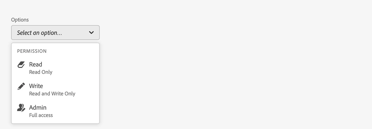
We’ve designed the APIs in React Spectrum to be easy to use. The following example shows how simple it is to create a select element with support for sections and complex options.
<Picker label="Options">
  <Section title="Permission">
    <Item textValue="Read">
      <Book size="S" />
      <Text>Read</Text>
      <Text slot="description">Read Only</Text>
    </Item>
    <Item textValue="Write">
      <Draw size="S" />
      <Text>Write</Text>
      <Text slot="description">Read and Write Only</Text>
    </Item>
    <Item textValue="Admin">
      <BulkEditUsers size="S" />
      <Text>Admin</Text>
      <Text slot="description">Full access</Text>
    </Item>
  </Section>
</Picker>
Figure 3: https://react-spectrum.adobe.com/react-spectrum/Picker.html#complex-items
Get started building an application with React Spectrum, and check out the docs for each component to learn more. In addition, if you’re building your own component library, React Spectrum is a good example of how to use React Aria and React Stately to build a full design system.
What we learned
We believe there is an opportunity to share much of the behavior and component logic between design systems and across platforms. For example, user interactions, accessibility, internationalization, and behavior can be reused, while allowing custom styling and rendering to live within individual design systems. This has the potential to improve the overall quality of applications while saving companies money and time and reducing duplicated effort across the industry. Modern view libraries like React Spectrum allow teams to build and maintain these components more easily than before.
Try it out!
We’re really excited to see how you use React Aria, React Stately, and React Spectrum in your own applications! We’ve started with an initial set of components, and many more will be added in the coming months.
Check out our documentation to learn more. We’ve put a huge amount of effort into making it easy to get started, with API docs and examples for each component, and a clear list of all of the functionality we handle out of the box.
Follow the Adobe Experience Platform Community Blog for more developer stories and resources, and check out Adobe Developers on Twitter for the latest news and developer products. Sign up here for future Adobe Experience Platform Meetups.
References
- React Spectrum Website — https://react-spectrum.adobe.com/
- React Spectrum Github — https://github.com/adobe/react-spectrum
- React Spectrum Documentation — https://react-spectrum.adobe.com/react-spectrum/index.html
- React Aria Documentation — https://react-spectrum.adobe.com/react-aria/index.html
- React Stately Documentation — https://react-spectrum.adobe.com/react-stately/index.html
- Spectrum Design Website — https://spectrum.adobe.com/
- Project Firefly — https://www.adobe.io/apis/experienceplatform/project-firefly.html
- WAI-ARIA Website — https://www.w3.org/TR/wai-aria-1.2/
- React Hooks Documentation — https://reactjs.org/docs/hooks-intro.html
Originally published: Jul 30, 2020