Beantwortet
How AdaptiveImageServlet / Dynamic Media know which device is it?
How does the AdaptiveImageServlet / Dynamic Media know user's device and screen size?
How does they know resolve which Rendition to be serve?
How does the AdaptiveImageServlet / Dynamic Media know user's device and screen size?
How does they know resolve which Rendition to be serve?
For Adaptive Image, please refer to https://techrevel.blog/2023/09/25/adaptive-image-rendering-via-delegation-for-aem-components/
1. A template author would configure accepted widths via policy of Image component
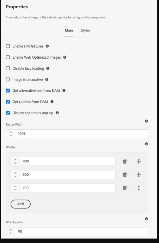
2. These Widths are used by Image component to generate SRC SET
3. The browser then evaluates the best match for current Device from that srcset
4. The selected rendition request is then made to AdaptiveImageServlet, which generates/returns the matching rendition.
The blog details the steps 2 & 3.
To learn more about Step-4, refer to https://experienceleague.adobe.com/docs/experience-manager-core-components/using/developing/adaptive-image-servlet.html?lang=en#rendition-selection
Enter your E-mail address. We'll send you an e-mail with instructions to reset your password.