How does the AdaptiveImageServlet / Dynamic Media know user's device and screen size?
How does they know resolve which Rendition to be serve?
Solved! Go to Solution.
Views
Replies
Total Likes
For Adaptive Image, please refer to https://techrevel.blog/2023/09/25/adaptive-image-rendering-via-delegation-for-aem-components/
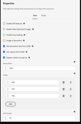
1. A template author would configure accepted widths via policy of Image component
2. These Widths are used by Image component to generate SRC SET
3. The browser then evaluates the best match for current Device from that srcset
4. The selected rendition request is then made to AdaptiveImageServlet, which generates/returns the matching rendition.
The blog details the steps 2 & 3.
To learn more about Step-4, refer to https://experienceleague.adobe.com/docs/experience-manager-core-components/using/developing/adaptive...
The srcset
attribute in AEM Core Component's Image component ensures optimal image delivery for responsive web design. It dynamically selects the most appropriate image source based on the user's device, adapting to different screen sizes and resolutions. This leads to faster page loads, reduced bandwidth usage, and an enhanced user experience. Here's a concise example:
<img
src="default.jpg"
srcset="small.jpg 320w, medium.jpg 768w, large.jpg 1200w"
sizes="(max-width: 320px) 280px, (max-width: 768px) 680px, 1200px"
alt="Responsive Image Example">
In this example, the srcset
attribute provides multiple image sources with different widths, and the sizes
attribute specifies the width of the image based on viewport dimensions. Browsers use this information to intelligently load the most suitable image, optimizing performance for diverse devices
Thanks for sharing the info @BrianKasingli
Views
Likes
Replies