Expand my Community achievements bar.

Don’t miss the AEM Skill Exchange in SF on Nov 14—hear from industry leaders, learn best practices, and enhance your AEM strategy with practical tips.
SOLVED

Navigation within a collection

Avatar

Level 3

In the old app we have several ways of navigating within a collection.
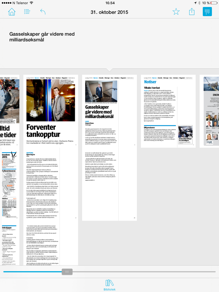
image.png

In DPS2015 we miss at least a navigation bar at the bottom of the screen, to let us quickly swipe from end to the beginning (or vice versa) of a collection.

If you open a collection you've already started to read, you land on the page you last visited. This is correct behavior.

But if you then want to read from the beginning, the only way of doing this is by swiping one, and one article - until you after 50 articles find the one you are looking for.

We use Content View, and not the browse page.

1 Accepted Solution

Avatar

Correct answer by
Employee

Hi Espen,

The browse page replaces those two navigation elements in DPS 2015. If you want to provide that style of quick navigation to your readers we encourage you to enable the browse page for your collection. You could also put a navto://relative/first link on your articles that, when tapped, would take the reader back to the start.

Neil

View solution in original post

1 Reply

Avatar

Correct answer by
Employee

Hi Espen,

The browse page replaces those two navigation elements in DPS 2015. If you want to provide that style of quick navigation to your readers we encourage you to enable the browse page for your collection. You could also put a navto://relative/first link on your articles that, when tapped, would take the reader back to the start.

Neil