Hey all, I'm brand new to Adobe Analytics, but I haven't found the answer to this question anywhere, so maybe you can help. I'm using a combo visualization to compare monthly values over the previous twelve months compared to the 12 months prior to that (each line represents 12 months). In the settings, I checked the box that said "Show trend line," but it doesn't show any trend lines unless I hover over the graph with my mouse (then the trend line is grey, so I have no idea which period of time it's referring to), which isn't helpful since I have lots of graphs to add to reports. Anyone know how to make them visible without me needing to hover over the graph? Also, is there a way to make a trend line match the color of the data line it represents? I'm including a picture of the way I need it to look with colored, dotted lines (I used Excel) and the way it looks now with my cursor hovering over it. I'd hate to go back to Excel with as much data as I have, but I will since trend lines are what my superiors want to see.
Solved! Go to Solution.
Views
Replies
Total Likes
Hi KyraSu
It seems that when multiple metrics are included in a line visualization, you need to hover over each one individually or select one to see their specific trend line. If you only have one metric in the Line graph, it will show the trendline without hovering. But it sounds like you need to show the comparison with one visualization.
Here are two ideas that might help (depending on what you need):
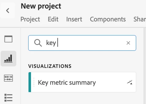
Try the 'Key metric summary': Although this is primarily a summary card, it provides you with a trend line when comparing two periods. The trend line within this visualisation shows the general movement or direction of the data.
Add the primary period and the previous period + the relevant metric.
Additionally, it shows the percentage increase or decrease for the metric, which is great for quickly assessing performance. This is especially useful when you want to highlight how a specific metric is performing this period compared to the same period last year or another selected period.
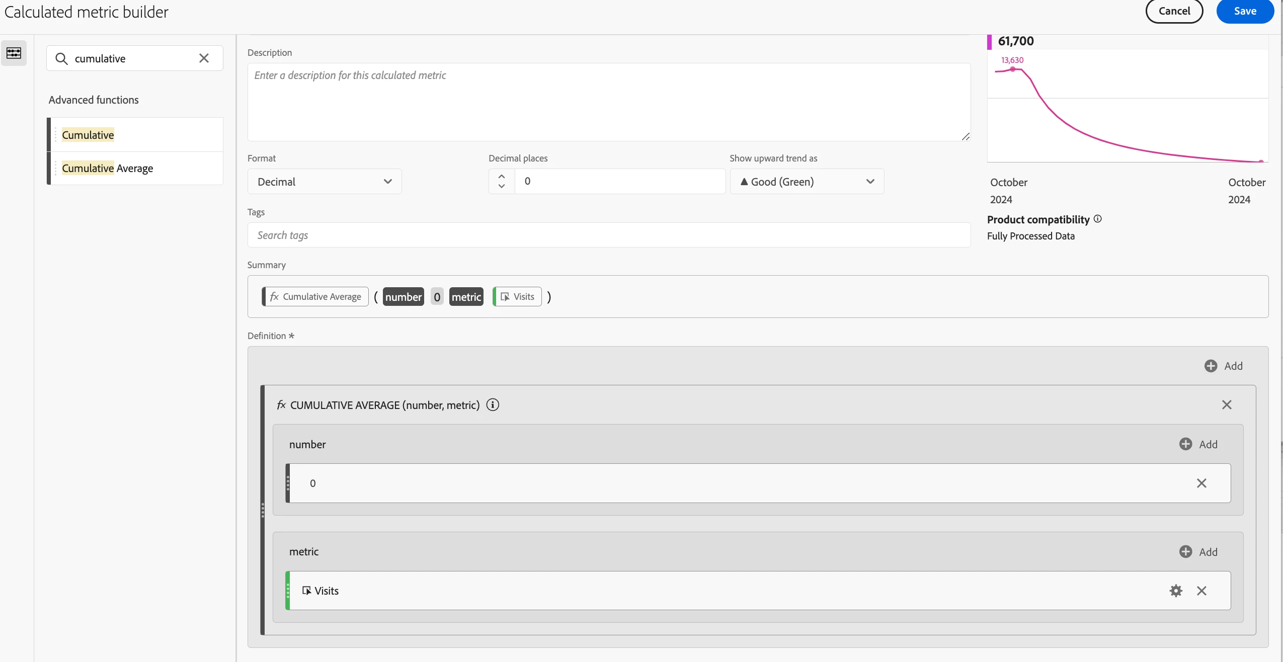
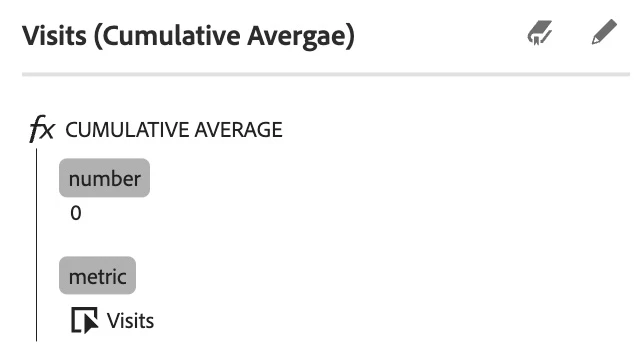
Use 'rolling averages' for comparison: You could create a calculated metric with a Cumulative Average function (found within the 'metric builder'). This will smooth out the fluctuations, making it easier to identify upward or downward trends. IOnce you have done this, place the two date ranges you’re comparing in a table and add the new cumulative average metric below each date range. Then, create a line visualization based on these two ranges to clearly display the comparison. It is not exactly trend lines but rolling averages does give you a broader view of performance up to each point.
Create the metic:
Add date ranges to tabe + the new metric:
Create the line visualization using the table:
With two rolling averages—one for the current period and one for the previous period—you can compare performance and identify whether you metric has improved, stayed consistent, or declined.
These are just some quick ideas that I had , so feel free to write if you need more/other input
Views
Replies
Total Likes
Views
Likes
Replies