Expand my Community achievements bar.

Workspace: Add a way to group related reports and visualizations

Avatar

Level 2

9/1/23

Description -

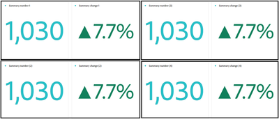
Add a way to group related reports and visualizations. It could be as simple as a container box, like in the attached image. Other options, change background colors, change border colors, etc.


Why is this feature important to you -

We have a few 'snapshot' dashboards that have many summaries, and it would be great to be able to group and differentiate them. This way, you can glance at it, see the overall picture, and not go cross-eyed. We've been adding in text visualizations to give some separation but sometimes it just makes the report long instead of easy to scan.


BTW, we don't rely on these for takeaways and/or alerts, but they are handy for quick glances and answering frequently occurring questions. Some of other dashboard would benefit from this as well, but those are typically more specific.


How would you like the feature to work -

Add a method to group, define, or visually separate two or more reports and/or visualizations. 

Select the items to group, right click, and have the option to group in a box, change background color, change border color, or whatever method is implemented to do this. While multiple ways to differentiate would be okay, I think only one is needed.


Current Behaviour -

The only distinguishing feature currently is the description. 


Sample data: obviously just the same two summaries in each 'group' but it's easy to see in this display that there are four separate chunks of information.


ctro_0-1693593817719.png


4 Comments

Avatar

Community Advisor and Adobe Champion

9/1/23

@ctro I understand the frustration.


The way the majority of us do this today is by pulling in a text Visualization from the components window and then typing a title into it. 

jeff_bloomer_1-1693599220011.png

You can even add a description, if needed (or not, so it just shows the title like I did).  Size it to fit over your Summary Visualizations, and then you would have the groupings you're talking about - like what I pulled out of our sandbox environment to demonstrate here:

jeff_bloomer_2-1693599349596.png

Hope this helps you for now.  This situation confounded me for quite a while, but it does make things just a little bit easier for organization purposes.  


Avatar

Level 10

9/1/23

I've done the same thing, using a text box. It's like adding an html rule line (a feature in Omniture dashboards) with a text description. Often I will use the edit description description part of the text box and suppress the text box title by using a period (no title is not an option). The edit description functionality has more font controls than the title.

Avatar

Community Advisor and Adobe Champion

9/5/23

@RobertBlakeley Agreed.  I hate the fact that you can't NOT use the title, but it kind of makes sense.  But I've also done exactly what you're talking about to go one step further to describe a section and even provide images, etc. so I have a section header.

Avatar

Level 2

9/6/23

I appreciate the suggestions, but we already use the text box to differentiate our visualizations and data.

I still think a way to clearly separate and group data would be beneficial.