Expand my Community achievements bar.

Better Workspace Formatting for Component Alignment

Avatar

Community Advisor and Adobe Champion

12/20/23

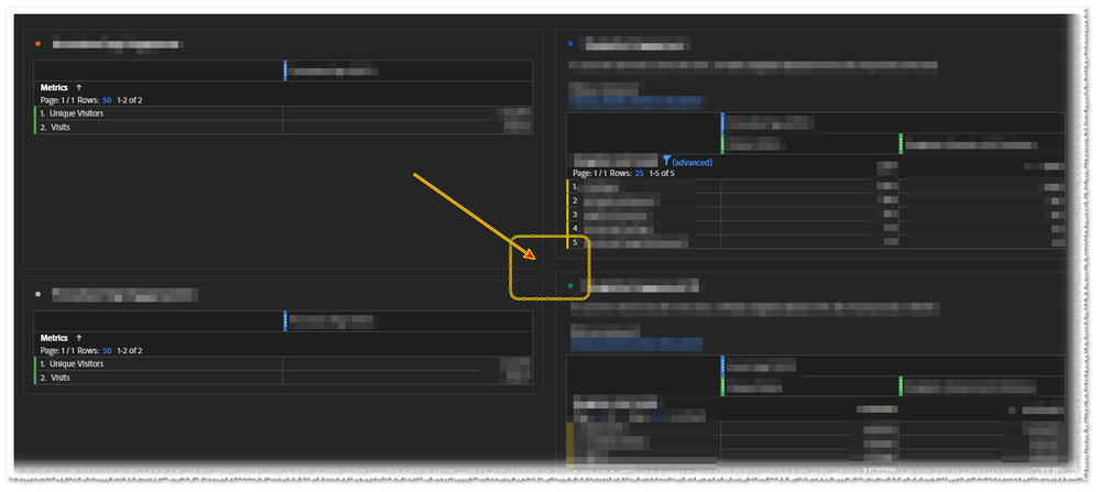
Description - We need the ability to work within and make our Workspace projects more aesthetically aligned and not have to worry about one component being slightly taller than another.  In other words, I should be able to cleanly size one component, especially one that has empty space in it, to be the same size as another one right next to it that DOES contain data.

Why is this feature important to you - This feature allows for easy alignment of data that is alike and easily segregates other pieces of data that are not the same.  It allows for proper line of sight and does not distract the data viewer when attempting to inform data storytelling.

How would you like the feature to work - I would prefer that I could simply click and drag on the border of a component and size it to the same height or width of its neighboring component and it would remain exactly the same size or height as that component next to it without snapping to a different size higher or lower.

Current Behavior - Currently, if I resize a component, it snaps to a size it prefers, whether it matches the neighboring component, leaving other components out of alignment and completely ruining both the line of sight and the aesthetic.
jeff_bloomer_0-1703111660697.png
6 Comments

Avatar

Community Advisor and Adobe Champion

12/20/23

Yes! The slightly off containers drives me crazy! I often use empty Text containers (as "headers" within my report) to get blocks re-aligned so that my whole report isn't wonky.

Avatar

Community Advisor and Adobe Champion

12/21/23

@RobertBlakeley At times a Horizontal Rule tag would be nice to throw in for flow, but honestly, it would be nice if I didn't have to pollute the page with "extra stuff" just to make up for Workspace's shortcomings. wink.png


Avatar

Community Advisor and Adobe Champion

12/21/23

I want all of the above... proper "Title" items (something a little more condensed, and with the ability to control font on the Title), Horizontal Rules, and the ability to resize blocks to the same height.


That way I can Title where I need, use horizontal rules to create visual breaks without the need for a new title, and where content is related, just have the blocks able to line up properly to keep a nice clean layout. Is that too much to ask? 

Avatar

Community Advisor and Adobe Champion

12/21/23

All of this!

Setting up my dashboards so they are visually appealing is one of the most difficult aspects because of the limitations.