Enhance the Format of Your Dashboards to Increase Clarity Around Data
Change the Color Palette of Your Dashboard
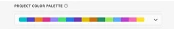
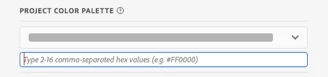
Changing the color palette may be necessary to ensure the accuracy and inclusion of all data points in your visualizations. For instance, if a color in your palette is too light, it may be hard for your audience to interpret your analysis accurately. Change the look of your data visualizations by using the Project Color Palette. Use pre-configured color palettes for your project, or create a custom color palette. For instance, below are the HEX codes for the colors I’d like to use for this dashboard:
- Black: #000000
- Red: #FF0000
- Blue: #0000FF
- Gold: #FFD700
How to Build:
- Go to Workspace > Create Project > Project > Project Info and Settings
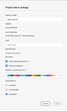
- Go to Project Info and Settings > Project Color Palette
Go to Project Color Palette > Custom Palette
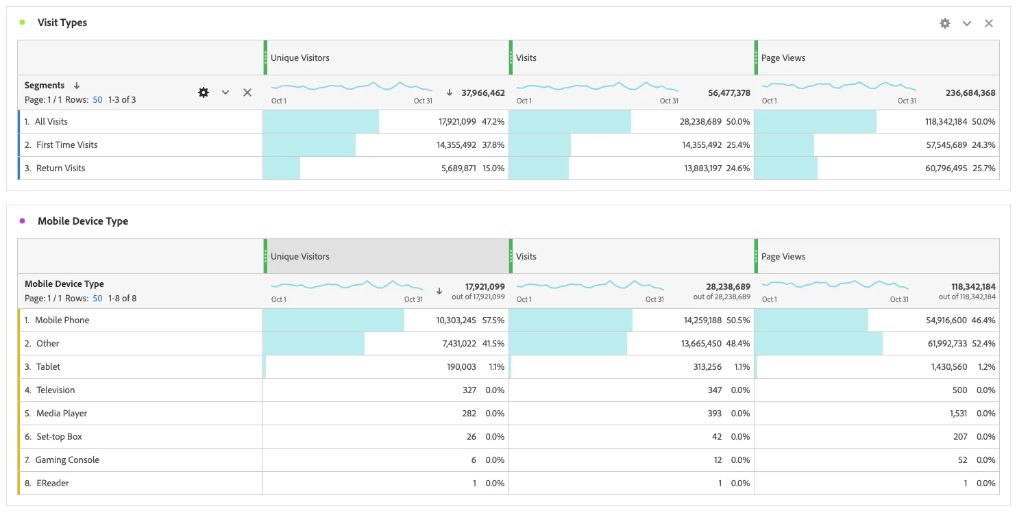
Update the View of Your Freeform Tables
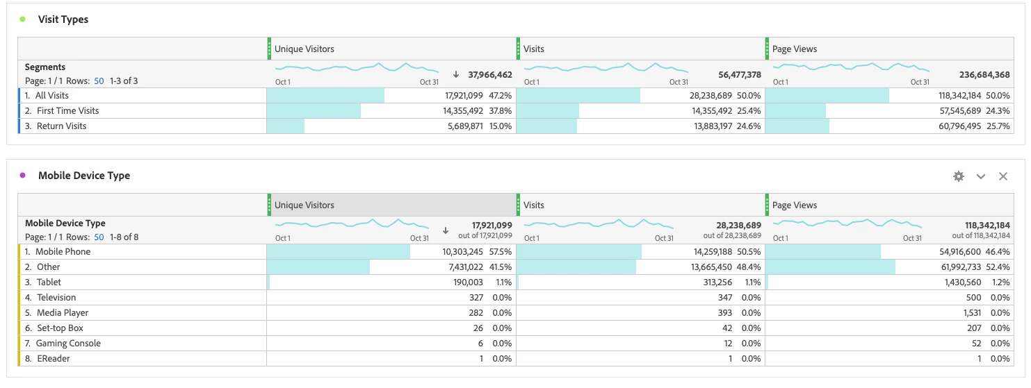
Properly formatted, intuitive Freeform tables will enable your organization to identify, assess, and derive actionable insights. The three “Density View” options can help analysts highlight trends or patterns in the data. Depending upon the amount of data you are analyzing, changing the density of your data views may aid your audience in better understanding your crucial data points. For instance, a smaller row height lets the user view more data without scrolling. However, it creates challenges around analysis which can lead to parsing errors. As a result, identify the audience who will be viewing and deriving insights from the dashboard to adjust the density view accordingly.
How to Build:
- Go to Project Info and Settings > Density View
- View Density > Compact View. This is the version with the most condensed view.
 . 2. View Density > Comfortable View. This leaves a little more padding than the Compact version.
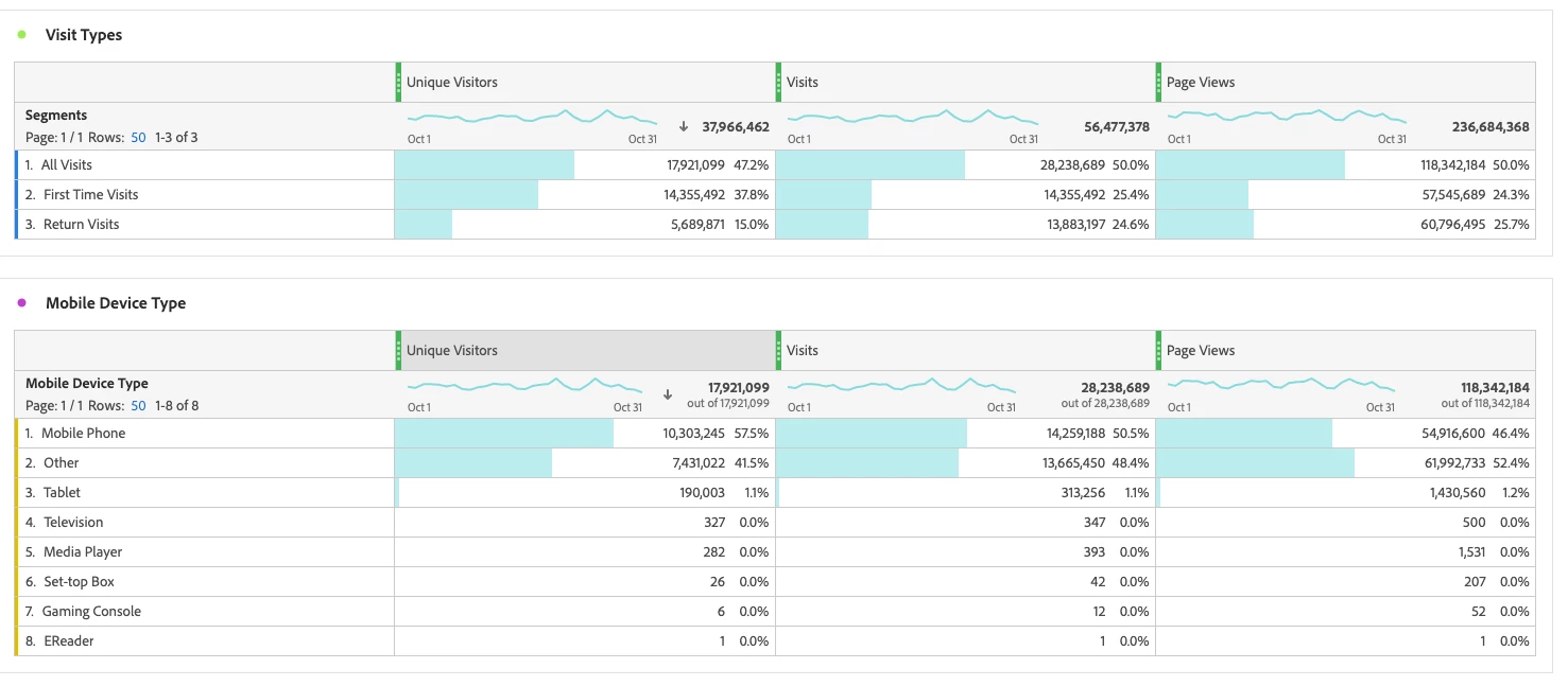
3. View Density > Expanded View. This is the view you are used to in Workspace.