

Demystifying Data #2: The Cuts Depend on the Dishes
Hi everyone, I’m back with the second edition of Demystifying Data. In this one we’re exploring How to look at our data by examining Why we’re looking at it in the first place, continuing the Less Is More (LIM) approach. In case you’re wondering what that is (and the mysterious origins of my kitchen-oriented metaphors) have a look here.
Alright, to use an analogy, let’s look at… Onions. Onions are like Data (and Ogres!) in the way that they have layers. Just as there is no one way to cut, slice, or dice onions; it depends on the dish; there is no one way to manipulate data to give results. However, in both cases we can always begin by asking questions.
To make this post more meaningful, I’ve included quite a few screenshots so that you can (literally) visualize what we’re talking about. If you’re new to data, Excel, or both: it would help if you sat on your screen and replicated the steps outlined to get a more hands-on feeling for it. (again, quite literally).
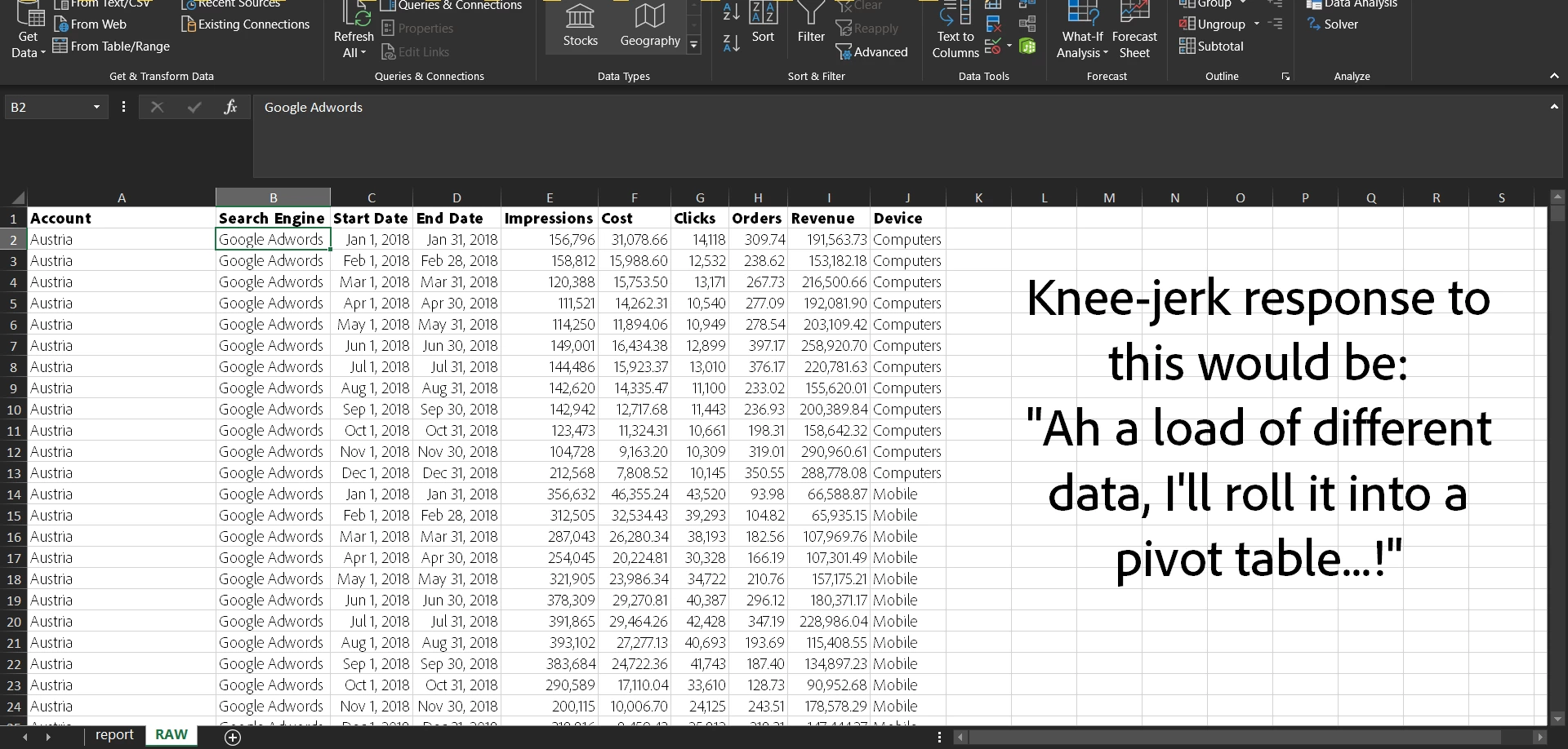
Before we begin, let me present a screenshot of my data set. It is one that should be very familiar to most marketers digital or otherwise.
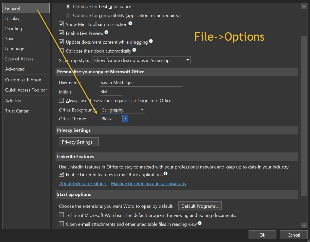
(Bonus: If you read to the end of the article, I’ll show you how to turn on Dark Mode for Office if you haven’t already!)
Pandora’s Box – as we can see it contains data for different countries and devices
Pivoting Pandora – And then we pivot it to find numerous inconsistencies with the data (the onions need to be washed!)
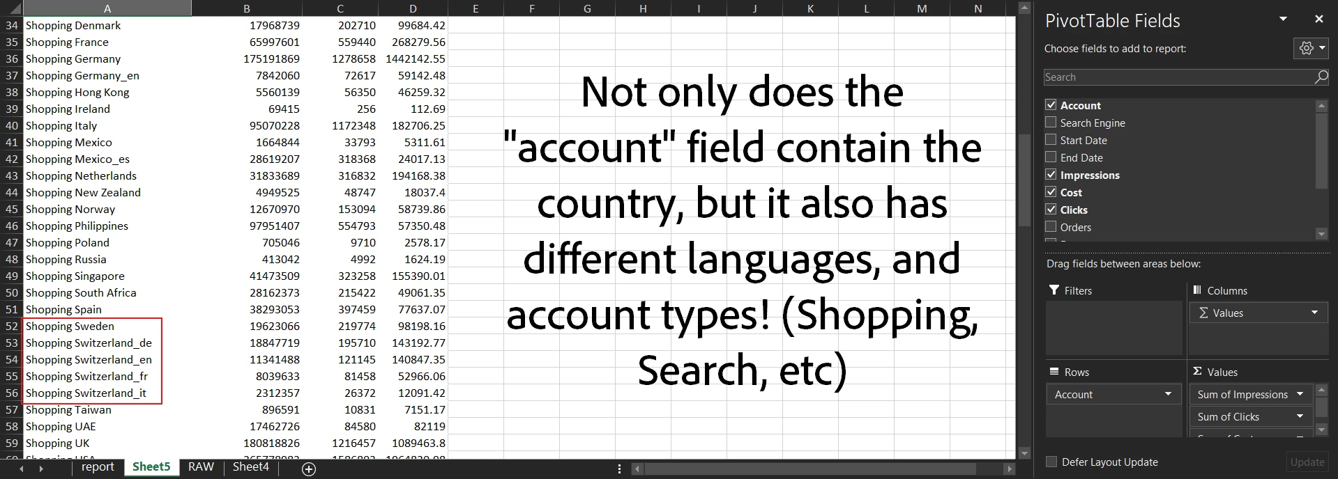
Going into the depths and details of data cleaning is beyond the scope of this article, but in this case we’ll have to clean and peel the data before we can cut it, and just like with onions: it’s going to make us shed a tear or two… (Yes, I’m really proud of myself for this one).
Questions to Think About (QTA)
- What new data points can the “Account” field give us?
- Account Type viz. Search or Shopping
- Account Language
- Account Country
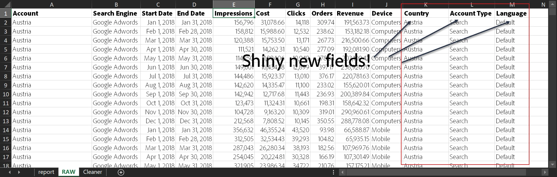
Using MS Excel’s most useful Text to Column and Filters functionalities, we add each piece of information to a new field. So going by the QTA above, we should have 3 new fields and our data should look like this:
Cleaned up data + Assumptions – I’ve assumed any account that’s not Shopping is Search, any language that’s not mentioned is the Default, and all the currencies are in USD
Finally, we have our cuts (the onions, nicely chopped up) however we need to decide what dish we’re going to make. Let’s explore our data by looking at the options. Time for another round of QTA.
QTA #2
- What are the top countries in terms of revenue or LIM Countries? (refer to the previous article for more details on LIM)
- Compare how devices differ in percentage contribution to revenue
- Compare Search and Shopping Cost per Orders
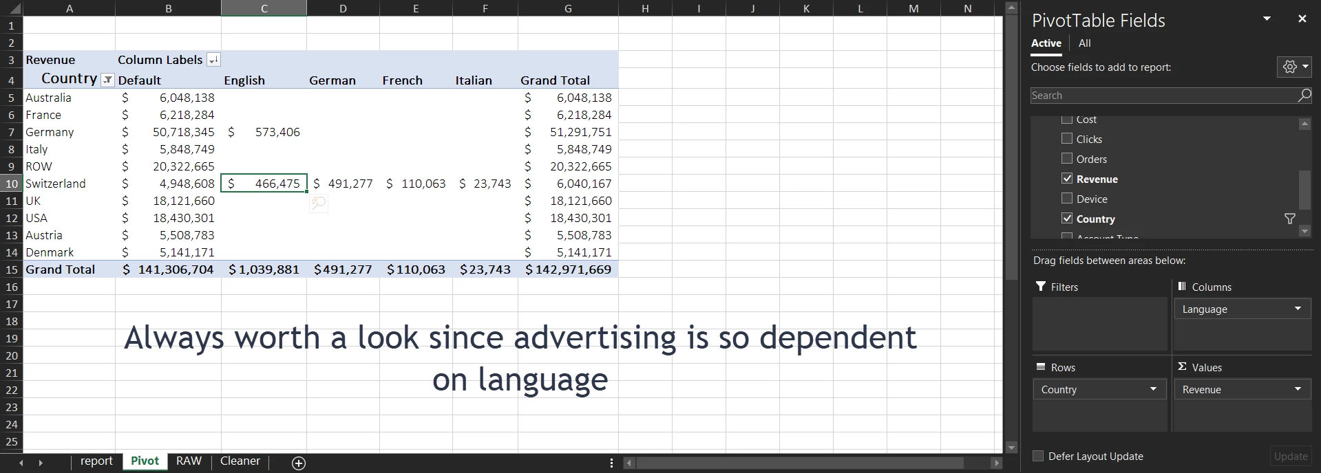
LIM Countries by Revenue – Now that our data is sliced nicely, it’s just a few steps before we have our top revenue Countries lined up
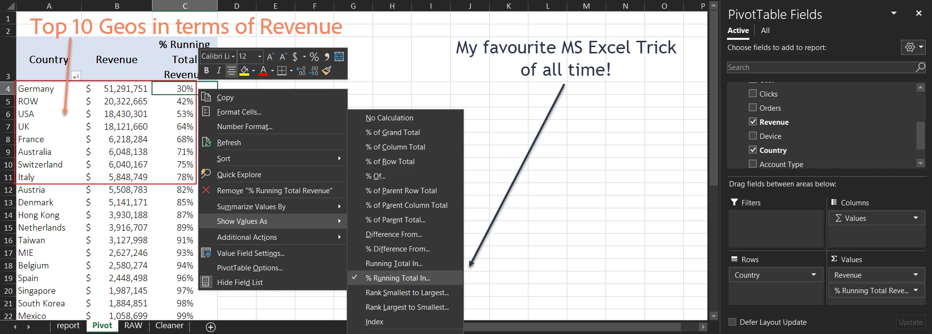
Point of Interest
- Just Germany consists of 30% revenue
- Let’s look deeper into just the top countries
Checking for language distribution – Nothing of particular note except that Switzerland seems linguistically diverse
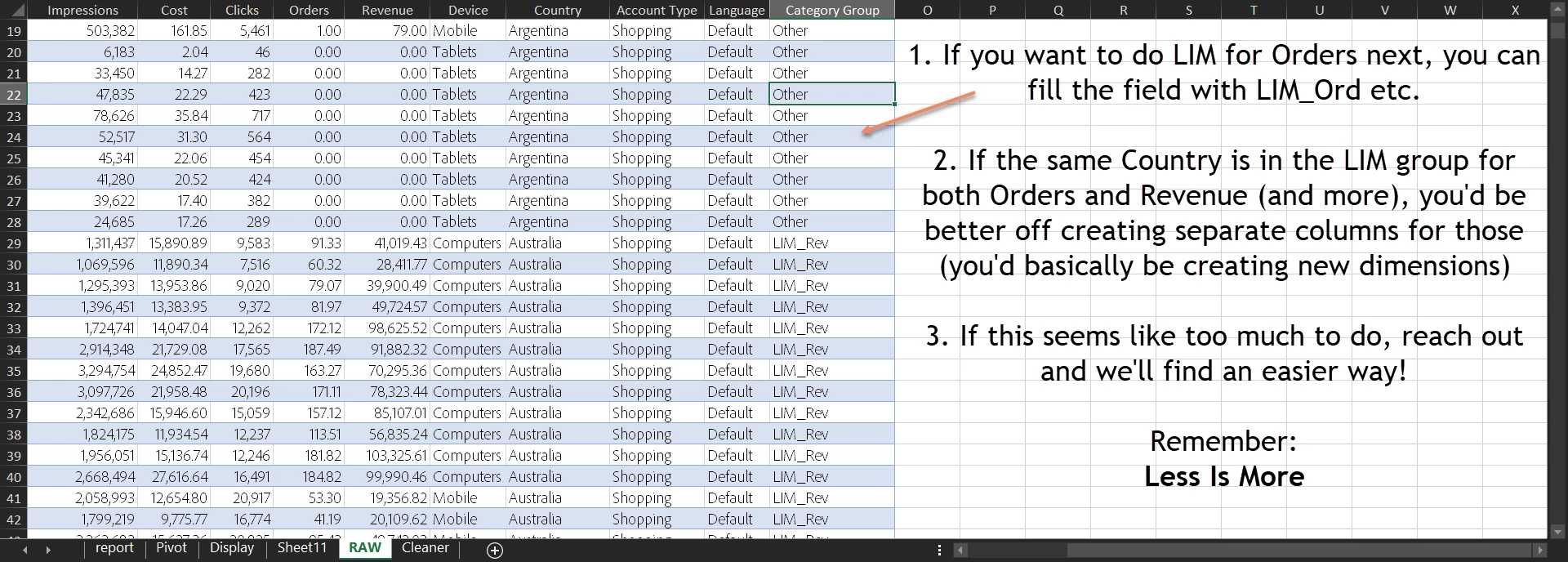
One thing I like to do is to keep my grouped countries together. Let’s create a new field called “Category Group” that will have the value “LIM_Rev” for the top 10 (remember, you can take 5, 20, etc.) revenue contributing countries and add it to the RAW data as a dimension (more on those later). This grouping then allows me to do quick comparisons and check if the LIM countries are different from the others (besides saving me the time of filtering it individually every time I want the top ten by Revenue, or top ten by Cost etc.)
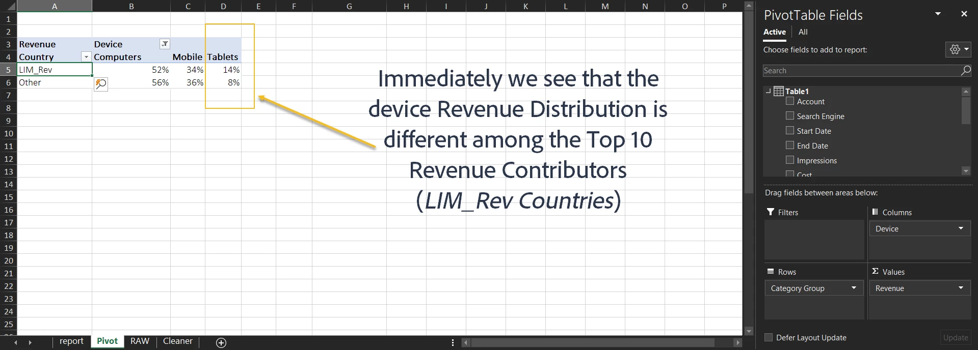
LIM Groupings are Dimensions – see?
Device Spend Distribution – My top Revenue (LIM_Rev) countries seem to skew higher towards tablets… let’s investigate!
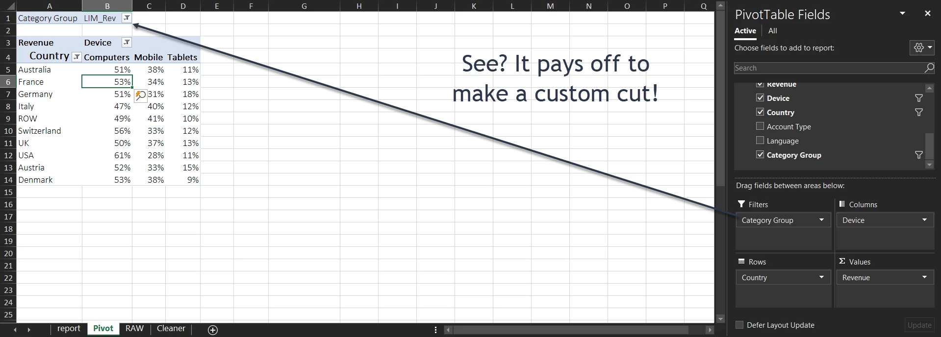
Device Spend Going Deeper… Austria and Germany skew heavily towards tablets, while the US skews towards Desktops (now that we have an idea of the ‘normal’)
Search v/s Shopping – Epic Battle to see who has the lower Cost Per Order + Voila!!!: Single Frame Story!
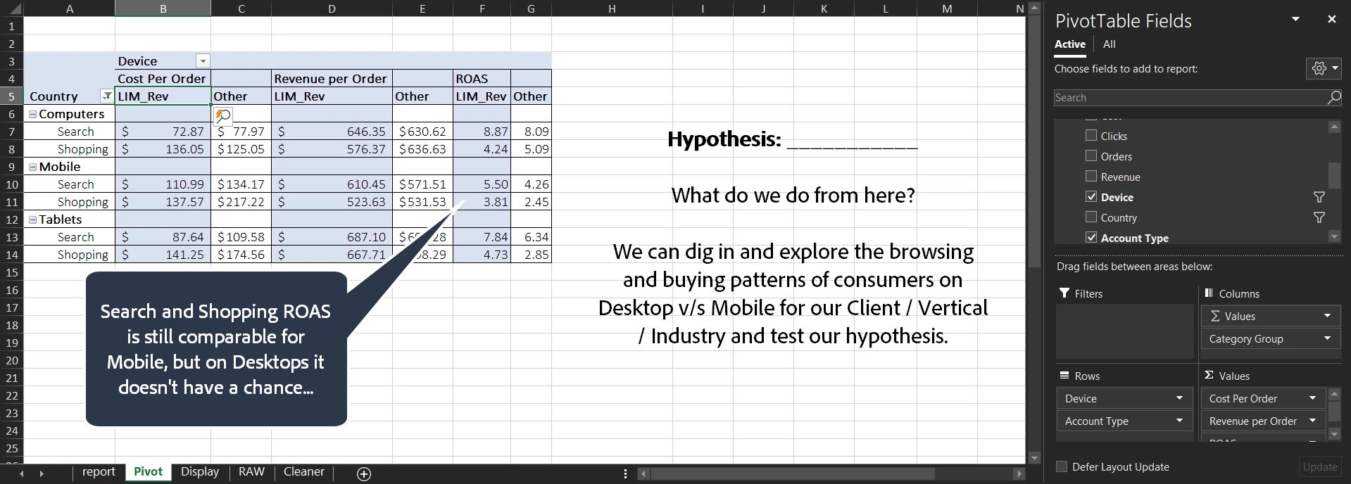
Alright, so I’ll just summarize (and unfortunately for you guys, extend the kitchen metaphor):
- Clean the Data
- Wash thoroughly for further information – remember how we used the ‘Account’ field to get so much more useful info?
- Chop into manageable chunks using the LIM methodology
- Slice useful information (By Device, by Geo, by Type etc.)
- Consume (make sure it’s presentable!)
Thank you for reading, hope it helps you reach your results faster and more efficiently. I’ll be exploring The Art and Science of Storytelling with Data in the next installment of Demystifying Data so be sure to tune in for more!
Bonus Screenshot: Dark Mode!
Please leave a comment below if you have tips on how I can get better at chopping faster (or indeed anything else that you think can be covered).
Sayaning off!