Delivered
Timesheet - Search Feature Pop Up User Experience / User Interface Enhancement
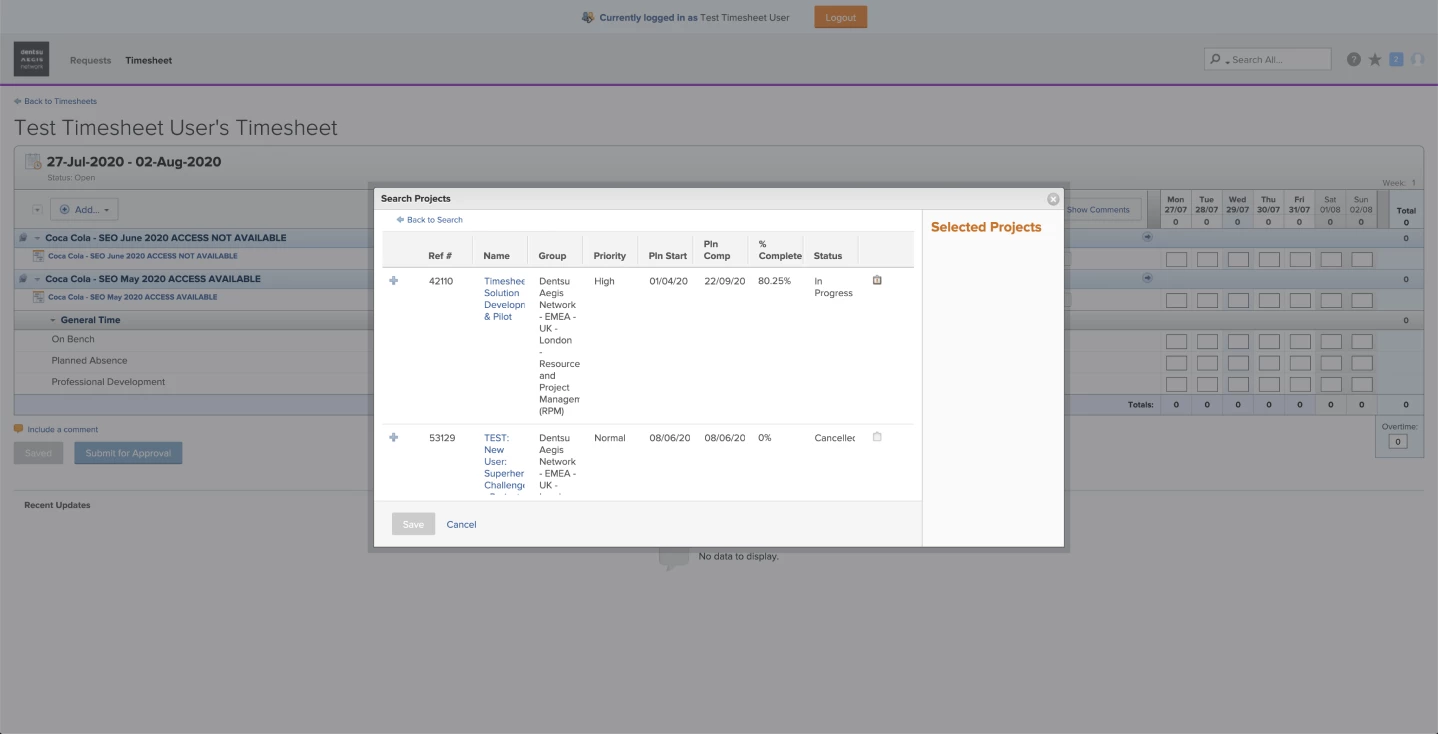
The timesheet pop-up search box is difficult to use and overall needs a facelift.
User Feedback (current design)
- Text is squeezed into short width columns
- Information presented is not helpful for timesheet users
- Lack of a filter to curate the search results
Design Changes (mock-up below)
- Use the full width of the pop-up to present the project details (i.e. name, group, status etc)
- Add a filter which allows the user to refine the list of projects by portfolio, programme, status etc
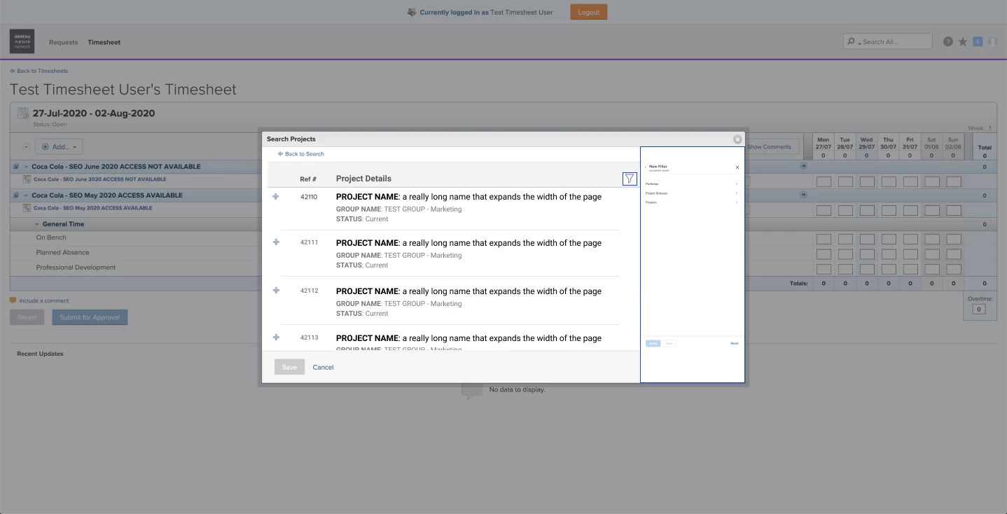
This would really help the end-users locate their projects and complete their timesheet independently of the System Admins.
Best,
Christian