Hi @NickVa1,
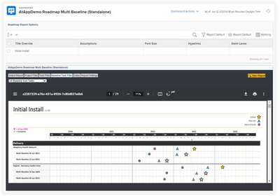
By coincidence, we've just developed a Multi-Baseline report, which will be released as an optional add-in under our Roadmap solution. In short, it lets you:
- tag Tasks with SysAdmin-definable icons (e.g. Approval.png, Go-Live.png)
- set filters for the Projects (e.g. Current), Tasks (e.g. icon-tagged), and Baselines (e.g. created within the last 6 months)
- choose a timeframe (e.g. beginning of this year until 2 years from now)
- set additional options (e.g. use Planned vs Projected Dates, etc.)
- view the report
What then comes back is a row for each Project across the selected timeframe, with an in-color icon for each of the tagged tasks, followed by a row for each baseline matching the filter, with a matching grey icon for each of the tagged tasks...but using the date from the baseline(s):

As a result, you can then see the "slippage" over time as plans moved and baselines (whether Default or not) were taken...which is super cool, and getting dangerously close to the idea I mentioned of eventually animating such slippages.
Happy to chat further with anyone who'd like more information via doug.denhoed@atappstore.com
Regards,
Doug