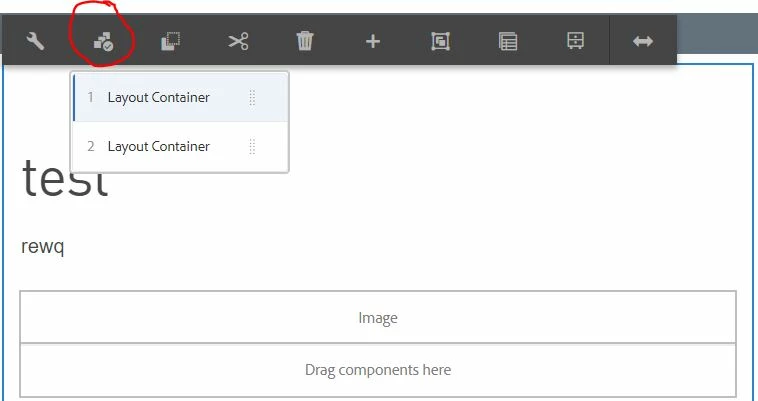
Using "Select Panel" on a custom component
Hi All,
I am doing a deep dive on how the "Select Panel" tool works. I can't find much information about it and am stuck.
I've been examining the WCM Core Components Tabs/Carousel/Accordion that use "Select Panel". These use a "childeditor" resourceType, which means that authors pick components in the dialog. I want to create a component that has sections with an optional hidden layout container. "Select Panel" is then used to select which is active similar to how the Carousel or Tab bring a specific panel into view.
For this experiment, I created a coral3 multifield dialog with a Title, Text, and Container checkbox. If checked, a container is inserted (resourceType='wcm/foundation/components/responsivegrid').
I was able to register the component to panelcontainer, but I can't get it to do anything. This is where I am stuck:
1) How can I pass the Title field as the Component name instead of it's defaulting to "Layout Container"?
2) It doesn't move, select, or re-order. It acts like it might, but it does nothing. Is there an event listener registration step I missed? I tried moving and nothing reorders. I tried selecting and do not see any classes changing when looking at Inspect Elements.
3) Can "Move" be disabled?

HTL
<sly data-sly-use.props="com.pnc.core.models.DemoPanelSelector">
<div data-sly-list.demo="${props.demoItems.listChildren}"
class="cmp-demoPanelSelector"
data-cmp-is="demoPanelSelector">
<h2>${demo.title}</h2>
<p>${demo.text}</p>
<sly data-sly-test="${demo.hasContainer}" data-cmp-hook-demopanelselector="item">
<div class="cmp-demoPanelSelector__item" data-sly-resource="${ demo.mfRef @ resourceType='wcm/foundation/components/responsivegrid'}"></div>
</sly>
</div>
</sly>
cq:EditConfig
<?xml version="1.0" encoding="UTF-8"?>
<jcr:root xmlns:cq="http://www.day.com/jcr/cq/1.0" xmlns:jcr="http://www.jcp.org/jcr/1.0"
jcr:primaryType="cq:EditConfig">
<cq:listeners
jcr:primaryType="cq:EditListenersConfig"
afterchilddelete="CQ.CoreComponents.panelcontainer.v1.AFTER_CHILD_DELETE"
afterchildinsert="CQ.CoreComponents.panelcontainer.v1.AFTER_CHILD_INSERT"
afterchildmove="CQ.CoreComponents.panelcontainer.v1.AFTER_CHILD_MOVE"/>
</jcr:root>
editorhook.js
(function(channel) {
"use strict";
channel.on("cq-editor-loaded", function(event) {
if (window.CQ && window.CQ.CoreComponents && window.CQ.CoreComponents.panelcontainer &&
window.CQ.CoreComponents.panelcontainer.v1 && window.CQ.CoreComponents.panelcontainer.v1.registry) {
window.CQ.CoreComponents.panelcontainer.v1.registry.register({
name: "cmp-demoPanelSelector",
selector: ".cmp-demoPanelSelector",
itemSelector: "[data-cmp-hook-demopanelselector='item']",
itemActiveSelector: ".cmp-demoPanelSelector__item--active"
});
}
});
})(jQuery(document));
cq:Dialog
<?xml version="1.0" encoding="UTF-8"?>
<jcr:root xmlns:sling="http://sling.apache.org/jcr/sling/1.0" xmlns:cq="http://www.day.com/jcr/cq/1.0"
xmlns:jcr="http://www.jcp.org/jcr/1.0" xmlns:nt="http://www.jcp.org/jcr/nt/1.0"
xmlns:granite="http://www.adobe.com/jcr/granite/1.0"
jcr:primaryType="nt:unstructured"
jcr:title="Basic Demo Panel Container Test"
sling:resourceType="cq/gui/components/authoring/dialog"
extraClientlibs="[core.pnc.components.demoPanelSelector.v1.editor]">
<content
jcr:primaryType="nt:unstructured"
sling:resourceType="granite/ui/components/coral/foundation/container">
<items jcr:primaryType="nt:unstructured">
<tabs
jcr:primaryType="nt:unstructured"
sling:resourceType="granite/ui/components/coral/foundation/tabs"
maximized="{Boolean}true">
<items jcr:primaryType="nt:unstructured">
<Basic
jcr:primaryType="nt:unstructured"
jcr:title="Basic"
sling:resourceType="granite/ui/components/coral/foundation/fixedcolumns"
margin="{Boolean}false">
<items jcr:primaryType="nt:unstructured">
<column
jcr:primaryType="nt:unstructured"
sling:resourceType="granite/ui/components/coral/foundation/container">
<items jcr:primaryType="nt:unstructured">
<multifieldcollection
jcr:primaryType="nt:unstructured"
sling:resourceType="granite/ui/components/coral/foundation/form/multifield"
composite="{Boolean}true"
fieldDescription="Click + to add a new item"
fieldLabel="Multifield collection"
name="./multiCol">
<field
jcr:primaryType="nt:unstructured"
sling:resourceType="granite/ui/components/coral/foundation/container"
name="./demoItems">
<items jcr:primaryType="nt:unstructured">
<mfRef
jcr:primaryType="nt:unstructured"
sling:resourceType="granite/ui/components/foundation/form/hidden"
name="./mfRef"
granite:class="mf-ref"
value=""/>
<title
jcr:primaryType="nt:unstructured"
sling:resourceType="granite/ui/components/coral/foundation/form/textfield"
fieldDescription="Add a title"
fieldLabel="Title"
name="./title"/>
<text
jcr:primaryType="nt:unstructured"
sling:resourceType="granite/ui/components/coral/foundation/form/textfield"
fieldDescription="Add Text"
fieldLabel="Text"
name="./text"/>
<hasContainer
jcr:primaryType="nt:unstructured"
sling:resourceType="granite/ui/components/coral/foundation/form/checkbox"
text="Include Container"
fieldDescription="Check this box to add a container"
name="./hasContainer"
value="{Boolean}true"
uncheckedValue="{Boolean}false"/>
</items>
</field>
</multifieldcollection>
</items>
</column>
</items>
</Basic>
</items>
</tabs>
</items>
</content>
</jcr:root>
DemoPanelSelector.java
package com.pnc.core.models;
import javax.inject.Inject;
import org.apache.sling.api.resource.Resource;
import org.apache.sling.models.annotations.*;
@Model(
adaptables = Resource.class,
defaultInjectionStrategy=DefaultInjectionStrategy.OPTIONAL
)
public class DemoPanelSelector {
@Inject
private Resource demoItems;
public Resource getDemoItems() {
return demoItems;
}
}
content.xml of component
<?xml version="1.0" encoding="UTF-8"?>
<jcr:root xmlns:cq="http://www.day.com/jcr/cq/1.0" xmlns:jcr="http://www.jcp.org/jcr/1.0"
cq:icon="panel"
cq:isContainer="{Boolean}true"
jcr:description="A Demo Component to test the PanelContainer selector in AEM"
jcr:primaryType="cq:Component"
jcr:title="Demo Panel Selector"
componentGroup="PNC.COM Core Components"/>
Message was edited by: relaxabyte-corp