Expand my Community achievements bar.

Learn about Edge Delivery Services in upcoming GEM session
SOLVED

OOTB support for a table component

Avatar

Level 1

Looking to build a table component where in the author could control how many rows/columns/cells they would want. This does not seem to be a core component at this point, is there any OOTB support for such a component or would it have to built as a custom component?

1 Accepted Solution

Avatar

Correct answer by
Level 4

Hi  @aemuser29 ,


Adding to the solutions provided by the @SantoshSai  , You will get the plain table only with edit text(how to enable configuration is already provided Reference answer)

Please check out the below link for the table styles configuration for classic UI only for the further customization:- 

https://experienceleague.adobe.com/docs/experience-manager-65/administering/operations/configure-ric...


The above limitation of classic UI will add some restriction to the project as mostly we will surely have custom tables designs as per website themes.


So, for custom table theming solutions:

1. Paste the table html with css directly in the rich text using source edit options or use source edit to add table css classes to exiting table create using the table plugins (becomes tedious for the content authors and will crop up lot of issues due to incorrect authoring)

bipinchandra92_0-1654369010914.png

2.(Recommended Solutions) Use the custom nested multifield to generate the table as per our custom css theme requirements. Sample reference for nested multifield:  https://levelup.gitconnected.com/aem-how-to-use-nested-multifields-in-your-components-using-a-sling-...

(You need to customize and configure your row and column numbers separately for proper table generation).

View solution in original post

4 Replies

Avatar

Community Advisor
  • You can use text component and enable table feature through design dialog.

Avatar

Community Advisor

Hi @aemuser29 

There are plenty options you can consider for the same

  • Create custom component and enable table plugin as is it for text component
  • Create custom component, extend to text component and enable plugin.
  • Can use Text component for the same.

Screen Shot 2022-06-04 at 12.46.03 PM.png
How to enable it?
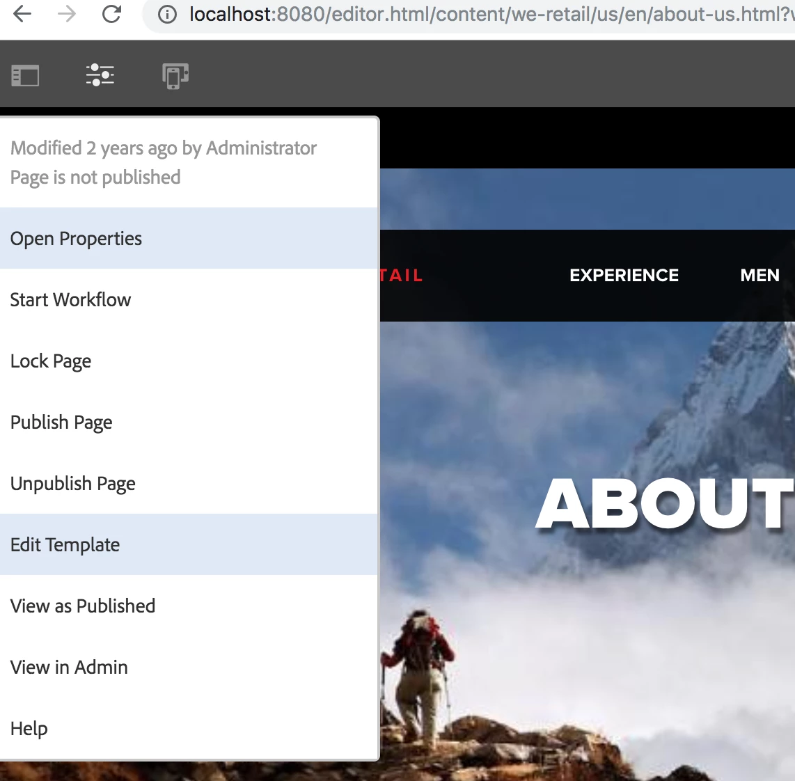
The design appears in the side panel if the user is using static templates. For editable templates we can enable components feature by going to the template editor mode follow below steps

From page properties, click on "Edit Template" option

Screen Shot 2018-12-29 at 11.54.25 AM.png

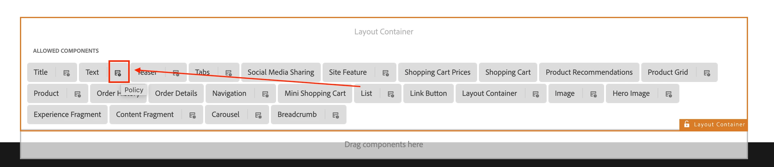
Which takes to below page and we can add the required components in layout container (Click on second option)

http://<host>:<port>/editor.html/conf/we-retail/settings/wcm/templates/hero-page/structure.html
Screen Shot 2022-06-04 at 1.13.16 PM.png

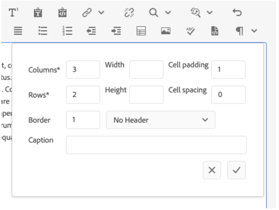
Note: The edit dialog features in-line editing with limited options with full functionality available in the full-screen edit dialog. Using the design dialog, text formatting options such as headings, special characters, and paragraph styles can be configured for the template for the content author.


Reference: https://experienceleague.adobe.com/docs/experience-manager-core-components/using/components/text.htm...

Hope that helps!

Regards,
Santosh

Avatar

Correct answer by
Level 4

Hi  @aemuser29 ,


Adding to the solutions provided by the @SantoshSai  , You will get the plain table only with edit text(how to enable configuration is already provided Reference answer)

Please check out the below link for the table styles configuration for classic UI only for the further customization:- 

https://experienceleague.adobe.com/docs/experience-manager-65/administering/operations/configure-ric...


The above limitation of classic UI will add some restriction to the project as mostly we will surely have custom tables designs as per website themes.


So, for custom table theming solutions:

1. Paste the table html with css directly in the rich text using source edit options or use source edit to add table css classes to exiting table create using the table plugins (becomes tedious for the content authors and will crop up lot of issues due to incorrect authoring)

bipinchandra92_0-1654369010914.png

2.(Recommended Solutions) Use the custom nested multifield to generate the table as per our custom css theme requirements. Sample reference for nested multifield:  https://levelup.gitconnected.com/aem-how-to-use-nested-multifields-in-your-components-using-a-sling-...

(You need to customize and configure your row and column numbers separately for proper table generation).

Avatar

Level 4

once try this piece of code. adding it to the cq:dialog


<description
jcr:primaryType="nt:unstructured"
sling:resourceType="cq/gui/components/authoring/dialog/richtext"
cq-msm-lockable="./description"
fieldDescription="Add description of the page"
fieldLabel="Description"
name="./description"
required="true"
useFixedInlineToolbar="{Boolean}true">
<rtePlugins jcr:primaryType="nt:unstructured">
<links jcr:primaryType="nt:unstructured">
<linkDialogConfig
jcr:primaryType="nt:unstructured"
height="{Long}316">
<linkAttributes jcr:primaryType="cq:WidgetCollection"/>
</linkDialogConfig>
</links>
<format
jcr:primaryType="nt:unstructured"
features="*"/>
<lists
jcr:primaryType="nt:unstructured"
features="*"/>
<justify
jcr:primaryType="nt:unstructured"
features="*"/>
<keys
jcr:primaryType="nt:unstructured"
features="*"/>
<paraformat
jcr:primaryType="nt:unstructured"
features="*"/>
<misctools
jcr:primaryType="nt:unstructured"
features="*"/>
<fullscreen
jcr:primaryType="nt:unstructured"
features="*"/>
<subsuperscript
jcr:primaryType="nt:unstructured"
features="*"/>
<findreplace
jcr:primaryType="nt:unstructured"
features="*"/>
<edit
jcr:primaryType="nt:unstructured"
features="*"/>
<table
jcr:primaryType="nt:unstructured"
features="*"/>
<image
jcr:primaryType="nt:unstructured"
features="*"/>
<spellcheck
jcr:primaryType="nt:unstructured"
features="*"/>
<undo
jcr:primaryType="nt:unstructured"
features="*"/>
<styles
jcr:primaryType="nt:unstructured"
features="*">
<styles jcr:primaryType="cq:WidgetCollection">
<employee
jcr:primaryType="nt:unstructured"
cssName="employee"
text="Employee Style"/>
<partner
jcr:primaryType="nt:unstructured"
cssName="partner"
text="Partner Style"/>
<customer
jcr:primaryType="nt:unstructured"
cssName="customer"
text="Customer Style"/>
</styles>
</styles>
<color-picker
jcr:primaryType="nt:unstructured"
features="*"/>
<highlight-color-picker
jcr:primaryType="nt:unstructured"
features="*"/>
</rtePlugins>
<uiSettings jcr:primaryType="nt:unstructured">
<cui jcr:primaryType="nt:unstructured">
<inline
jcr:primaryType="nt:unstructured"
toolbar="[format#bold,format#italic,format#underline,subsuperscript#subscript,subsuperscript#superscript,edit#cut,edit#copy,edit#paste-default,edit#paste-plaintext,edit#paste-wordhtml,links#modifylink,links#unlink,findreplace#find,findreplace#replace,undo#undo,undo#redo,justify#justifyleft,justify#justifyright,justify#justifycenter,lists#unordered,lists#ordered,lists#outdent,table#createoredit,table#removetable,lists#indent,misctools#sourceedit,misctools#specialchars,#paraformat,#styles,fullscreen#finish,fontstyles#styles,color-picker#textColorPicker,highlight-color-picker#textHighlightColorPicker]">
<popovers jcr:primaryType="nt:unstructured">
<styles
jcr:primaryType="nt:unstructured"
items="styles:getStyles:styles-pulldown"
ref="styles"/>
<paraformat
jcr:primaryType="nt:unstructured"
items="paraformat:getFormats:paraformat-pulldown"
ref="paraformat"/>
</popovers>
</inline>
<dialogFullScreen
jcr:primaryType="nt:unstructured"
toolbar="[format#bold,format#italic,format#underline,subsuperscript#subscript,subsuperscript#superscript,edit#cut,edit#copy,edit#paste-default,edit#paste-plaintext,edit#paste-wordhtml,links#modifylink,links#unlink,findreplace#find,findreplace#replace,undo#undo,undo#redo,justify#justifyleft,justify#justifyright,justify#justifycenter,lists#unordered,lists#ordered,lists#outdent,table#createoredit,table#removetable,lists#indent,misctools#sourceedit,misctools#specialchars,#paraformat,#styles,fullscreen#finish,fontstyles#styles,color-picker#textColorPicker,highlight-color-picker#textHighlightColorPicker]">
<popovers jcr:primaryType="nt:unstructured">
<styles
jcr:primaryType="nt:unstructured"
items="styles:getStyles:styles-pulldown"
ref="styles"/>
<paraformat
jcr:primaryType="nt:unstructured"
items="paraformat:getFormats:paraformat-pulldown"
ref="paraformat"/>
</popovers>
</dialogFullScreen>
</cui>
</uiSettings>
</description>