Hi Team,
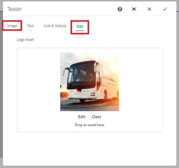
I have created a component named teaser extending teaser from core component, however, I have added one extra node as logo which is image. I want to add two images in the teaser, one is logo and one is teaser background. However, When I drop the image asset only logo image is setting and , image under option image also set to same as logo image. Could you please help. How I can achieve this.
And How I can set the value of Image using Dialog box in HTL code.
Thanks
Solved! Go to Solution.
Views
Replies
Total Likes
Hi @Heena91
Same image is shown as both the places because the same property name is used for both the image fields.
As you are using fileupload resourcetype here please ensure to use a different parameter for "fileReferenceParameter" property so that you can set different image for each of the field.
Now as you mentioned you are extending the core component, you need to add the HTL from core component into your proxy component and read the dialog value in the proxy component and use it.
Thanks!
As suggest I have changed the file name in logo node and override issue was resolved, but I am not able to get both the images. Now only Image added under Image is showing, I need to get both the images in div tags so that I can apply css to this, now m getting only one image
testTeaser.html:
<div data-sly-use.teaser="com.adobe.cq.wcm.core.components.models.Teaser"
data-sly-use.templates="core/wcm/components/commons/v1/templates.html"
data-sly-use.imageTemplate="image.html"
data-sly-use.logoTemplate="logo.html"
data-sly-use.titleTemplate="title.html"
data-sly-use.descriptionTemplate="description.html"
data-sly-use.actionsTemplate="actions.html"
data-sly-test.hasContent="${teaser.imageResource || teaser.logoResource || teaser.title || teaser.description || teaser.actions.size > 0}"
class="cmp-teaser${!wcmmode.disabled && teaser.imageResource ? ' cq-dd-image' : ''}">
class="cmp-teaser${!wcmmode.disabled && teaser.logoResource ? ' cq-dd-image' : ''}">
<sly data-sly-call="${logoTemplate.logo @ teaser=teaser}"></sly>
<sly data-sly-call="${imageTemplate.image @ teaser=teaser}"></sly>
<div class="cmp-teaser__content">
<sly data-sly-call="${titleTemplate.title @ teaser=teaser}"></sly>
<sly data-sly-call="${descriptionTemplate.description @ teaser=teaser}"></sly>
<sly data-sly-call="${actionsTemplate.actions @ teaser=teaser}"></sly>
</div>
</div>
<sly data-sly-call="${templates.placeholder @ isEmpty=!hasContent, classAppend='cmp-teaser'}"></sly>
Thanks!
Views
Replies
Total Likes
Views
Replies
Total Likes
I am using Teaser core component, so am using below html file for teaser, from core components and additionally created logo.html, the way they have created for image. I m new to HTL so, if you can share the syntax to fetch the logo as well, that would be very helpful.
logo.html:
<sly data-sly-template.logo="${@ teaser}">
<div class="cmp-teaser__image" data-sly-test="${teaser.logoResource}" data-sly-resource="${teaser.logoResource}"></div>
</sly>
image.html:
<sly data-sly-template.image="${@ teaser}">
<div class="cmp-teaser__image" data-sly-test="${teaser.imageResource}" data-sly-resource="${teaser.imageResource}"></div>
</sly>
myTeaser.html: (from core components just added logo code in it, the way they did for image)
Views
Replies
Total Likes
Hi @Heena91
While extending the component you need to use the sling:resourceSuperType property and point it to the core component path.
Add only the additional property in the proxy component such as the additional "logo" node.
Now if you want to make changes to any HTL script, copy only the required HTL file from core component into proxy component. No need to copy all the HTL scripts.
As required here all the images are loading from image.html so as you can see you need to copy only the image.html file from core to proxy component and make the required changes.
Please see the screenshot below:
Please try the above steps and let me know if this does not work.
Hope this helps!
Thanks
Views
Replies
Total Likes
I tried the way you suggested, now same problem only logo image is getting set.
image.html:
<sly data-sly-template.image="${@ teaser}">
<div class="cmp-teaser__image" data-sly-test="${teaser.imageResource}" data-sly-resource="${teaser.imageResource}"></div>
<div class="cmp-teaser__image_additional" data-sly-test="${properties.logoReference}">
<img src="${properties.logoReference}" class="cmp-teaser_logo"</div>
</sly>
Views
Replies
Total Likes
@Heena91 Do you have the node name as "logoReference"? The fileReferenceParameter property and the name used in HTL should be same.
Views
Replies
Total Likes
Yes, It worked!!
Thank you so much for your help. I appreciate that.
It would be helpful. If you can guide me some HTL tutorials, which can help me in AEM & how to work with Java classes in AEM
Thanks in Advance!
Views
Replies
Total Likes
Hi @Heena91
Great!
You can refer the below links for HTL:
https://www.netcentric.biz/insights/2015/08/aem-sightly-style-guide.html
http://www.sgaemsolutions.com/2018/03/deep-dive-in-htlsightly-in-aem-63.html
Views
Replies
Total Likes
I want to achieve functionality which is given in below points:
NOTE: I have created navigation component from core components and created language copy and live copies to achieve multi region functionality
1. Once clicked on option in (highlighted below), options should appear to choose the region (countries listed below). How to achieve that??
2. Once hover on that navigation option, dropdown as shown in below image.
And can we created a custom dialog combining different nodes from different core components?? If yes, how to call them in one HTL or need to add each and every corresponding HTL from core components??
Thanks!
Views
Replies
Total Likes
Hi @Heena91
To achieve multi region functionality dropdown as shown below, you can use the "Navigation" component from core components without any customization and configure the path till global which holds the content for other regions. You might need to restructure the content if required. It can be easily achieved.
Hover effect on the navigation item should show the dropdowns like shown below also can be achieved using the "Navigation" component with minor customization like an additional image fields needs to be shown. I believe you can keep the image on the page property and then read it from the page value and populate in the navigation component. This way very minor backend logic update will be required for the navigation model.
Review the link to understand more about the Sling Model customization for core components: https://experienceleague.adobe.com/docs/experience-manager-core-components/using/developing/customiz...
Just the styling needs to be handled to achieve the desired layout.
Yes, we can create a custom component by referring different nodes from different dialogs using "granite/ui/components/coral/foundation/include" resource type. The node name and all other property will be defined in the base component and child component node will have only 3 property for each node i.e.:
<prop1
jcr:primaryType="nt:unstructured"
sling:resourceType="granite/ui/components/coral/foundation/include"
path="test/components/content/dialogshared/content/items/column/items/headline"/>
<prop2
jcr:primaryType="nt:unstructured"
sling:resourceType="granite/ui/components/coral/foundation/include"
path="test/components/content/dialogshared/content/items/column/items/title"/>
To call in HTL, we need to use the same property name i.e. used in parent component i.e. if the parent component is storing the value as ./property1 then it will be ${property.property1} and so on...
Thanks!
Views
Replies
Total Likes
I have few questions regarding custom component. I created teaser extending core component and I have add one extra node logo. It working fine.
As suggested by you, I have kept only logo node in proxy component & image.html.
However, If I want to add my html structure how I can do that.
1. I can call the node properties in one file Eg:MyTeaser.html (having my html structure)
2. Or I have to write title.html, image.html. description.html and call all these files in MyTeaser.html
3. Or I can add the code in image.html
What is recommended approach to use in this case??? so that my teaser styles are not conflicting with core component
My HTML/CSS that I want to apply:
<sly data-sly-template.image="${@ teaser}">
<div class="portfolio-v1">
<div class="portfolio-content">
<div class="portfolio-images">
<div class="gallery-popup">
<div class="item-image">
<img src="${teaser.imageResource}" data-sly-resource="${teaser.imageResource}">
</div>
</div>
</div>
<div class="content-inner">
<div class="portfolio-information">
<div class="category" data-sly-test="${properties.logoReference}">
<img src="${properties.logoReference}">
</div>
<div class="portfolio-hover">
<div class="desc">
<p data-sly-test.title="${teaser.title}">${title @ context="html"}</p>
</div>
<div class="tags" data-sly-test.description="${teaser.description}">${description @ context="html"}</div>
</div>
</div>
</div>
</div>
</div>
</div>
</sly>
Views
Replies
Total Likes
Hi @Heena91
I see that you want to customize the complete markup of the teaser component.
Ideall approach is just to override the area which is really required i.e. if we are adding only an image, we need to override only image.html in the proxy component as the rest of the functionality remains same.
The same logic applies for title and description as well. All of these individual sections are loaded into the component script i.e. "teaser.html" by the use of individual file which is called as the template.
Now as per the markup you have provided the below is the order of the elements that you are expecting:
But you need it with some additional wrapper classes which I believe will be used for the styling and functionality purpose. I will still suggest to go with the OOTB approach and just override the specific files which is in this case (image.html -> for image and logo) and keep the other classes as is. If still you need to apply any parent classes you can override the teaser.html and add any other classes to cmp-teaser div.
If you do not have the flexibility to change the markup and has to use the markup anyhow that you have provided, in that case you can override the teaser.html and remove all the 2 statements below which will not load the title, description.
<sly data-sly-call="${titleTemplate.title @ teaser=teaser}"></sly>
<sly data-sly-call="${descriptionTemplate.description @ teaser=teaser}"></sly>
To remove the image you can remove the below block as well:
<sly data-sly-call="${imageTemplate.image @ teaser=teaser}"></sly>
Now within cmp-teaser__content div you can keep your HTML and call the individual section as per your HTML.
Note: When calling data-sly-resource, it should be called inside a div or sly tag, not inside an <img>
<div class="item-image">
<div src="${teaser.imageResource}" data-sly-resource="${teaser.imageResource}"/>
</div>
Views
Replies
Total Likes
I have created below files:
1. image.html:
<sly data-sly-template.image="${@ teaser}">
<div class="portfolio-v1">
<div class="portfolio-content">
<div class="portfolio-images">
<div class="gallery-popup">
<div class="item-image">
<img src="${teaser.imageResource}" data-sly-resource="${teaser.imageResource}">
</div>
</div>
</div>
<div class="content-inner">
<div class="portfolio-information">
<div class="category" data-sly-test="${properties.logoReference}">
<img src="${properties.logoReference}">
</div>
</div>
</div>
</div>
</sly>
2. Title.html:
<sly data-sly-template.title="${@ teaser}">
<div class="portfolio-hover">
<h4 class="cmp-teaser__title" data-sly-test.title="${teaser.title}" data-sly-element="${teaser.titleType}">
<a class="cmp-teaser__title-link" href="${teaser.linkURL}" data-sly-unwrap="${!teaser.linkURL || teaser.titleLinkHidden}">${title}</a>
</h4>
</div>
</sly>
3. description.html
<sly data-sly-template.description="${@ teaser}">
<div class="portfolio-hover">
<div class="cmp-teaser__description" data-sly-test.description="${teaser.description}">${description @ context="html"}</div>
</div>
</sly>
Now, I am not getting how to call these in myTeaser.html
Thanks
Views
Replies
Total Likes
Hi @Heena91
You do not have to call it in myTeaser.html.
Your component is extended from teaser component using sling:resourceSuperType property. So your proxy component will internally call teaser.html from the core.
teaser.html will internally call image.html, title.html and description.html present inside the core component. But while rendering when it will find the local copies present in proxy component,l it will render the local copies than rendering the core component copy.
So you can delete the myTeaser.html and keep only these files which has the overridden content. This should render the content now.
Thanks!
Views
Replies
Total Likes
I want to achieve below design:
Before hover: (charles & keith is also image) After hover:
Before hover:
After hover:
Getting result but, title and description should appear on hover only (may be it is calling from teaser core component, i need to remove it)
I followed the below steps:
1. I created component using teaser core component
2. Added Logo node
3. called classes in image.html.
image.html:
<sly data-sly-template.image="${@ teaser}">
<div class="portfolio-v1">
<div class="portfolio-content">
<div class="portfolio-images">
<div class="gallery-popup">
<div class="item-image">
<img src="${teaser.imageResource}" data-sly-resource="${teaser.imageResource}">
</div>
</div>
</div>
<div class="content-inner">
<div class="portfolio-information">
<div class="category" data-sly-test="${properties.logoReference}">
<img src="${properties.logoReference}">
</div>
<div class="portfolio-hover">
<div class="desc">
<p data-sly-test.title="${teaser.title}">${title @ context="html"}</p>
</div>
<div class="tags" data-sly-test.description="${teaser.description}">${description @ context="html"}</div>
</div>
</div>
</div>
</div>
</div>
</div>
</sly>
-------------------------------------------------------------------------------------------------------------------------------------------------------------------------------------
2. Approach:
On hover only title is coming, but not as required.
I followed the below steps:
1. I created component using teaser core component
2. Added Logo node
3. added files image.html, title.html, description.html
title:html:
<sly data-sly-template.title="${@ teaser}">
<div class="portfolio-hover">
<div class="desc">
<p data-sly-test.title="${teaser.title}" data-sly-element="${teaser.titleType}"></p>
<a class="cmp-teaser__title-link" href="${teaser.linkURL}" data-sly-unwrap="${!teaser.linkURL || teaser.titleLinkHidden}">${title}</a>
</div>
</div>
</sly>
image.html:
<sly data-sly-template.image="${@ teaser}">
<div class="portfolio-v1">
<div class="portfolio-content">
<div class="portfolio-images">
<div class="gallery-popup">
<div class="item-image">
<div data-sly-resource="${teaser.imageResource}"></div>
</div>
</div>
</div>
<div class="content-inner">
<div class="portfolio-information">
<div class="category">
<img src="${properties.logoReference}">
</div>
</div>
</div>
</div>
</div>
</sly>
description.html:
<sly data-sly-template.description="${@ teaser}">
<div class="portfolio-hover">
<div class="tags" data-sly-test.description="${teaser.description}">${description @ context="html"}</div>
</div>
</sly>
Could you please check the html files, if any issue in html tags.
I need to add below html structure:
<div class="portfolio-v1">
<div class="portfolio-content">
<div class="portfolio-images">
<div class="gallery-popup">
<div class="item-image">
<img src="https://d1max5sgcetgxr.cloudfront.net/sites/default/files/2020-09/Charles-_-Keith_0.jpg"
alt="Charles & Keith" typeof="Image">
</div>
</div>
</div>
<div class="content-inner">
<div class="portfolio-information">
<div class="category">
<div class="item-image">
<img
src="https://d1max5sgcetgxr.cloudfront.net/sites/default/files/2020-04/CharlesKeith-Logo_WebLogo_1_0.png"
alt="Charles & Keith " typeof="Image">
</div>
</div>
<div class="portfolio-hover">
<div class="desc">
<p>Charles & Keith empowers women around the world to express themselves freely through fashion with
Ranosys commerce experts.</p>
</div>
<div class="tags">#Adobe #SAP #DigitalTransformation</div>
</div>
</div>
</div>
</div>
</div>
Thanks
Views
Replies
Total Likes
Views
Likes
Replies