This is difficult for me to articulate, so I'll do the best I can.
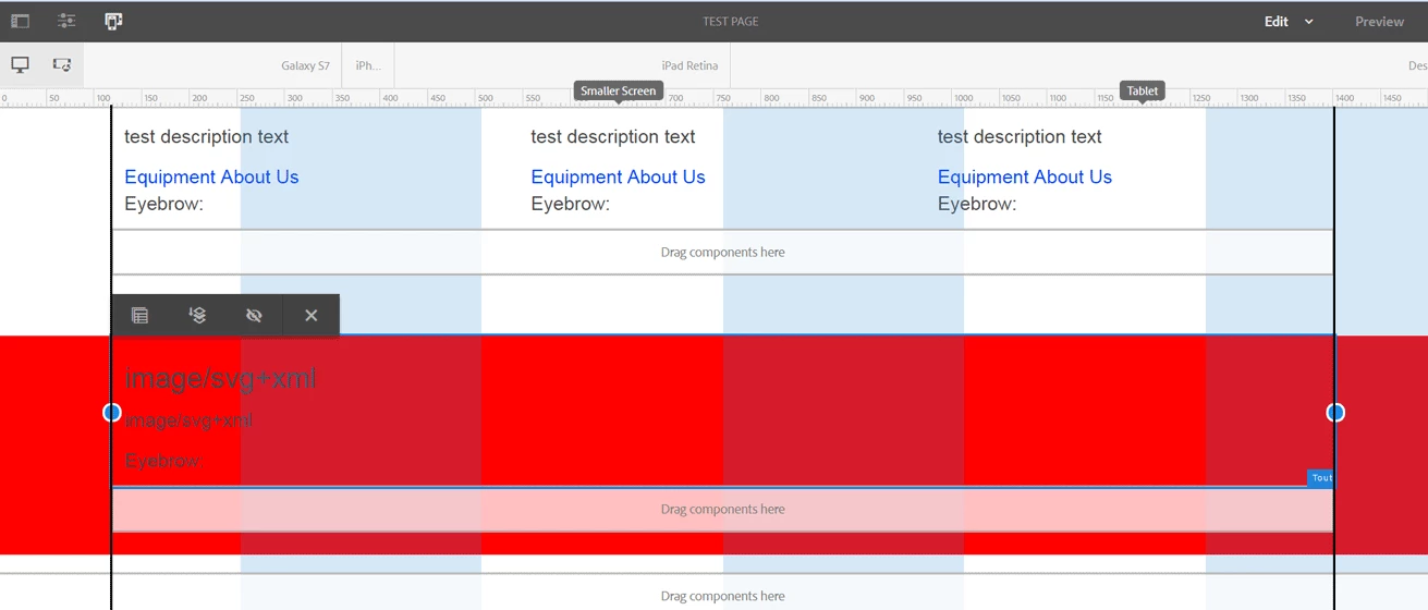
I want to extend the layout component to add some additional properties (BG color, ability to provide an anchor, etc). The tricky part I am running in to is I want the component to extend 100% of the viewport, but the inner content to have a max-width. However, I want the responsive grid to only be contained within that max-width, and not the width of the entire component. I've illustrated it the best I could in the attached screenshot.
The entire layout component is the red background, but the text component inside, which is conforming to the max-width, is bound to the layout's 100% width grid. I would like for the grid to be contained inside of the 2 black lines.
Solved! Go to Solution.
Views
Replies
Total Likes
Another approach is to actually have two layout containers. The outer layout container is the full-width w/ colored background and the inner layout container is a fixed-width (no background). The inner layout container will have the grids appropriately and you won't have to have some crazy CSS w/ negative margins. The downside is now you have to author two layout containers...
If possible I would try to do everything with the Style System. Supertyping the Layout container will mean you will have to maintain this custom component long term through upgrades, although having a background image might be difficult w/ Style System alone.
FWIW the Core Component team is planning on moving the Layout Container into Core Components in the future and others have requested background capabilities. This doesn't help you in the short-term but something to keep an eye out for: [RTC] Container Background · Issue #507 · adobe/aem-core-wcm-components · GitHub
Views
Replies
Total Likes
Use negative margins for your background. To avoid horizontal scrolling, set overflow-x:hidden on both the html and body elements.
Views
Replies
Total Likes
smacdonald2008 - I'm simply setting my component with a superType to 'wcm/foundation/components/responsivegrid' and creating a separate java model for my new component to account for any new properties I'll be adding.
gauravb10066713 - The issue is less with how to achieve it from a CSS perspective, but more how can I set what gets controlled by the responsive grid. When I set the max-width on the inner responsive grid parsys, I want the grid to be set to that, as opposed the parent container, which is 100% width
Views
Replies
Total Likes
Did you ever find a solution to this?
Views
Replies
Total Likes
Another approach is to actually have two layout containers. The outer layout container is the full-width w/ colored background and the inner layout container is a fixed-width (no background). The inner layout container will have the grids appropriately and you won't have to have some crazy CSS w/ negative margins. The downside is now you have to author two layout containers...
If possible I would try to do everything with the Style System. Supertyping the Layout container will mean you will have to maintain this custom component long term through upgrades, although having a background image might be difficult w/ Style System alone.
FWIW the Core Component team is planning on moving the Layout Container into Core Components in the future and others have requested background capabilities. This doesn't help you in the short-term but something to keep an eye out for: [RTC] Container Background · Issue #507 · adobe/aem-core-wcm-components · GitHub
Views
Replies
Total Likes
Live demo example of multiple layout containers: Pinnacle Finance (view the source and search for the class fsi-container--highlight to find the outer layout container and cmp-layout-container--fixed for the nested fixed width layout)
Views
Likes
Replies
Views
Likes
Replies