Expand my Community achievements bar.

SOLVED

Components arrangement in different viewports

Avatar

Level 2

Hi,


I have components in the below order in the desktop view.

Component 1,

Component 2,

Component 3,

Component 4


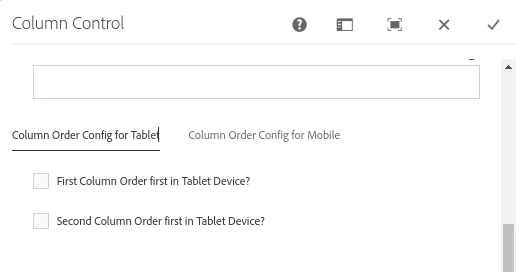
In my iPad view, I want them to be displayed in the below order.

Component 2,

Component 3,

Component 1,

Component 4


And in mobile view, the order should be

Component 1,

Component 3,

Component 2,

Component 4


Can anyone help me how can we do this in AEM?


Thanks.

1 Accepted Solution

Avatar

Correct answer by
Community Advisor

In Modern UX design, this pattern is very common. There is no OOTB solution for this by AEM.

You can smartly handle the order change for the lower device. For this, you need to add a new component called column-control (custom). Discuss with your teammate.


Features & Solution Outline:

1. Add Column option (1 column, 2 column, 3 column, 4 column)

2. Based on your column selection appear checkbox for ordering the column in the lower device. For example-

Sady_Rifat_0-1687242511586.png

3. Add the corresponding class and add to the HTML markup

4. Write proper CSS. example,

.order-first-tab {
    @include media-breakpoint-only(md) {
        order: -1;
    }
}

.order-first-mobile {
    @include media-breakpoint-down(sm) {
        order: -1;
    }
}


Still, the choice is yours.

View solution in original post

4 Replies

Avatar

Community Advisor

There is nothing ootb to achieve what you are asking for, but I think you could potentially achieve that purely with CSS, you could overwrite your styles with Flexbox and the property order, you can learn more here: https://css-tricks.com/snippets/css/a-guide-to-flexbox/#aa-order. If you go with this method is going to be easier to wrap all the components within a specific section and then work with that section.


The drawback is that you will be going to build a fixed layout which is kind of the opposite of what a CMS concept is all about. 


Esteban Bustamante

Avatar

Community Advisor

@mvelicheti 

I had implemented the same for one of my past requirement using jquery. Say like find the view port on page load and then in the body have a dummy div tags as shown below and in the function identify the view port and then invoke the respective component content in respective div element.I would not recommend adding the component multiple times and enabling and disabling the display by show and hide.This will have impact on SEO since the same component is loaded multiple times in same page in the location we need and even if you hide it still browser parse and loads the dom. So its better to inject the html at run time as shown below.


<script src="//ajax.googleapis.com/ajax/libs/jquery/2.1.4/jquery.min.js"></script>

<div  id="element1"></div>
<div  id="element2"></div>
<div id="element3"></div>
<div id="element4"></div> <button onclick="addText()">click to add text</button> <script type="text/javascript"> function addText() {
if (port 1){ $("#element1").append("inject the component content as static1");
$("#element2").append("inject the component content as static2");
$("#element3").append("inject the component content as static3");
$("#element4").append("inject the component content as static4");
}
if(port 2){
$("#element1").append("inject the component content as static2");
$("#element2").append("inject the component content as static1");
$("#element3").append("inject the component content as static3");
$("#element4").append("inject the component content as static4");
} </script>

 Regards

Avatar

Community Advisor

Hello @mvelicheti  - 


You may use use responsive grid layouts and the Layout Container component to achieve component reordering based on different viewports (desktop, iPad, mobile) in AEM.


  • Create a responsive grid layout component that will act as a container for your components. This will allow you to control the layout and ordering of the components based on different viewports.

  • Add a Layout Container component to your responsive grid layout. This component allows you to define different layouts for different viewports.

  • Within the Layout Container, add the Component 1, Component 2, Component 3, and Component 4 in the desired order for the desktop view. Set the appropriate width and positioning for each component using the grid system.

  • Define the layout for iPad view: Within the Layout Container, switch to the iPad view and rearrange the components in the desired order: Component 2, Component 3, Component 1, and Component 4. Adjust the width and positioning accordingly.

  • Define the layout for mobile view: Within the Layout Container, switch to the mobile view and rearrange the components in the desired order: Component 1, Component 3, Component 2, and Component 4. Adjust the width and positioning as needed.

  • Now that the responsive grid layout is configured with appropriate breakpoints for desktop, iPad, and mobile views. These breakpoints define when the layout changes based on the screen size.

Avatar

Correct answer by
Community Advisor

In Modern UX design, this pattern is very common. There is no OOTB solution for this by AEM.

You can smartly handle the order change for the lower device. For this, you need to add a new component called column-control (custom). Discuss with your teammate.


Features & Solution Outline:

1. Add Column option (1 column, 2 column, 3 column, 4 column)

2. Based on your column selection appear checkbox for ordering the column in the lower device. For example-

Sady_Rifat_0-1687242511586.png

3. Add the corresponding class and add to the HTML markup

4. Write proper CSS. example,

.order-first-tab {
    @include media-breakpoint-only(md) {
        order: -1;
    }
}

.order-first-mobile {
    @include media-breakpoint-down(sm) {
        order: -1;
    }
}


Still, the choice is yours.