HI All,
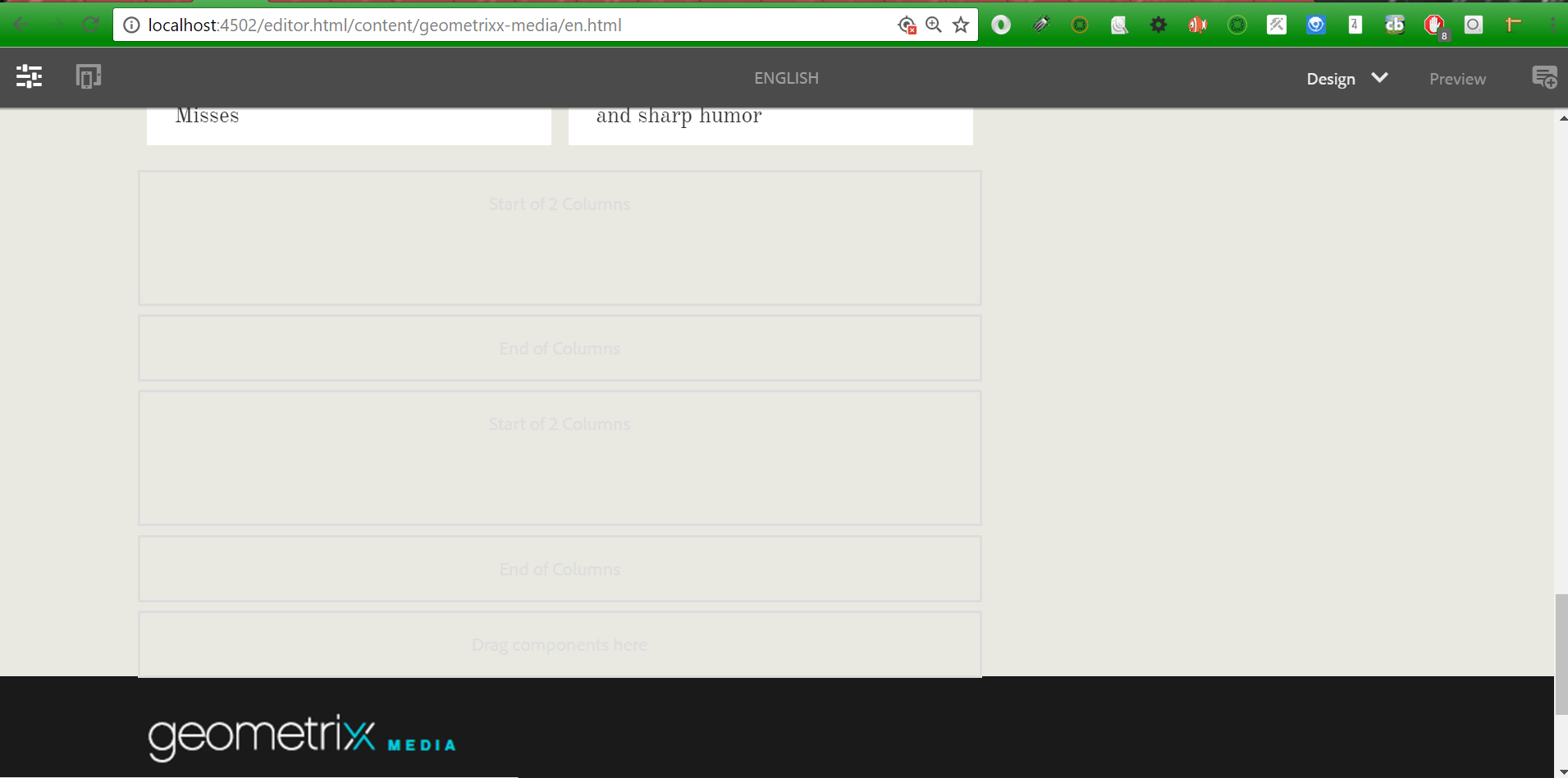
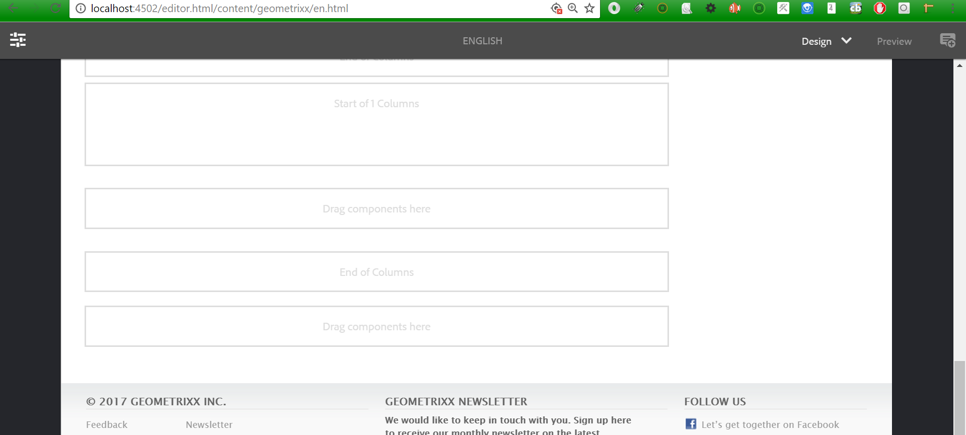
I added colctrl(Column control - Sightly) component in geometrixx-media site but it is not working , I am unable to see parsys between 'start of column' and 'end of column'
Please find the attached screenshots
It is working finne as expected in demo site.
I have even included the below css in media site:
/* column control layouts */
div.cq-colctrl-cols {width: 100%; float: left; }
div.cq-colctrl-default { width: 100%;}
/* layout 0 : 50% 50% ( grid6 + grid6 ) */
div.cq-colctrl-lt0 { }
div.cq-colctrl-lt0-c0 { width: 340px; margin-right:10px}
div.cq-colctrl-lt0-c1 { width: 340px; margin-left: 10px}
/* layout 1 : 33% 33% 33%( grid4 + grid4 + grid4 ) */
div.cq-colctrl-lt1 { }
div.cq-colctrl-lt1-c0 { width: 220px; margin-right: 10px;}
div.cq-colctrl-lt1-c1 { width: 220px; margin-left: 10px; margin-right: 10px;}
div.cq-colctrl-lt1-c2 { width: 220px; margin-left: 10px; }
/* layout 2: 16% 16% 16% 33% ( grid2.6 + grid2.6 + grid2.6 + grid4 ) */
div.cq-colctrl-lt2 { }
div.cq-colctrl-lt2-c0 { width: 140px; margin-right: 10px;}
div.cq-colctrl-lt2-c1 { width: 140px; margin-left: 10px; margin-right: 10px}
div.cq-colctrl-lt2-c2 { width: 140px; margin-left: 10px; margin-right: 10px}
div.cq-colctrl-lt2-c3 { width: 220px; margin-left: 10px }
/* layout 3: 4 x 25% ( grid3 + grid3 + grid3 + grid3 ) */
div.cq-colctrl-lt3 { }
div.cq-colctrl-lt3-c0 { width: 160px; margin-right: 10px;}
div.cq-colctrl-lt3-c1 { width: 160px; margin-left: 10px; margin-right: 10px;}
div.cq-colctrl-lt3-c2 { width: 160px; margin-left: 10px; margin-right: 10px;}
div.cq-colctrl-lt3-c3 { width: 160px; margin-left: 10px; }
/* layout 4: 5 x 20% ( grid2.5 + grid2.5 + grid2.5 + grid2.5 + grid2.5 ) */
div.cq-colctrl-lt4 { }
div.cq-colctrl-lt4-c0 { width: 124px; margin-right: 10px;}
div.cq-colctrl-lt4-c1 { width: 124px; margin-left: 10px; margin-right: 10px;}
div.cq-colctrl-lt4-c2 { width: 124px; margin-left: 10px; margin-right: 10px;}
div.cq-colctrl-lt4-c3 { width: 124px; margin-left: 10px; margin-right: 10px;}
div.cq-colctrl-lt4-c4 { width: 124px; margin-left: 10px; }
/* widepage layouts */
/* layout 5 : 50% 50% ( grid8 + grid8 ) */
div.cq-colctrl-lt5 { }
div.cq-colctrl-lt5-c0 { width: 460px; margin-right:10px}
div.cq-colctrl-lt5-c1 { width: 460px; margin-left: 10px}
/* layout 6 : 25% 25% ( grid4 + grid4 + grid4 + grid4) */
div.cq-colctrl-lt6 { }
div.cq-colctrl-lt6-c0 { width: 220px; margin-right:10px}
div.cq-colctrl-lt6-c1 { width: 220px; margin-left: 10px; margin-right:10px}
div.cq-colctrl-lt6-c2 { width: 220px; margin-left: 10px; margin-right:10px}
div.cq-colctrl-lt6-c3 { width: 220px; margin-left: 10px}
and below lines in design mode for dialog dropdown:
2;cq-colctrl-lt0 2 Columns (50%, 50%) 3;cq-colctrl-lt1 3 Columns (33%, 33%, 33%) 4;cq-colctrl-lt2 4 Columns (16%, 16%, 16%, 33%) 4;cq-colctrl-lt3 4 Columns (25%, 25%, 25%, 25%) 5;cq-colctrl-lt4 5 Columns (20%, 20%, 20%, 20%, 20%)


