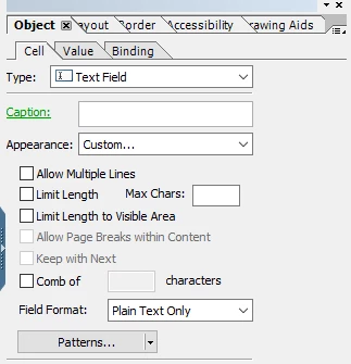
I have a group of text fields where the user will enter an (up to) three digit number.
Right now, some of the captions (which I have displayed above the field) are ridiculously long, so the box where the number is entered is also long.
Is there a way to force a line break on the caption, or should I just try to rework the layout so that the caption is off to the side, therefore the entry part of the fields can be consistent?
Also the Percentage total needs to be 100. I have a message that comes up when that isn't the case, but then the user can just ignore it and go ahead. Is there an action that will keep the form from advancing until the total is 100?
I would be very grateful for any help.
Solved! Go to Solution.
Views
Replies
Total Likes
Hi @fogharty ,
1. For aligning fields and grouping the items you can use the table option.
In this case, the table holds label and value separately,
for the value field at row2
without a caption and select the custom options.
This one is a corner case, so i don't think there is an option to allow line breaks within the field caption while you do have an option if it's a rich text field, you can use an html <br> tag.
Ideally, you should rework on the layout to ensure that the UI suits the requirement.
For the second question, If you have set the message box alert on the initialize event of the next field (after the ones above) then you may set the focus on the "Percentage Total" field of the form at the exit or any button click event of the message box or this thread elaborates a similar use-case.
Hi @fogharty ,
the labels will not break lines and \n or <br> will also not work.
In this case simply design your field without caption (turn it off in Layout) and place a Text object right above it.
Captions are static as well. With this approach you even could use floating fields if needed.
Design the Text object with Paragraph Bottom so that the text is aligned with the top of your field. But you could also tweak it by changing height and move it.
To get the line borders around it in the same way I arranged them in a subform (make it float Top to Bottom for easier positioning) and set the border of the subform.
result:
See if that approach works for you.
Hi @fogharty ,
1. For aligning fields and grouping the items you can use the table option.
In this case, the table holds label and value separately,
for the value field at row2
without a caption and select the custom options.
Thank you all!
I went with the table, which seemed to be the best solution for what I was trying to do.
That made the Action on the Total field easier.
Thank you PulkitJain and Kosta_Prokopiu1 as well!
Views
Likes
Replies