Expand my Community achievements bar.

July 31st AEM Gems Webinar: Elevate your AEM development to master the integration of private GitHub repositories within AEM Cloud Manager.

Show/Hide cq-dialog Fields based on Drop-Down Selection in AEM

Avatar

Community Advisor

12/19/22

ShowHIDE FIELD IN AEM.jpg

Show/Hide cq-dialog Fields based on Drop-Down Selection In AEM

  by Mayur Satav

In this blog post, we will see how to use OOTB show/hide functionality for CQ-dialogs fields based on the drop-down selection in AEM.In AEM, CQ-dialogs are one of the most important components. It is possible to greatly improve the user experience by strategically hiding dialog fields until a specific option is selected by the user.


It’s time to get started, so let’s do it step by step.


Step 1 — First create one node list of type nt:unstructured for the drop-down list and add below properties.

a. class— cq-dialog-dropdown-showhide*.

b. cq-dialog-dropdown-showhide-target— .{{anyClassName}}-showhide-target*.

e.g.

.test-options-showhide-target

c. fieldLabel— Options Type.

d. name — ./optionsType.

e. sling:resourceType — granite/ui/components/foundation/form/select*.

NOTE — properties marked as * are madatory

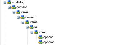
Once parent node list is created. Create item node of type nt:unstructured under list node. Then create one node of type nt:unstructured for each drop-down option. List node hierarchy should look like this.

MayurSatav_0-1671479545775.png
 

And here we are done with list structure.

You can refer below node structure for Step 1 

<list
    jcr:primaryType="nt:unstructured"
    sling:resourceType="granite/ui/components/foundation/form/select"
    class="cq-dialog-dropdown-showhide"
    cq-dialog-dropdown-showhide-target=".test-options-showhide-target"
    fieldLabel="Options Type"
    name="./optionsType">
    <items jcr:primaryType="nt:unstructured">
        <option1
            jcr:primaryType="nt:unstructured"
            text="Option1"
            value="option1"/>
        <option2
            jcr:primaryType="nt:unstructured"
            text="Option2"
            value="option2"/>
    </items>
</list>


Next, Will create node structure for each drop-down option.

Step 2 — Create container node option1Group of type nt:unstructured and add below properties.

a. class — hide {{anyClassName}}-showhide-target

e.g.

hide test-options-showhide-target

b. showhidetargetvalue — option1

on the basis of showhidetargetvalue, option1Group container will display and hide the fields added under it. showhidetargetvalue value should be same as value given for the option.

c. sling:resourceType — granite/ui/components/foundation/container

till here we are done with main logic of show/hide functionality. Now you can add different fields as per your requirements.


Similarly, follow Step 2 for each drop-down option.

You can refer below node structure for Step 2 

<option1group
    jcr:primaryType="nt:unstructured"
    sling:resourceType="granite/ui/components/foundation/container"
    class="hide test-options-showhide-target"
    showhidetargetvalue="option1">
    <items jcr:primaryType="nt:unstructured">
        <heading
            jcr:primaryType="nt:unstructured"
            sling:resourceType="granite/ui/components/foundation/heading"
            class="coral-Heading coral-Heading--4"
            level="{Long}4"
            text="Options 1 Group"/>
        <well
            jcr:primaryType="nt:unstructured"
            sling:resourceType="granite/ui/components/foundation/container">
            <layout
                jcr:primaryType="nt:unstructured"
                sling:resourceType="granite/ui/components/foundation/layouts/well"/>
            <items jcr:primaryType="nt:unstructured">
                <webUrl
                    jcr:primaryType="nt:unstructured"
                    sling:resourceType="granite/ui/components/coral/foundation/form/textfield"
                    fieldLabel="Web Url"
                    name="./webUrl"/>
            </items>
        </well>
    </items>
</option1group>
<option2group
    jcr:primaryType="nt:unstructured"
    sling:resourceType="granite/ui/components/foundation/container"
    class="hide test-options-showhide-target foundation-layout-util-vmargin"
    showhidetargetvalue="option2">
    <items jcr:primaryType="nt:unstructured">
        <heading
            jcr:primaryType="nt:unstructured"
            sling:resourceType="granite/ui/components/foundation/heading"
            class="coral-Heading coral-Heading--4"
            level="{Long}4"
            text="Options 2 Group"/>
        <well
            jcr:primaryType="nt:unstructured"
            sling:resourceType="granite/ui/components/foundation/container">
            <layout
                jcr:primaryType="nt:unstructured"
                sling:resourceType="granite/ui/components/foundation/layouts/well"/>
            <items jcr:primaryType="nt:unstructured">
                <htmlSnippet
                    jcr:primaryType="nt:unstructured"
                    sling:resourceType="granite/ui/components/foundation/form/pathbrowser"
                    fieldLabel="Upload HTML Snippet"
                    name="./htmlSnippet"
                    rootPath="/content/dam/"/>
            </items>
        </well>
    </items>
</option2group>​


I am sharing with you complete dialog structure also for your reference.


MayurSatav_2-1671479649574.png
<?xml version="1.0" encoding="UTF-8"?>
<jcr:root xmlns:sling="http://sling.apache.org/jcr/sling/1.0" xmlns:cq="http://www.day.com/jcr/cq/1.0" xmlns:jcr="http://www.jcp.org/jcr/1.0" xmlns:nt="http://www.jcp.org/jcr/nt/1.0"
    jcr:primaryType="nt:unstructured"
    jcr:title="Test Dialog"
    sling:resourceType="cq/gui/components/authoring/dialog">
    <content
        jcr:primaryType="nt:unstructured"
        sling:resourceType="granite/ui/components/foundation/container">
        <items jcr:primaryType="nt:unstructured">
            <column
                jcr:primaryType="nt:unstructured"
                sling:resourceType="granite/ui/components/foundation/container">
                <items jcr:primaryType="nt:unstructured">
                    <list
                        jcr:primaryType="nt:unstructured"
                        sling:resourceType="granite/ui/components/foundation/form/select"
                        class="cq-dialog-dropdown-showhide"
                        cq-dialog-dropdown-showhide-target=".test-options-showhide-target"
                        fieldLabel="Options Type"
                        name="./optionsType">
                        <items jcr:primaryType="nt:unstructured">
                            <option1
                                jcr:primaryType="nt:unstructured"
                                text="Option1"
                                value="option1"/>
                            <option2
                                jcr:primaryType="nt:unstructured"
                                text="Option2"
                                value="option2"/>
                        </items>
                    </list>
                    <option1group
                        jcr:primaryType="nt:unstructured"
                        sling:resourceType="granite/ui/components/foundation/container"
                        class="hide test-options-showhide-target"
                        showhidetargetvalue="option1">
                        <items jcr:primaryType="nt:unstructured">
                            <heading
                                jcr:primaryType="nt:unstructured"
                                sling:resourceType="granite/ui/components/foundation/heading"
                                class="coral-Heading coral-Heading--4"
                                level="{Long}4"
                                text="Options 1 Group"/>
                            <well
                                jcr:primaryType="nt:unstructured"
                                sling:resourceType="granite/ui/components/foundation/container">
                                <layout
                                    jcr:primaryType="nt:unstructured"
                                    sling:resourceType="granite/ui/components/foundation/layouts/well"/>
                                <items jcr:primaryType="nt:unstructured">
                                    <webUrl
                                        jcr:primaryType="nt:unstructured"
                                        sling:resourceType="granite/ui/components/coral/foundation/form/textfield"
                                        fieldLabel="Web Url"
                                        name="./webUrl"/>
                                </items>
                            </well>
                        </items>
                    </option1group>
                    <option2group
                        jcr:primaryType="nt:unstructured"
                        sling:resourceType="granite/ui/components/foundation/container"
                        class="hide test-options-showhide-target foundation-layout-util-vmargin"
                        showhidetargetvalue="option2">
                        <items jcr:primaryType="nt:unstructured">
                            <heading
                                jcr:primaryType="nt:unstructured"
                                sling:resourceType="granite/ui/components/foundation/heading"
                                class="coral-Heading coral-Heading--4"
                                level="{Long}4"
                                text="Options 2 Group"/>
                            <well
                                jcr:primaryType="nt:unstructured"
                                sling:resourceType="granite/ui/components/foundation/container">
                                <layout
                                    jcr:primaryType="nt:unstructured"
                                    sling:resourceType="granite/ui/components/foundation/layouts/well"/>
                                <items jcr:primaryType="nt:unstructured">
                                    <htmlSnippet
                                        jcr:primaryType="nt:unstructured"
                                        sling:resourceType="granite/ui/components/foundation/form/pathbrowser"
                                        fieldLabel="Upload HTML Snippet"
                                        name="./htmlSnippet"
                                        rootPath="/content/dam/"/>
                                </items>
                            </well>
                        </items>
                    </option2group>
                </items>
            </column>
        </items>
    </content>
</jcr:root>

Output

ezgif.com-gif-maker.gif


Summary

Basically, class and cq-dialog-dropdown-showhide-target these both properties are mandatory for hiding container based on showhidetargetvalue property value.

In short —

  1. add class — cq-dialog-dropdown-showhide and cq-dialog-dropdown-showhide-target — .{anyName}-showhide-target in your dropdown list node
  2. Add class — hide {anyName}-showhide-target and showhidetargetvalue — { value of drop down option } in each container of your drop-down list option.
 
For more visit
 

Q&A

Please use this thread to ask questions relating to this article

5 Comments

Avatar

Administrator

1/5/23

@MayurSatav , this is helpful and relevant. As I have seen many questions in the community asking about this. Keep on writing such a great articles for the AEM community. 

Avatar

Level 4

4/14/23

Hi @MayurSatav !
Thanks for this brief explanation. Is the method for this functionality different for different AEM versions? Because I'm using AEM Cloud SDK, I followed your instructions but it didn't work. But if I follow steps as given by Theo in his article show-hide field works. Curious to know what's different in both approach. 

Avatar

Level 3

5/18/23

When I change select field the text field of the previous option remais filled in. How can I delete the content of the previous option so that there is no duplication ? 

Avatar

Level 1

1/10/24

@MayurSatav, while using showhide dropdown in multifield, it is not working as expected.

for example: we have dropdown with Options Type [Option1, Option 2], if we select Option 1, Option1group container should show. if we select Option 2, Option2group should show. is working as expected outside multifield. but it is not working inside multifield.

In my case if I select Option 1, it should remain same not giving any validation for that. if I select Option 2, Option2group container should show

saran_kp_0-1704878965090.png

after adding another dropdown in multifield by selecting Option2, it is giving duplicate in other dropdown multifields.

saran_kp_1-1704879128167.png

can you please help me to get it resolved.


Avatar

Level 5

7/2/24

I tried the above and created the following, but I'm still seeing the pathfield when it should be hidden. The pathfield (ctaIconPath) should only appear when "Primary Large with Icon" is selected. 

<multiCtaStyle
    jcr:primaryType="nt:unstructured"
    sling:resourceType="granite/ui/components/coral/foundation/form/select"
    class="cq-dialog-dropdown-showhide"
    cq-dialog-dropdown-showhide-target=".test-options-showhide-target"
    defaultValue="btn-primary"
    fieldDescription="CTA style"
    fieldLabel="Select CTA style"
    name="./multiCtaStyle">
    <items jcr:primaryType="nt:unstructured">
        <primary-large
            jcr:primaryType="nt:unstructured"
            text="Primary Large"
            value="btn-primary"/>
        <primary-large-icon
            jcr:primaryType="nt:unstructured"
            text="Primary Large with Icon"
            value="btn-primary btn-primary-icon"/>
        <primary-small
            jcr:primaryType="nt:unstructured"
            text="Primary Small"
            value="btn-primary btn-small"/>
        <secondary-large
            jcr:primaryType="nt:unstructured"
            text="Secondary Large"
            value="btn-secondary"/>
        <secondary-small
            jcr:primaryType="nt:unstructured"
            text="Secondary Small"
            value="btn-secondary btn-small"/>
        <text-link
            jcr:primaryType="nt:unstructured"
            text="Text Link"
            value="primary-cta"/>
    </items>
</multiCtaStyle>
<ctaIconPath
            jcr:primaryType="nt:unstructured"
            sling:resourceType="granite/ui/components/coral/foundation/container"
            class="hide test-options-showhide-target"
            showhidetargetvalue="btn-primary btn-primary-icon">
    <items jcr:primaryType="nt:unstructured">
        <ctaIconPath
            jcr:primaryType="nt:unstructured"
            sling:resourceType="granite/ui/components/coral/foundation/form/pathfield"
            fieldLabel="CTA Button Icon Path"
            name="./ctaIconPath"/>
    </items>
</ctaIconPath>