Hi,
I have a basic question on Responsive Feature provided with Core Image Component.
When the size of screen changes the soruce of image also changes accoridngly with respect to the width defined in template design for image component
Example:
<img class="cmp-image__image" itemprop="contentUrl" data-cmp-hook-image="image" alt="" src="/content/we-retail/language-masters/en/products/equipment/_jcr_content/root/responsivegrid/image.coreimg.82.300.png/1595274233631/wknd-logo-dk.png">
My Doubt is
a) was the servlet everytime fectching the original image component and applies the width Size thereby compressing and displaying it
or
b) Is the adaptive servlet picking up image from different rendition of the available image based on nearly matching width?
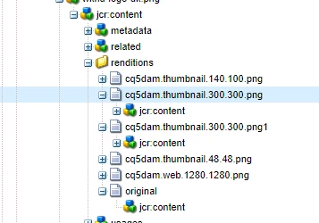
I know the ACS Commons Named Image Servlet picks up original image and applies different sizing/cropping etc on top of that at run time is the Adaptive Servlet works same way?
Please suggest
Solved! Go to Solution.
Views
Replies
Total Likes
Hi @RajaShankar
Wcm Core Image Component works in the similar way acs commons one. If you look at the image page path :
<img class="cmp-image__image" itemprop="contentUrl" data-cmp-hook-image="image" alt="" src="/content/we-retail/language-masters/en/products/equipment/_jcr_content/root/responsivegrid/image.coreimg.82.300.png/1595274233631/wknd-logo-dk.png">
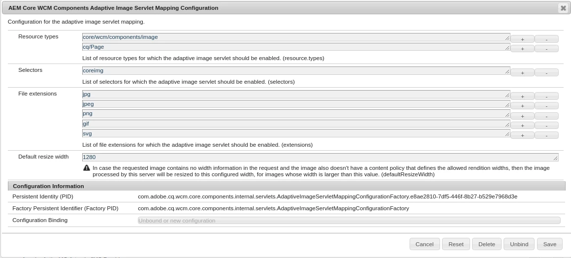
This basically calls the Core Adaptive Servlet which depending upon the factory OSGI configuration ""AEM Core WCM Components Adaptive Image Servlet Mapping Configuration"" and for "coreimg" selector applies different rules for transformation.
You can refer https://helpx.adobe.com/in/experience-manager/6-3/sites/developing/using/responsive.html#Understandi... and https://github.com/adobe/aem-core-wcm-components/wiki/the-adaptive-image-servlet to read more on how adaptive servlet works and how can you define different transformation configuration.
Hope it helps!
Thanks!
Nupur
Here is an article that may help you https://helpx.adobe.com/in/experience-manager/6-3/sites/developing/using/responsive.html#UsingAdapti....
Also see https://github.com/adobe/aem-core-wcm-components/wiki/The-Adaptive-Image-Servlet.
Views
Likes
Replies
Views
Likes
Replies
Views
Likes
Replies