Hi there,
We are hoping to build a number of dashboards based off of data available to us via Adobe.
When we run the segments in Workspace, we have difficulty creating the style report that would be the most efficient for extracting the data.
For example, we wish to be able to see a breakdown of the total Unique Visitors, Visits and Page Views for each day broken down by country, see screenshot 1.
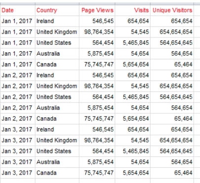
However, so far we have difficulty producing the above. The nearest we have gotten is by putting each country into Breakdown section by day.
This is a very manual process.
Is there a more efficient and quicker way to produce the ideal output as shown in screenshot 1 above?
Thanks in advance,
Emmet
Solved! Go to Solution.
Views
Replies
Total Likes
Workspace here I feel will soon limit you. 400 lines max if i remember correctly, not to mention the severe speed slow down.
I would recommend data warehouse if workspace is not sufficient. It is a text based report but you can get column for column what you need based on example. You can run regularly and even apply segments as needed. FIle size for large timeframes mean you should use ftp delivery option though.
GLTU
Hi emmetc2018
I mainly use Workspace for all reporting, almost never Excel. and I do not like tables like this
however, in workspace you have an option for "breakdown by position" (on you top breakdown dimension). that means once you added the breakdown on the selected days, the breakdown will stay there even when the items (day) change.
do as follow:
- add "day" as first dimension
- select all "days" (make them blue highlighted)
- drop "country" on one of the days, all selected days will receive the breakdown
- change setting on "day" header to "breakdown by position"
Thanks for getting back to me.
Just a few questions on this:
1. What is the issue with the example table in my previous email? Have you a recommendation on this?
2. When trying to analyse large ranges like dates i.e. 2016-2018, why do you not like to extract and export to Excel for reporting purposes?
Thanks,
Emmet
Views
Replies
Total Likes
Hi emmetc2018
let me add some remarks:
1) how did you get to that table? by report builder? have you tried a download in data warehouse?
it really looks strange and might be best get customer care to look at ...
2) I do not line those tables since they have farr to mach data/dimensions. I either report by single country (if you want to have a country view) or by some sort of country comparison to answer a certain question. but just to have the 3 metrics by day and country does not say anything ... just my two cent
Workspace here I feel will soon limit you. 400 lines max if i remember correctly, not to mention the severe speed slow down.
I would recommend data warehouse if workspace is not sufficient. It is a text based report but you can get column for column what you need based on example. You can run regularly and even apply segments as needed. FIle size for large timeframes mean you should use ftp delivery option though.
GLTU
Data Warehouse outputs this information in this exact format. That would be my recommendation as well.
Workspace, while it does allow breakdowns, does not do so in a table-like format. There has been a request to introduce this table-like format, outlined in this idea here: Multiple Dimensions columns in Adobe Workspace
Be sure to upvote it and comment there why it would be valuable to you in reporting!
Views
Replies
Total Likes
Views
Likes
Replies
Views
Likes
Replies
Views
Likes
Replies