활동이 없어 이 대화는 잠겼습니다. 새 게시물을 작성해 주세요.
Hello Community,
I am looking to create a dashboard for our stakeholders where they wanted to see the Worst hour in a day by Visits and the Best Hour in a day by Visits as a separate columns.
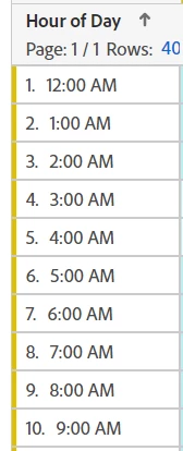
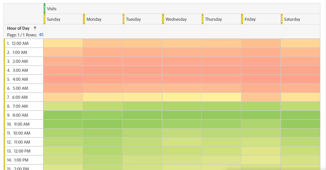
I have below table which shows Visits / Day and looking to have 2 new columns which can show me the worst hour (in terms of visits) and number of visits on that hour, best hour(in terms of visits) and number of visits on that hour.
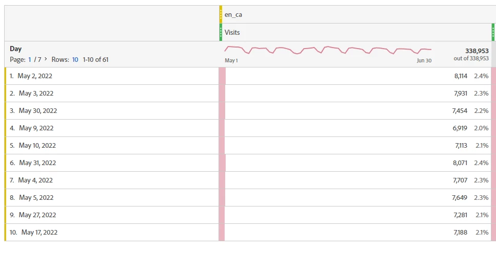
The output iam looking for can be like below, just sharing it as an example:
| Visits | Best Hour | Best Hour Visits | Worst Hour | Worst Hour Visits |
Day |
|
|
|
|
|
May 2, 2022 | 8,114 | 11:00 AM | 465 | 12:00 AM | 3 |
May 4, 2022 | 79,018 | 9:00 AM | 1,003 | 4:00 AM | 8 |
May 5, 2022 | 65,111 | 7:00 AM | 5,045 | 5:00 AM | 200 |
Is there any way I can get these metrics in Adobe Analytics. Any help or suggestions would be greatly appreciated.
Thank you very much!
Satish
해결되었습니다! 솔루션으로 이동.
조회 수
답글
좋아요 수
I don't believe you can display data natively in Workspace as you are trying to do....
You can create a "heatmap" showing on average the best and worst times of the day, based on day of the week (I will show that at the end); and you can get the "Max" and "Min" value for the column, but this will just get you the value of the day with the most/least visits, and will show that value on every row (to get by hour, your table would have to have each hour on the row - really not what you want to show).
If I were trying to create such a report, I would probably use Report Builder to pull the data in with an hourly granularity, then use Excel Formulas to find the min/max value (all doing this in "hidden tabs") and stitch the final data together into the final requested format in a visible tab.
What I do know how to do, and I know this isn't exactly what you want... but, I would create a freeform table using the Visits metric, but broken down by "Day of Week":
Then use "Hour of Day" in the breakdown:
Then I would configure the Visits to be "conditional formatting"
Then finally turn off the values:
This will create a "heat map" of your traffic high/lows for whatever time frame you select:
So it's not the high and low for each specific day, but creates a nice visual of your traffic times for quick consumption (not so colour blind friendly if that is a concern... it would be nice if we could configure 'high", "low" and "mid" range colours.... )
@Jennifer_Dungan Loved your solution on this 😊
조회 수
답글
좋아요 수
Thanks 🙂
I mean I love what they wanted to do and wish we could do natively.
FYI @vallus here are some Excel Formulas if you need them:
Min/Max "Value" in a range:
=MIN(A2:A20)
=MAX(A2:A20)
To get the "corresponding" hour/date whatever that connects to the min/max (but it one column over):
=INDEX(B2:B20,MATCH(MIN(A2:A20),A2:A20,0))
=INDEX(B2:B20,MATCH(MAX(A2:A20),A2:A20,0))
(the B range is the hour / date / etc that corresponds to the actual min/max value in the A range)
조회 수
답글
좋아요 수
@Jennifer_Dungan Thank you very much for the detailed solution! Appreciate it! 🙂
I will try this out.
조회 수
답글
좋아요 수
조회 수
Likes
답글