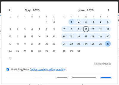
The UI for the date selector in Analysis Workspace has changed to result in more whitespace. On smaller screens, that means a lot of scrolling is needed when toggling the rolling date ranges.
See this screenshot where the bottom part got cut off, requiring scrolling.

Also, given the absence of a scrollbar, it's not immediately obvious that scrolling is needed.
FYI my screen resolution is 1440x900.