Expand my Community achievements bar.

Join us at Adobe Summit 2024 for the Coffee Break Q&A Live series, a unique opportunity to network with and learn from expert users, the Adobe product team, and Adobe partners in a small group, 30 minute AMA conversations.

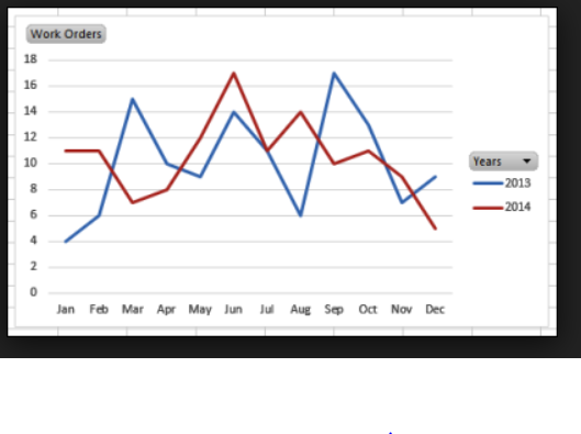
Provide YOY multi line chart visualizations in Workspace

Avatar

Level 3

11/16/18

Hi Adobe,

It will be great to have some year over year comparison visualizations option available in Adobe Analytics Workspace as shown in the below image. This will help users/execs better understand and compare the trends over the same time previous years. Currently we are having to extract Adobe data in to BI tools like Domo or Tableau to build such charts.
1623483_pastedImage_0.png

Thanks,

Srujana

- https://rnd.aspencore.com/eetimes-redesign-adtest/

2 Comments

Avatar

Level 1

12/10/18

This is possible currently, though it's not immediately obvious and could be a lot better. Just right click on a column and choose "Add time period column". Then you can manually ensure that the two columns are included in your trend visualization.

It sure would be nice, though, to just be able to add something like this to a line chart without adding it to the table. And to have it normalized and automatically updated.

Avatar

Level 3

4/21/21

@srujanam558322 @michaelh37 

If you need to import Adobe analytics data in Tableau, Daexus built a free web data connector.

  • no sign-up required
  • no download 
  • ultra secure as data doesn't go through external server - from Adobe Analytics straight to your computer.

To access it, paste the link in Tableau and start brining your data.

cristinafoit_0-1619045604304.png

The paid version enables date expressions and automated data imports.

Access the link on their website