
Make the Workspace Text Colour Pallet more readable between Light/Dark Mode displays (provide preview sample for each mode in the selector)
Description -
As pointed out in https://experienceleaguecommunities.adobe.com/t5/adobe-analytics-questions/multiple-black-colours-when-using-colour-palette-in-text/td-p/590810 Some of the colour options available in the colour pallet work well for Light Mode and not for Dark Mode... since Light/Dark mode is left to each user to choose, it can be hard to ensure that descriptions and notes are properly visible.
While the colour pallet does oscillate between shades, the readability of those shades isn't exactly equal.
Perhaps WCAG's colour contrast checker could be used to ensure that shades meet the accessibility standards in each mode, but providing options with similar contrast balance.
In addition, to help report creators see what the colours might look like, I am suggesting that the pallets for light/dark be shown with a sample so that the creator doesn't need to switch their modes constantly to see the result.
Why is this feature important to you -
Notes, descriptions, text blocks, etc are important to provide context to the reports... if these can't be read, they are no longer doing their job.
How would you like the feature to work -
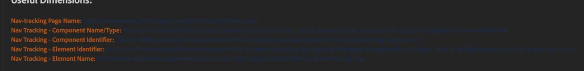
I am suggesting to display the colour pallet showing both variations (the selection box with a diagonal slash showing the Light Mode variant on the top left and the Dark Mode variant on the bottom right) and providing a Light/Dark Mode Preview sample.
The preview should change with hovering over a colour, and when not hovering, show the current selection
(The text could just be coded to "Sample", it doesn't need to reflect the actual text in the description)
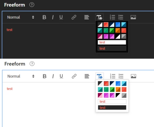
In addition, the colour option in the top right (position 5) the colour contrast in Light Mode is quite different from the contrast in Dark Mode... I would suggest reviewing the colours against WCAG Contrast Checkers to find colours that site within a similar contrast range
The Light Mode Variant (Cyan on White) has a contrast ratio of 1.66:1
The Dark Mode Variant (Dark Blue on Grey) has a contrast ratio of 1.85:1
(Both technically fail WCAG at default font sizes, but the Cyan is more readable)
Current Behaviour -
There is no way to preview the colour options without switching between Light and Dark mode.. this takes extra time that a lot of report curators wouldn't normally take.
The colour options aren't completely one to one between Light and Dark Mode when it comes to readability.. making some information significantly harder to read when in certain modes.