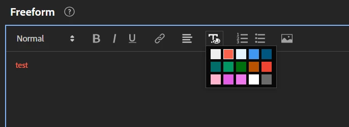
I don't really use Dark Mode... but the "default" font colour will be white in Dark Mode and black in Light Mode by default.. if you look at the pallets in the different modes, the colours do in fact change... that dark blue colour is as a result of someone choosing a lighter colour in Light Mode (that was likely quite visible) and in dark mode it became a dark variant that is less readable.
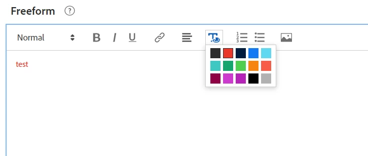
Light Mode Pallet:
Dark Mode Pallet:
That said, you can't actually see the result of a colour choice without constantly changing your mode... which isn't ideal....
Maybe instruct your users to stick to colours that you know work in both modes. Or to preview their reports in both modes if they are using coloured text.
In the meantime, I have logged an idea to both improve the colour contrast for the options, so that the variations maintain the same level of readability. But also to show the variations, and preview the colours without needing to always check both modes manually.
https://experienceleaguecommunities.adobe.com/t5/adobe-analytics-ideas/make-the-workspace-text-colour-pallet-more-readable-between/idi-p/590971
Add your comments if you have anything else that you think would make this better, and give it a like to hopefully get this on the radar for a future change.