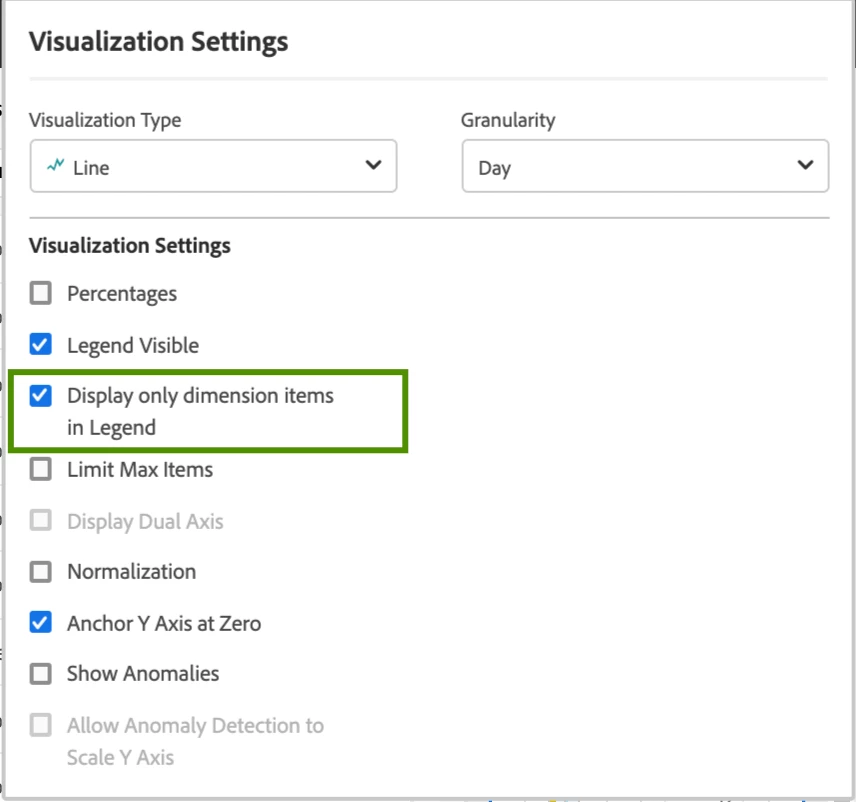
Line Visualization Setting: Display only dimension items in Legend
It is very often when the legend part of the visualization requires manual edit for making the chart look cleaner and easier to read. It would be very helpful to add a new setting that would allow to not include Metrics and Metric Filters (column names) in the legend labels.
This is how it looks when a metric is filtered by dimension, segment, date range or their combination. The legend becomes too heavy that is especially critical for dashboards.

This is a desirable way of how the legend should be displayed that today requires manual update of each label.

Here is how that new setting could look in the settings popup.
