Map Your Data to Identify Similarities in Data + Anomalies
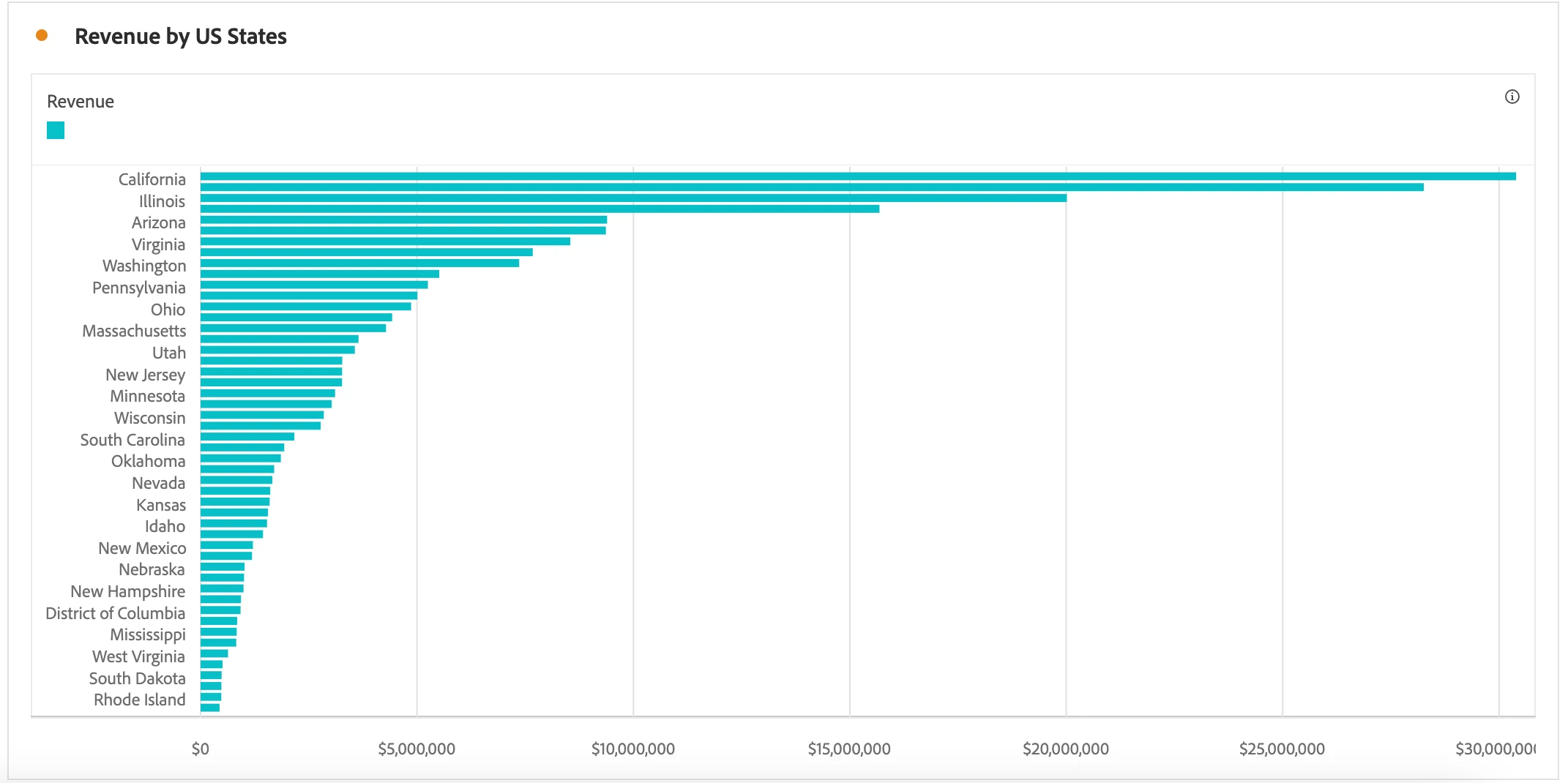
Displaying your organization's key metrics on a map is crucial if the problem or use case you are investigating relates to location. For instance, to identify the average revenue by state, you may begin your analysis with a horizontal bar chart, as shown below:

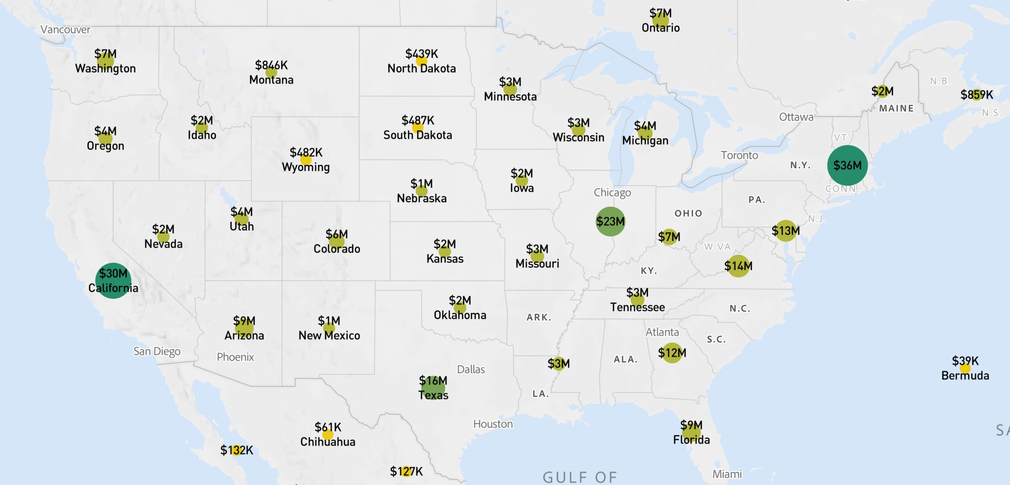
However, a list of states could be more insightful and easier to interpret. As a result, leverage the Map visualization to determine which states drive the highest and lowest revenue. Map symbols can be beneficial to identify the five top or bottom states efficiently. As shown on the map visualization below, bubble size and color represent the amount of revenue by state.

To change the shading of the bubble map to more easily identify the states with the highest and lowest revenue, click on the Gear Icon > Color Theme > Select Positive/ Negative. This option will change the color symbols, showing a darker green to denote higher revenue. One insight we may derive from this map is the difference in income between states such as Arizona and New Mexico, as the two states are adjacent, similar in size, and contain mountains (which may indicate similar lifestyle offerings). As a result, digging into this insight more deeply may help identify a critical factor that could boost revenue in New Mexico.

