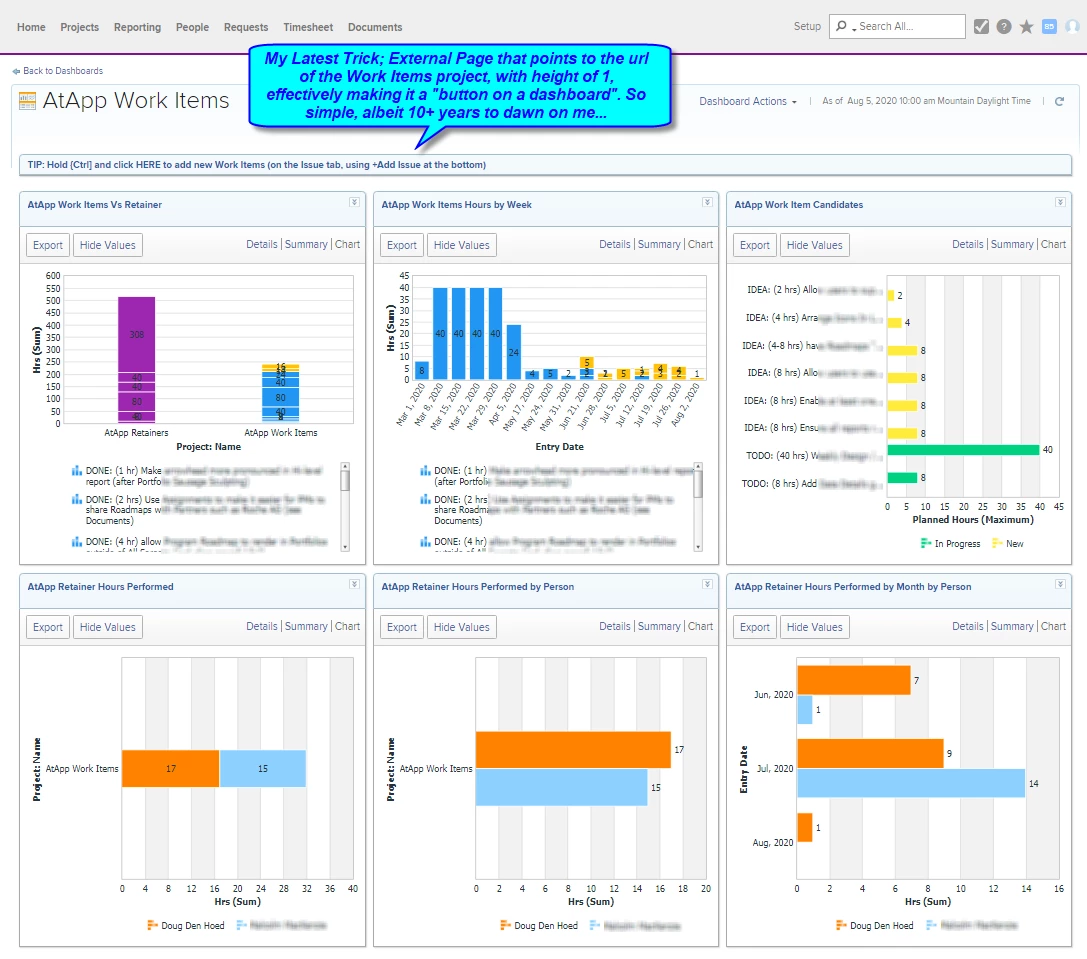
As shown below, by copying any URL (e.g. to a particular Workfront Project...although it could be outside Workfront too), adding an External Tab to a Dashboard with that URL pasted in as the target, naming the External Page in an informative and instructional manner, and setting the External Page's height to 1 (the minimum), it then effectively renders as a button.
I'm using it for navigation in this case (to quickly add new Work Items from our primary AtApp Work Items dashboard), but because you could put in ANY target...Oh, The Places You'll Go!
If anyone comes up with some particularly cool or clever ways of using this technique, please share them below, and have fun!
Regards,
Doug
Topics help categorize Community content and increase your ability to discover relevant content.
Hey Doug,
It's a genius move that one of my users showed me one day and surprised the heck out of me. He had a three-column layout dashboard with a collection of links he had created pointing to Workfront and SharePoint resources. It's a pretty slick trick if you dare to give it a try. Good stuff!
Thanks,
Narayan
Views
Replies
Total Likes
Hi @Doug Den Hoed‚
Is it possible to share the code for the same or share the idea?
Mvh
Kundan.
Views
Replies
Total Likes
Nice tip, Doug!
Views
Replies
Total Likes
Thanks Adina!
Kundan, there is no code required, which is the beauty of this one: all you need to do (as per the screenshot) is:
In my case, I used the URL of a particular Workfront Project and set the name of the External Page to "Click HERE to add a new Work Item under the Issue Tab on the Work Request Project".
In your case, you could use the URL of your company (e.g. https://ien.kvernelandgroup.com/) and set the name to "Click HERE to open our corporate website".
Other ideas could include:
Regards,
Doug
Thanks a lot @Doug Den Hoed‚
mvh
Kundan.
Views
Replies
Total Likes
Hey @Doug Den Hoed‚ ,
I see some details within your first and second report with scroll bar next to it. How did you get that, and is it possible to get the same in NWE? What's the use case of it please?
The area in the red box:
Views
Replies
Total Likes
Hi Manish,
Those bar charts are grouping and stacking Task names, with the height of each such wedge being the Task's actual hours. The section you've highlighted below the chart then shows each such Task name, and because they are long (and there are a lot of them), the vertical scrollbar appears automatically in both Classic and NWE.
Regards,
Doug
Views
Replies
Total Likes
Ahh.. I get it now. Thanks Doug! 🙂
Views
Replies
Total Likes
Hey Doug - we use these all the time! They are great when you don't want to clutter up a dashboard with reports that aren't used as often. We also use it to provide help links for our internal process.
One word of caution - the permissions hierarchy does not work with these linked reports so make sure you are sharing the linked report to anyone you have the dashboard shared with!
Views
Replies
Total Likes
Learned this trick about 1+ years back and it has been a handy way to make a "click here for training materials" link and that sort of thing. Very handy!
Views
Replies
Total Likes
We use these at the bottom of our system wide reports for support queues. (add a project, report an issue, etc)
Views
Replies
Total Likes
Oooh, good one. I may need to keep that one on mind as we grow.
Views
Replies
Total Likes
Views
Likes
Replies