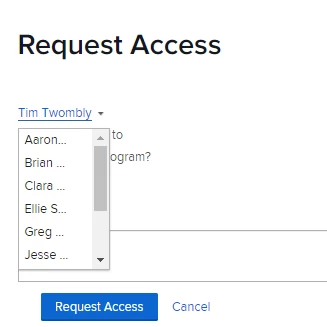
I was instructed to upvote this idea, although my issue is related but not the same. I'm having issues with the list of people who populate in the Request Access dropdown not being Owners or Managers of that item. Therefore, Request Access emails are getting sent to people who are only Viewers of certain items, and they are wondering why they should grant access (and therefore wasting time digging in to determine who should actually provide access).
In this example, the default name (Tim Twombly) is just a Viewer. One wouldn't know by looking at this list that the Owner of the item is Clara, Greg has Manage access, and the rest are just Viewers. And this list is only a small random sampling of people with access to this item.


