Great UX for a webinar series
Company Name:MoTaM
Company URL:https://motam.co.nz
Your Name:Jo Pitts
Your Title:CEO
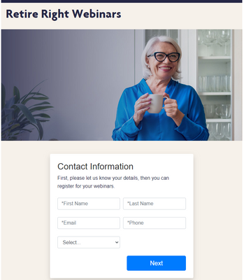
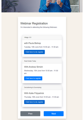
MoTaM is one of NZ's leading Marketing Operations consultancies. We delivered a solution for a client who wanted to run a series of webinars. We produced a custom form that over three pages let a prospect enter their personal details on the first page, and on the second page select between one and three webinars to attend, and on the third page opt in for further communications.
All webinar registration details were stored in a single string. Once the form was submitted, a Marketo smart campaign was triggered that:
- called a webhook was used to determine how many webinars the prospect had registered for and set a counter against the user record
- performed a Zoom registration for each webinar the prospect had requested registration for, and called another webhook to decrement the counter.
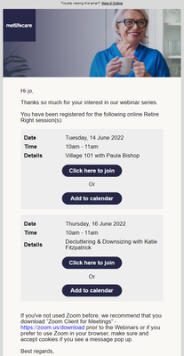
When the counter reached zero (i.e. all zoom registrations had been performed), a single confirmation email was sent to the user with the details of all their webinars. The content of the email was built using velocity script to create on brand details for each webinar the user had registered for, providing a simple clean UX. Further to this, we were able to detect if someone was using Gmail vs other mail clients and produce a gcal link for Gmail, and an ICS for other clients.
The registration links supplied to each user were unique to them, so attendance could be tracked.
From here, each event was managed separately (i.e. as expected) with reminder emails being sent for each webinar one day, and fifteen minutes before the event. The reminder emails contained the same join CTA as the original confirmation email.
A followup email was sent after all three events with links to records for each event. The text varied based on whether people had registered, registered and attended, or not attended any of the events.
No emails were sent by/from Zoom. The entire UX was delivered consistently, and elegantly via Marketo.
While this is only a single product example, it is innovative (no one else is generating single confirmation emails from multiple registrations like this), and provides a much better experience than multiple confirmation emails and/or multiple registration forms.
Events
Community
- Community home
- Guidelines
- Community Advisors
- Experience League Showcase
- Advertising
- Analytics
- Audience Manager
- Campaign Classic v7 & Campaign v8
- Campaign Standard
- Developer
- Experience Manager Sites & More
- Experience Platform
- Journey Optimizer
- Target
- Community Announcements
- Real-Time Customer Data Platform
- Workfront
- Marketo Engage
- Commerce
- Creative Cloud
- Document Cloud


You must be a registered user to add a comment. If you've already registered, sign in. Otherwise, register and sign in.